If you've been crafting for a while, you probably have a collection of dies that you use the same way every single time. Today I want to challenge that! I'm sharing a mixed media card made with the latest Seth Apter Sizzix release, and my favorite part of this project is how I pushed the dies beyond their intended use. Sometimes the most interesting results come from asking "what else can this do?"

Think Outside the Die
The Seth Apter Mini Pages die set is designed to create a folded mini book or page, but here I used it purely as a design element — no folding required. I layered it with the dotted die from the Seth Apter Paper Cutz 2 die set, positioning it to cut the design the full length of the Mini Pages die cut. The result is a beautifully detailed panel that looks intentional and intricate, and nobody would ever guess it started as a booklet die!
The other technique I want to highlight is using the Seth Apter Magic Mesh embossing folder on a die cut rather than on flat cardstock. I embossed the butterfly after die cutting it from the Tim Holtz Tattered Butterflies die set, and the mesh texture on those irregular butterfly edges is just chef's kiss. It adds so much depth and visual interest to the focal element.

How to Make This Card
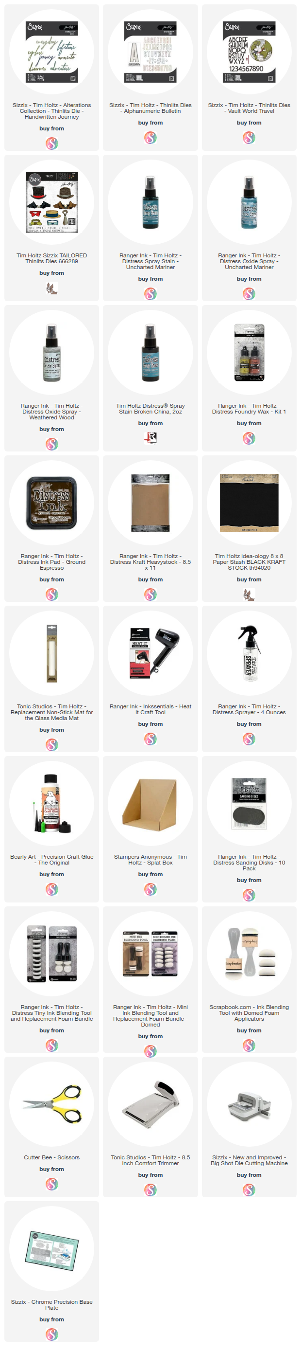
Start with a piece of white cardstock cut to 4.5 x 6.25 inches and ink the edges with Walnut Stain Distress Ink.
Cut a piece of blue kraft stock or cardstock to 2.75 x 6 inches. Stamp across the surface using the dotted stamp from the Seth Apter Viewfinder Stamp and Die Set with Twilight Versafine Clair Ink, or a slightly darker ink than your cardstock color. If you're using kraft stock, lightly sand the edges with fine grit sandpaper or a Ranger Sanding Disk. If you're using regular cardstock, ink the edges with Walnut Stain Distress Ink. Adhere this to the card front, but leave the right-hand side unattached so you can tuck the circle die cuts underneath later.
Cut circles from black kraft stock using the Seth Apter Twisters Die Set and lightly sand the edges with fine grit sandpaper or a Ranger Sanding Disk. Tuck these under the right side of the blue panel and adhere in place.
Now for the Mini Pages panel. Die cut a piece of Distress Watercolor Cardstock using the Seth Apter Mini Pages die set. Then take the dotted die from the Seth Apter Paper Cutz 2 die set and position it to cut the design across the full length of the Mini Pages die cut — you're using it as a design element here, not as a folded booklet. Use a baby wipe to apply Distress Paint in Salvaged Patina across the surface. Ink the edges and here and there over the surface with Walnut Stain Distress Ink. Adhere this layer to the card.
Next, take one of the outer dies from the Paper Cutz 2 set and cut another piece of Distress Watercolor Cardstock. Spray with Old Paper Distress Spray Stain and a little water, then dry with a heat tool. Stamp the splatter image from the Seth Apter Viewfinder Stamp and Die Set using Walnut Stain Distress Ink. Ink the edges with Walnut Stain Distress Ink and adhere to the card with double-sided foam tape for dimension.

For the butterfly, die cut a piece of Distress Watercolor Cardstock using the larger butterfly from the Tim Holtz Tattered Butterflies die set. Emboss it using the Seth Apter Magic Mesh embossing folder — this is where the magic happens, because that mesh texture on the shaped butterfly edges is incredible. Apply Distress Paint in Salvaged Patina and Uncharted Mariner using a baby wipe. Once dry, add Distress Paint in Peeled Paint here and there. When the paint is fully dry, apply Sizzix Luster Wax in Rose Gold to the raised embossed design using your finger. For the butterfly body, cut a piece of black kraft stock using a cross image from the Seth Apter Roundabouts Die Set and lightly sand the edges. Adhere both the body and the butterfly to the card with double-sided foam tape for dimension.
I tucked a few vintage postage stamps here and there for an extra pop of color and visual interest. Mine happen to be Queen Juliana stamps sent to me by my friend Saskia from the Netherlands — they're quite special to me, and yes, you can probably guess why! If you don't have vintage stamps, the Tim Holtz Postmarked Sticker Book is a great alternative and would give you a similar look.

The final touch is the sentiment, a sticker from the Minty Art Journal Essentials Paper Stickers in Black. "Be the artist of your own life" felt like the perfect note to end on for a card built around creative experimentation.
I hope this card inspires you to look at your die collection with fresh eyes! I'd love to know — have you ever used a die in an unexpected way? Tell me about it in the comments!
Happy crafting!
~ Juliana
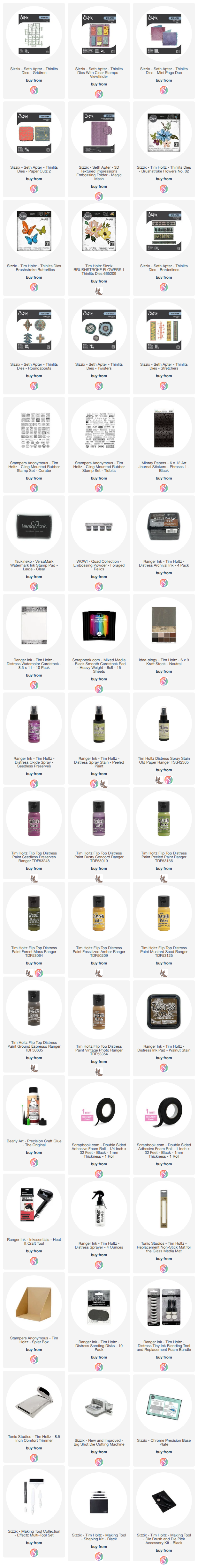
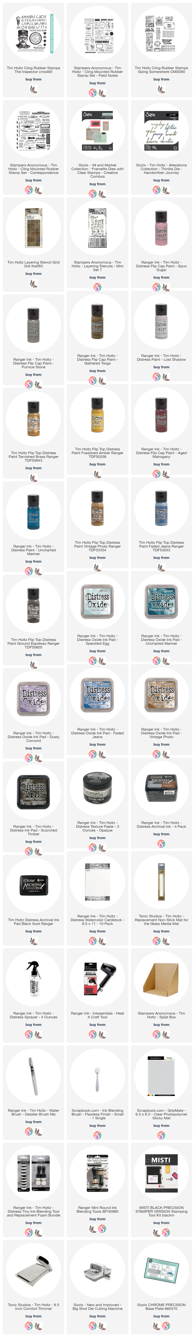
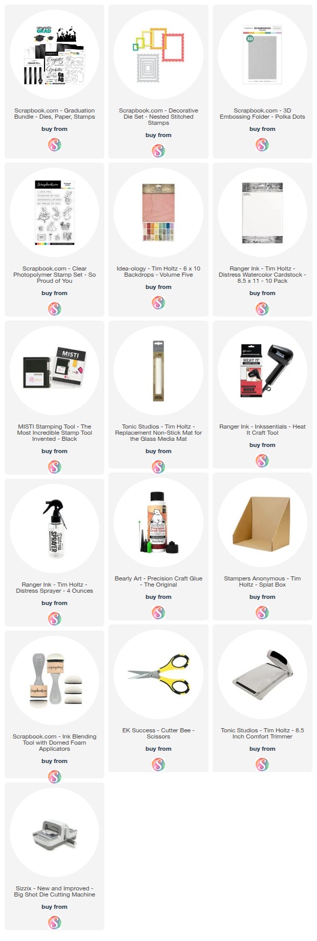
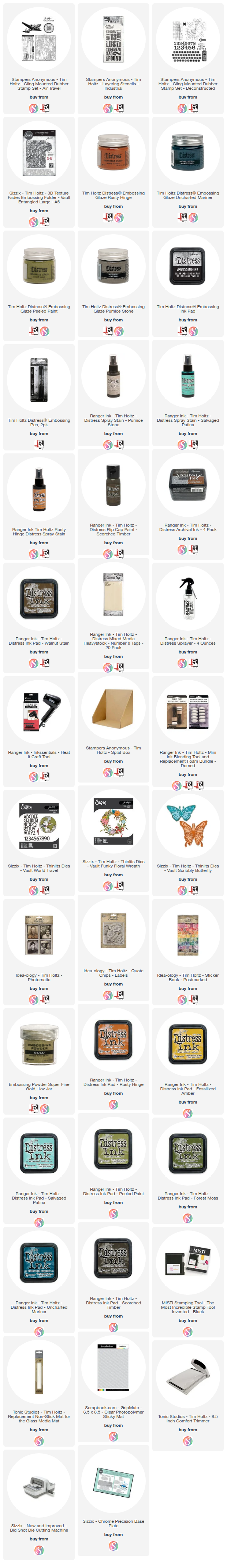
Supplies
Below you will find links to the supplies I used to create this card. When you shop through these links—whether you purchase that exact item or something else entirely—you're supporting me at no extra cost to you. The commission I receive helps me cover the costs of my blog and other expenses, and allows me to continue providing you with FREE inspiration and tutorials. If you want to learn more, you can see my full affiliate and product disclosure statement here: https://www.17turtles.com/p/affiliate-and-product-disclosure.html. Thank you so much for your love and support!