Scrapbook.com has done it again with another mini kit called
Hello Winter. This time it has a magical winter wonderland theme with heartfelt sentiments, adorable critters and patterns perfect for welcoming winter and the start of the new year! I personally love the color palette of the paper pad. And with its combination of solid and pattern papers, it couldn't be more easy to coordinate and create a cozy winter scene!
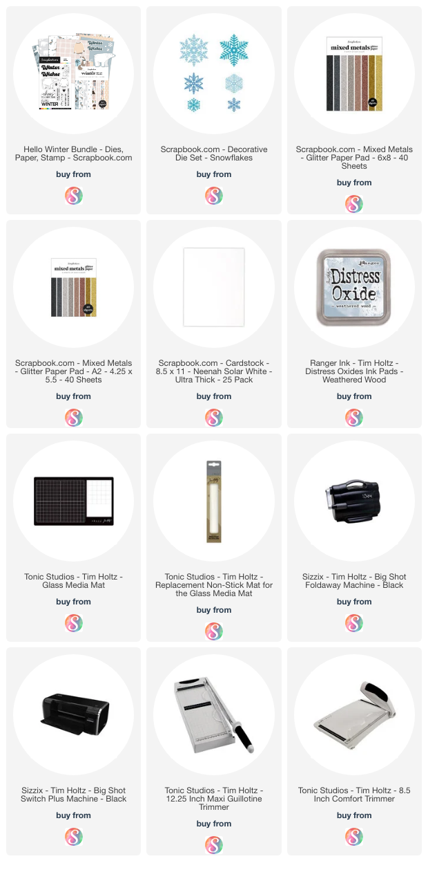
Here's a look at what is included in the
Hello Winter Kit. It included the Hello Winter Stamp Set (there is also a coordinating die set for those of you who don't like fussy cutting), the A2 Winter Patterned Paper Pad, and the Winter Wishes Die Set. Today it's available for a special bundle price and if you want more inspiration on how to use it, make sure to check out the
Scrapook.com Live Stream!
WINTER WISHES CARD
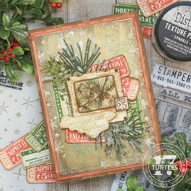
I used the kit to create both of the winter themed cards I'm sharing here today. On this first card, I used the Winter Paper Pad to die cut the layers of the polar bear from the Winter Wishes Die Set (included with the bundle) and to create the background and card front for my card.
I sanded the edges of each panel for a touch of distress and added some machine stitching around the edge of the plaid paper. I then layered on some die cut snowflakes cut from silver glitter paper using the Snowflakes Decorative Die Set and the small snowflake from the Winter Wishes Die Set. The sentiment is from the Hello Winter Stamp Set and I stamped it using Weathered Wood Distress Oxide Ink onto a piece of white cardstock.
WINTER WISHES CARD
On this second card, I used the same background papers and techniques. I then layered on some die cut snowflakes and festive greenery. The snowflakes are cut from silver glitter paper once again using the Snowflakes Decorative Die Set and the small snowflake from the Winter Wishes Die Set. The greenery was die cut from papers in the Winter Patterned Paper Pad using the Cozy Autumn Foliage Die Set. The sentiment is from the Winter Wishes Die Set and cut from papers in the Winter Paper Pad as well.
On both cards I used Scrapbook.com Artis Glue to adhere the die cuts. To add some dimension to the sentiment on this second card and the polar bear and small snowflakes on the second card, I used Scrapbook.com 1mm Double Sided Foam Adhesive. This is my new favorite foam adhesive! I love that it's more thin. You get a little bit of dimension (which I love) without all of the bulk!
I hope you enjoyed this winter wonderland of inspiration using the Scrapbook.om Hello Winter Mini Kit!
SUPPLIES
Below you can find the supplies I used to create these winter themed cards. When you shop through the links below, I receive a small commission from Scrapbook.com. These links are at no cost to you and the commission I receive helps me cover the costs of my blog and other expenses, and allows me to continue to provide you with FREE inspiration and tutorials. If you want to learn more about what an affiliate link is, you can see my full affiliate and product disclosure statement
here. Thank you so much for your love and support!