Hello my crafty friends! In this blog post, I'm sharing 3 more card ideas and techniques using the Scrapbook.com Gloss Pops of Color. These new Gloss Pops of Color have a beautiful shine to them and are a perfect accent to add to any card project.

Thinking Of You Card
Finished size: 4.25x5.5 inchesOn this first card, I was inspired by a card I made a couple of years ago. I came across it and was inspired to recreate it with some new products including the Scrapbook.com Pops of Color. To get started, I die cut some butterflies using the Tim Holtz Flutter Thinlits and Scrapbook.com Sprigs Dies from Distress Heavystock. I applied some Mint Tape to the backside of the butterfly bodies and the sprigs. I then applied Distress Oxide Ink in Salvaged Patina, Milled Lavender and Saltwater Taffy to the butterflies. If you don't want to ink the paper, you could also die cut them from colored cardstock.

Next, I did some heat embossing using the Tim Holtz Tapestry Stamp Set. I stamped it using clear embossing ink, sprinkled it with clear embossing powder and heat embossed it using a heat gun. Heat embossing was one of the first card making techniques I learned nearly 20 years ago and I still absolutely love watching the powder transform and become shiny! It's like a magic trick that never gets old!

For the background, I took a piece of Distress Watercolor and used the ink smooshing technique to add some color to it. I smooshed Old Paper and Vintage Photo Distress Ink Pads directly onto my craft mat, spritzed them with some water using my Distress Sprayer and then smooshed my paper into the ink. I used my heat tool to dry the paper and then smooshed the paper back onto my craft mat to pick up some of the remaining ink. I repeated this process until I was happy with the look of my paper.

For the sentiment, I used the Friendly Bouquet Stamp Set from Scrapbook.com with Versafine Pigment Ink in Onyx. I like to use this ink with clear stamps because it doesn't tend to stain them like Archival Ink will and the stamped image is still permanent.
When it came time to adding the other die cuts, I did quite a bit of futzing around with their placement. After I finally settled on the placement of the sprigs and butterflies I used a some double sided foam adhesive strips to adhere the butterflies to the one sprig and then tucked the other pieces behind and adhered them with Distress Collage Medium. I then adhered the sentiment using the foam adhesive strips. To finish off the card, I added a mat of colored cardstock using a piece of paper from the Scrapbook.com Floral Paper Pad.

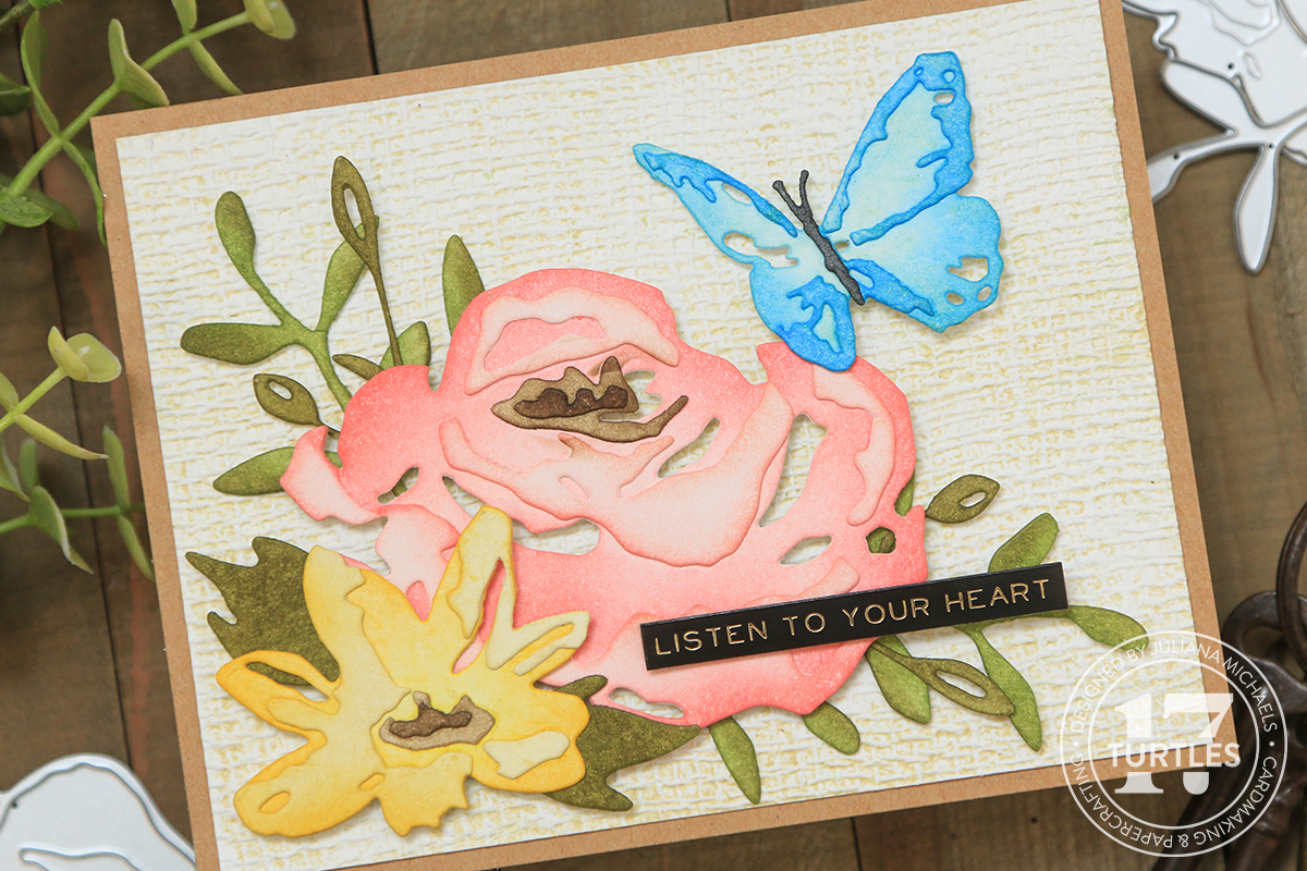
Hello Card
Finished Size: 4.25 x 5.5 inchesTo get started on this card, I adhered the Scrapbook.com Spring Florals Stencil to a piece of Distress Watercolor paper using Mint Tape. I then applied Distress Oxide Inks using a sponge dauber and a Detail Blending Tool. I used Salvaged Patina on the butterflies, Mowed Lawn on the leaves and Saltwater Taffy on the flowers. Except for a couple of flowers that I added Salvaged Patina too just to get a bit more of this color on the design. I tended to use the sponge dauber for the larger openings and the detail blender for the smaller spots where the sponge dauber was too big. I also like to apply the ink using a twisting motion as I find this gets the ink into the corners of the stencil a bit better.

Next, I went about adding dots of Pops of Color to the various images, using the the same technique as on the first card.
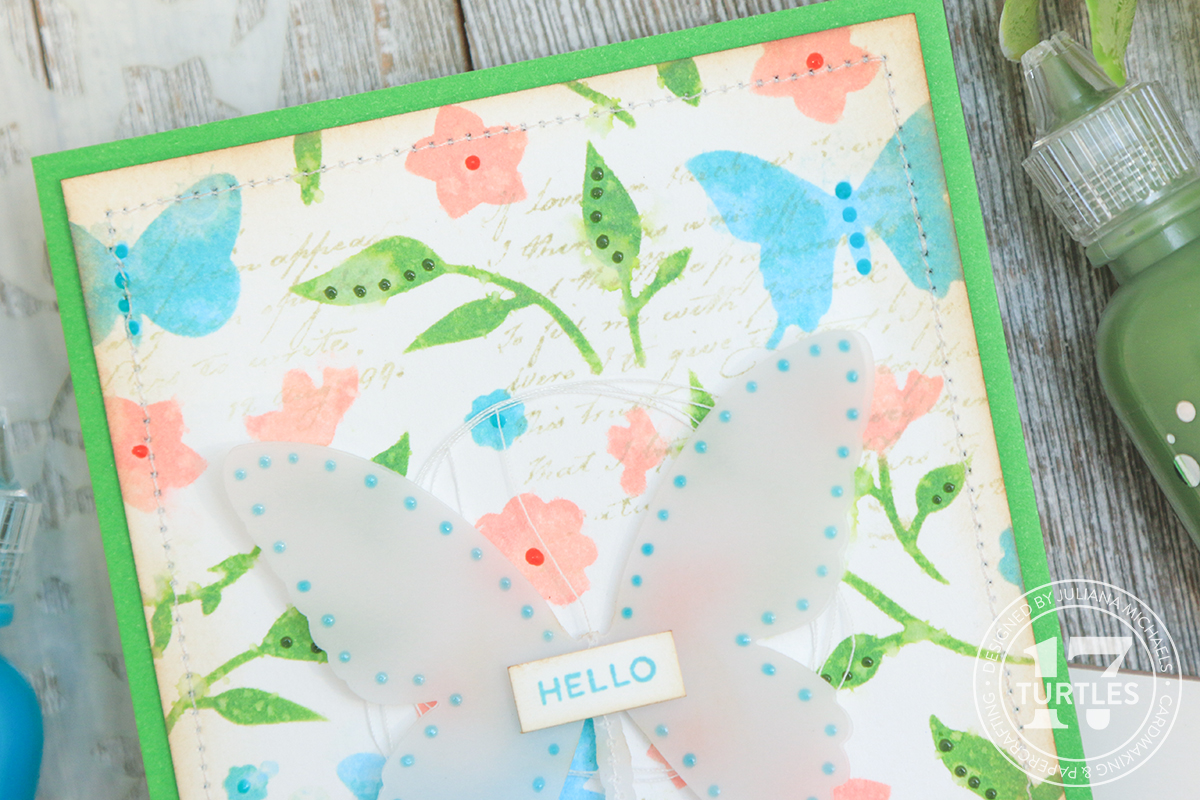
To add a little more texture, I machine stitched around the outside edge of the card panel. Next, I applied Vintage Photo Distress Ink to the edges of the card panel to grunge it up just a tiny bit. I also decided to add some stamping using the script image from the Tim Holtz Dearly Departed Stamp Set. I didn't want it to be a stark image, so I applied Old Paper Distress Ink to my craft mat and then picked up the ink with the stamp before stamping the image onto the paper.
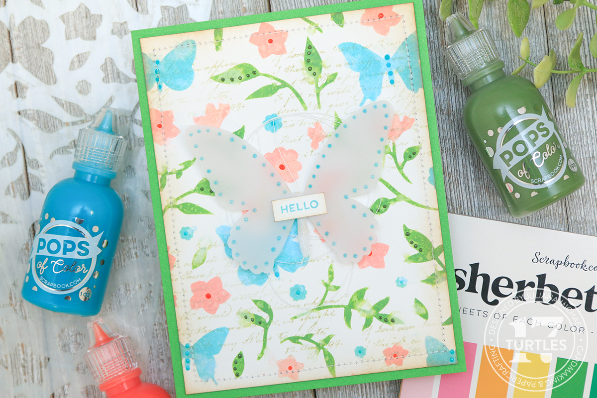
For the sentiment on this card, I used the same stamp set as the first card. This time I stamped it using Distress Oxide Ink in Salvaged Patina.
The mat for this card is a piece of green paper from the Scrapbook.com Sherbet Paper Pad adhered using Scrapbook.com Permanent Refillable Adhesive Roller. I then adhered it to the center of the butterfly using double sided foam adhesive.
At this point, I thought I was finished, but after setting the card to the side and looking at it later, I decided to add some Turquoise Waters Pops of Color to the vellum butterfly and a bit of white sewing thread behind it. I used the Scrapbook.com Permanent Refillable Adhesive Roller to tack it in place.

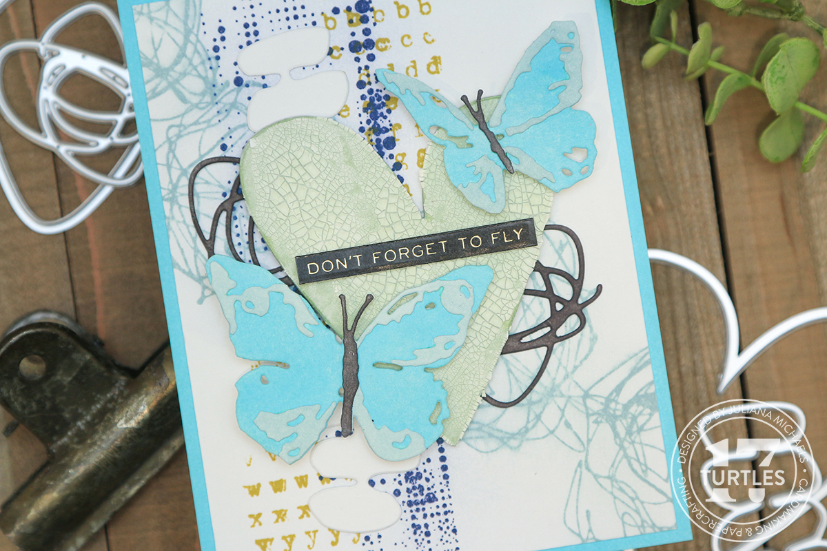
Dreamer Of Dreams Card
Finished Size: 4.25x5.5 inchesThis third and final card kind of goes off on it's own little tangent. I've been wanting to try mixing Pops of Color with Texture Paste Transparent Gloss to see if it would work with a stencil AND keep the shiny look of the Pops of Color. Spoiler alert...it works perfectly!!!
For this card, I used the Scrapbook.com Little Boxes Stencil and used a piece of Mint Tape to hold the stencil in place on a piece of Distress Watercolor paper. I then mixed some Turquoise Waters Pops Of Color and Transparent Gloss Paste together using my palette knife until it was thoroughly mixed together. I then applied it through the stencil using my palette knife, carefully removed the stencil to clean it and set the paper to the side to dry.
On a side note, I wanted to share that I think the Texture Paste Transparent Gloss is the same thing as the newly released Distress Texture Paste Translucent. So if you already have some of this, make sure to use it up first.

For the next part, I adhered a Scrapbook.com adhesive sheet to the back side of the lighter blue paper from the Sherbet Paper Pad. I used this to die cut some of the scribbly shapes from the Tim Holtz Abstract Faces Dies.
I then took the darker blue paper from the Sherbet Paper Pad and die cut a butterfly using the Tim Holtz Detailed Butterflies Dies.
Using a craft pick, I removed the liner from the adhesive and adhered the scribbly die cuts to the butterfly. I then took a pair of scissors and trimmed off the overhanging parts of the die cuts.


For a little more interest, I used the script stamp from the Tim Holtz Dearly Departed Stamp Set applying the same technique I used on the second card with Old Paper Distress Ink. And of course, I had to ink the edges of the card panel and the die cuts with Vintage Photo Distress Ink.


SUPPLIES