

DISTRESS INK SWATCHES
One way I like to create and store my swatches is in this 6x8 album from Scrapbook.com and their 2x2 square pockets page protectors are the perfect size for swatches. I simply swatch the ink onto a piece of Distress Watercolor paper and trim it down to fit on a square of white printer paper with the ink color printed on it.

Here you can see how Lumberjack Plaid fits in with the other reds in the palette. I've swatched both the Distress Ink and Distress Oxides as the inks are slightly different in color due to the nature of their properties. Since Distress Ink is more transparent and the Oxides are more opaque and they are both swatched onto white paper, I spritzed the Oxides with water and dabbed them dry to lift off some of the ink.


When creating these types of swatches I recommend using the products in ways that you typically use that product and on paper that you would use for that technique.


MERRY CHRISTMAS CARD | LUMBERJACK PLAID DISTRESS EMBOSSING GLAZE
After stamping the image, I inked the edges using a foam blending tool and Vintage Photo Distress Ink. I then use a heat tool to dry the ink and paper. I need it to be completely dry before the next step. You can also allow it to air dry if you aren't in a hurry.

Once the ink is dry I apply Distress Translucent Crackle Paste through the stencil using a palette knife. This paste will create a beautiful crackle effect as it dries and because it's translucent you can see through it! To get the crackle effect though, you must allow the paste to air dry. If you try to speed it up with a heat gun, it just doesn't seem to crackle at all. Also as you apply the paste, the thicker it is the larger the cracks and the thinner the smaller. However, the thicker application will also take longer to dry, so keep that in mind as well. The drying time will also vary depending on the temperature and humidity of where you live. Once you are finished applying the paste, wipe off any that is hanging over the edge and then make sure to wash your stencil immediately so the paste doesn't dry on the stencil.
Next, I add the Lumberjack Plaid Embossing Glaze. If you aren't familiar with Embossing Glaze it's similar to embossing powder, however it's biggest difference is that it's translucent, so you can see through it to whatever is underneath it. As for the similarities, it's also a powder that needs something to stick to and you must heat it with an embossing gun to melt the powder. That's why you want the ink to be dry before going onto this step. The powder can stick to any ink or even water and we just want it where we apply the paste.
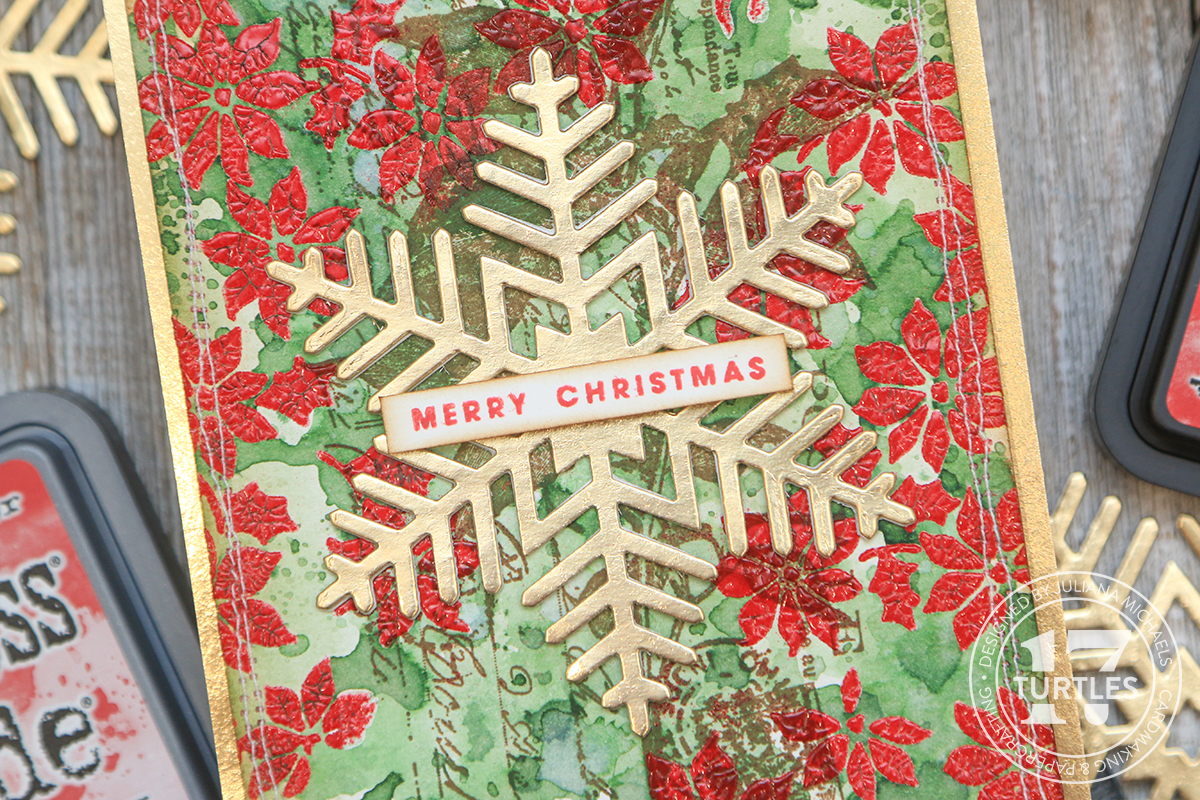
Once the paste is dry, I hold the paper with a pair of tweezers to protect my fingers and use a preheated embossing tool to melt the powder.
While you're melting the powder, make sure to keep the heat gun moving so you don't overheat the powder and once you see it turn shiny move on to the next section. If you overheat the powder, you run the risk of melting it so much that you can't see the crackle texture anymore.
To bring out the crackle effect, I added some color to the background using an ink smooshing technique. You can use Distress Spray Stain or Distress Ink. I used an ink pad and smooshed the pad onto my craft mat and spritzed it with some water. I then used my finger to mix it together and kind of smooth out the straight edges from the ink pad and then smooshed my paper into the ink. I then used my heat tool to dry the ink. You can repeat this process as desired. You can also spritz the paper with water to help the ink move around more and to add to the distressed look.
With the background completed, I added a snowflake cut from gold metallic paper using the Scrapbook.com Snowflakes Decorative Die Set. I added a sentiment from the Celebrate Expressions Stamp set from Scrapbook.com, which I stamped using the Lumberjack Plaid Distress Oxide ink and popped it up using double sided foam adhesive strips. The final touch was to add a bit of machine stitching before layering the background onto a piece of gold metallic cardstock.

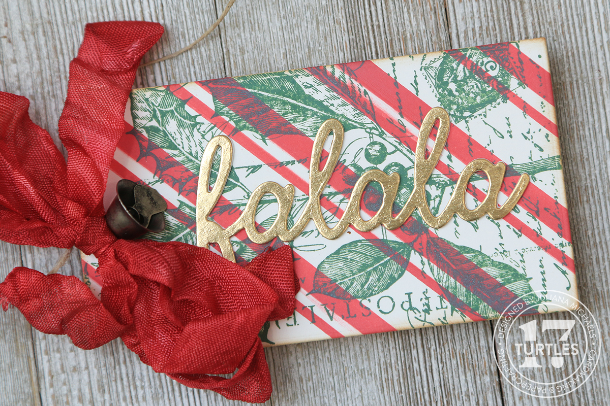
LUMBERJACK PLAID DISTRESS COLOR COMBOS
One last thing I wanted to share with you are some color combinations using Lumberjack Plaid. I used these combos to create a set of Christmas tags and I love how they show how Lumberjack Plaid can go from a traditional to a modern color scheme depending on which colors you mix with it.


• • • • • • • • • • • • • • • • • • • • • • • • •
Thanks so much for stopping by and I hope you enjoyed seeing the new Tim Holtz Distress Color Lumberjack Plaid in action with the and how to work with Distress Embossing Glaze.
SUPPLIES
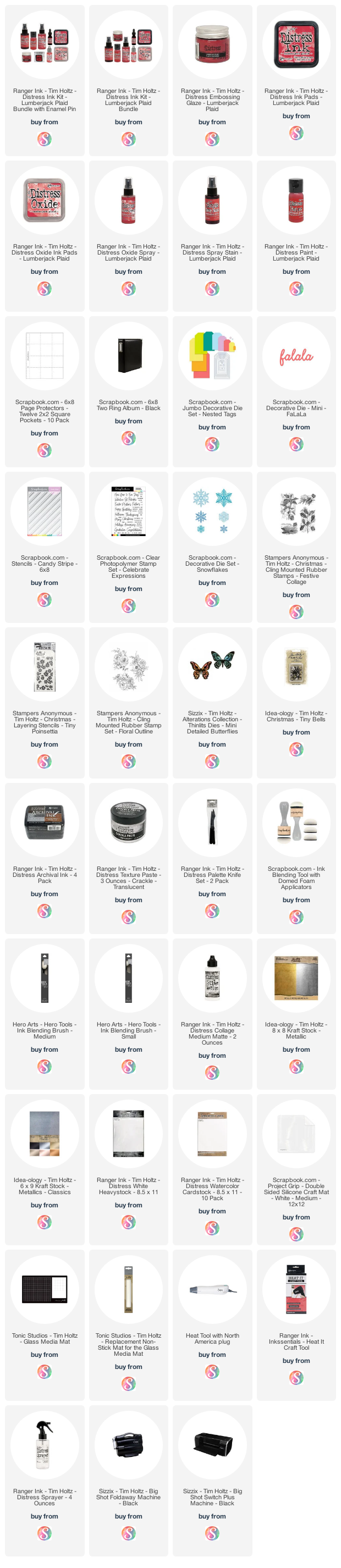
Below you can find the products I used to create this project along with compensated affiliate links to Scrapbook.com. These links are at absolutely no cost to you. When you shop through the links below, I receive a small commission from Scrapbook.com. These links are at absolutely no cost to you and the commission I receive helps me cover the costs of my blog and other expenses, which allows me to continue to provide you with FREE inspiration and tutorials. If you want to learn more about what an affiliate link is, you can see my full affiliate and product disclosure statement here. Thank you so much for your love and support!


No comments
Every time you smile at someone, it is an action of love, a gift to that person, a beautiful thing. ~Mother Teresa
HUGS!
JULIANA