Tim Holtz Perspective Moth Thinlits | Let Light Lead The Way Framed Panel

Hello friends! I'm back to shared another make I created for the Tim Holtz Sizzix Chapter 3 2021 Release. This project was featured during Tim's YouTube live in which he shared all the new dies and some amazing project inspiration from all of his makers! Today, I'm sharing with you this Let Light Lead the Way Framed Panel I made using the Perspective Moth.

Let Light Lead the Way Framed Panel by Juliana Michaels featuring the Tim Holtz Sizzix Chapter 3 Perspective Moth.

To create the background I began with a piece of Distress Watercolor trimmed to the size of the approximately 6 3/8" x 8 7/8 inches. I then used Distress Micro Glaze as a resist with the Honeycomb and Floral Layering Stencils. Once the glaze was dry, I ink blended a mix of Kitsch Flamingo, Crackling Campfire, Wild Honey and Festive Berries Distress Oxide to the entire piece of paper. I then added some spritzing with my Distress Sprayer and dabbed it dry.


The next step for the background was to add the stamping. I began with Archival Distress Ink in Black Soot, using the new full size ink pads. I'm so very happy these are now available as it makes applying ink to large stamp images SO much easier. Here I used the Dearly Departed and Field Note Stamp Sets.To add a little depth to the stamping I used the script stamp from Dearly Departed with Distress Oxide in Hickory Smoke and gently smudged the ink after I stamped the image.


With the background completed, I moved onto the Perspective Moth. I wanted it to be center stage so I die cut it from both black cardstock and white Distress Heavystock. Before I die cut it from the Heavystock, I adhered the Heavystock to a double sided adhesive sheet.  The die didn't cut all the way through which was perfect as I wanted the adhesive to help hold all the little negative pieces in place. I then inked the edges of the Heavystock with Vintage Photo Distress Ink before I adhered the black die cut on top.


Now for the Framed Panel. I dry brushed Black Soot Distress Paint over the entire frame with the intention of not getting the paint down into all of the cracks and crevices. I find the easiest way to avoid getting too much paint on the frame is to just apply small amounts of paint to your brush. If you do happen to get too much in one spot, you can always use some sandpaper to remove it.


The sentiment was inspired by a postcard by Brandi Kincaid. Her words always seem to be so fitting for the moment I'm in when I see them and the words "let the light lead the way" definitely spoke to me and all that I am going through right now. I typed this onto typing paper using my vintage typewriter, but you could also print it out using your computer and an old typewriter font. I then trimmed it to size, inked the edges and added a piece of double sided foam tape to adhere it to the die cut. To finish off the sentiment, I added a couple of Hardware Heads that I distressed by first painting with Distress Collage Medium and then Mushroom Alcohol Ink.


Thank you so much for your visit today and I hope you enjoyed learning how this framed panel came together using the Perspective Moth Thinlits by Tim Holtz.


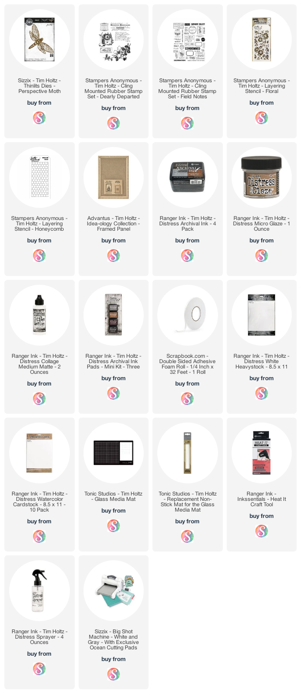
Supplies

As always, you can find the products I used to create this project along with compensated affiliate links to  Scrapbook.com. These links are at absolutely no extra cost to you. If you want to learn more about what an affiliate link is, you can see my full affiliate and product disclosure statement here.
 

Merry Christmas Card | Christmas In July at Scrapbook.com

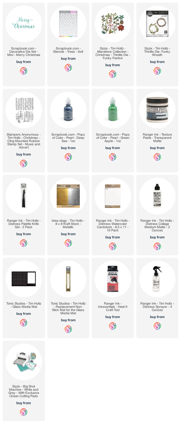
Merry Christmas in July friends! All month long Scrapbook.com has been celebrating Christmas in July with fabulous deals and freebies.  For those of you who might be new around here, I'm a huge lover of all things Christmas so of course I had to spend some creative time making a Christmas card to share with you using their Merry Christmas Die. This die is currently available as a freebie with any order from Scrapbook.com, so make sure you head over and grab yours while supplies last!

Merry Christmas Card by Juliana Michaels featuring Scrapbook.com Merry Christmas Die and Pops of Color

Now let's get on with the making. First I'll walk you through how I created the background for this card. I began with a piece of Distress Watercolor paper and Scrapbook.com Pops of Color in Green Apple and Deep Sea. I mixed just a dab of the blue into the green to darken the green just a bit and achieve a more evergreen color. I then mixed the Pops of Color mixture with a bit of Ranger Transparent Texture Paste. Using a palette knife I spread the mixture over the Scrapbook.com Trees Stencil. I have found that mixing the paste with the pops of color gives me a more even application of the color and still retains the shimmer of the Pops of Color. For more inspiration and examples of how to work with Scrapbook.com Pops of Color, you can check out my How To Use Scrapbook.com Pops of Color with Stencils blog post or 3 Ways to Use Scrapbook.com Pops of Color with Stencils blog post.


Once this was dry, I added some stamping using the music note stamp from the Tim Holtz Music and Advert Stamp Set and Vintage Photo Distress Ink. I also did a little ink smooshing with Old Paper Distress Ink and ink blended the edges with Vintage Photo Distress Ink to give the paper a more vintage look. I finished it off with some machine stitching around the edge. With the background finished and layered it onto a Distress Spray Stain background from my stash.

For the die cuts I used more Spray Stain backgrounds that were mostly combinations of reds, greens and browns to create the wreath, foliage and poinsettia. The dies I used are the Funky Wreaths and the Funky Festive Thinlits.


To complete the card, I used the Scrapbook.com Merry Christmas Die and cut if from Metallic Kraftstock and then adhered it to the card front.


I hope you enjoyed learning how this Merry Christmas Card came together using some fabulous products from Scrapbook.com.

Supplies

Below you can find the products I used to create this project along with compensated affiliate links to Scrapbook.com. These links are at absolutely no extra cost to you. If you want to learn more about what an affiliate link is, you can see my full affiliate and product disclosure statement here.

Tim Holtz 3D Impresslits Butterfly | Be Brave Slimline Card

One of my favorite products from the Tim Holtz Sizzix Chapter 3 Release has to be this 3D Impresslits Butterfly. I love all things butterfly and when I first saw it, I knew it was going to be the first thing I wanted to play with when the new products arrived.

I've also created a video tutorial for this card that shares I how created this Eroded Metal 3D Butterfly along with all the rest of the card details. Please remember, I am not a professional video maker, so this video is a bit rough around the edges, but it's something I hope to do more of in the future if I see that there is interest in it.

Be Brave Slimline Card by Juliana Michaels featuring Tim Holtz 3D Impresslits Butterfly

Eroded Metal 3D Butterfly | Be Brave Slimline Card

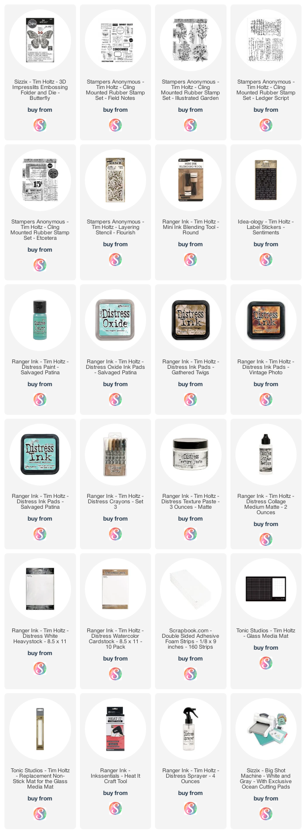
I began by die cutting/embossing several of the butterflies from Metallic Kraftstock. I then painted each one with Salvaged Patina Distress Paint and with the paint still wet, lightly dabbed off the excess paint with the goal of keeping the paint down in the cracks. Once the paint was dry, I applied a layer of Distress Crackle Paint Clear and allowed this layer to dry. I then began applied Distress Crayon in Walnut Stain working in small sections and rubbing it into the cracks and crevices. With the butterflies grungy and gorgeous I was ready to move onto the background.


I began with a piece of Distress Watercolor cut to 3.75 x 8.25 inches and a mix of stamps including the following: Field Notes, Ledger Script, and Illustrated Garden. I laid them out stamping different images with a mix of Distress Inks including Gathered Twigs and Vintage Photo.

The next step for creating the background was some ink smooshing with a bit of Old Paper Distress Ink which I then dried using my Heat Tool. I repeated this process until I was pleased with the coverage. I wanted more splatters, so I pulled out some Old Paper Distress Spray and used the tip of the spray tube to flick on some splatters and then dried it with my heat tool.

For a bit more distressing, I did some drippy sprays onto the paper using my Distress Sprayer and dabbed them dry with a paper towel.


To add some texture to the background, I grabbed the Flourish Layering Stencil and Distress Texture Paste and applied it through the stencil using a palette knife. Once the paste was dry, I decided I wanted to add a little color to it, so I placed the stencil over the textured areas and added color using Salvaged Patina Distress Paint. This part was a little tricky because the paint is thinner and tends to run under the stencil, I if you attempt this, I recommend that you make sure to lightly apply the paint. Also, if I had known I wanted the color beforehand, I think I would have added paint to the texture paste and applied it all in one application, but this worked well enough and helped me achieve the look I was going for.

Next, I did a bit of ink blending around the edges of the paper. I began with Vintage Photo Distress Ink and then added a bit of Salvaged Patina Distress Ink which wasn't showing up enough for me, so I grabbed the Salvaged Patina Distress Oxide. I then did some spritzing with the Distress Sprayer and added some more ink blending with Gathered Twigs Distress Ink.


I layered the panel onto a piece of custom colored Distress Heavystock trimmed to 4 x 8.5 inches that I colored using Salvaged Patina Distress Oxide. Because the center was going to be covered up, I only inked the outside edge.

For added dimension, I popped up the butterflies using double sided foam strips.

I then finished off the card by adding the Be Brave sticker from the Sentiments Label Stickers and popped it up with some foam tape as well.


I hope you enjoyed learning how this card came together using the gorgeous Tim Holtz 3D Impresslits Butterfly.

Supplies

Below you can find the products I mentioned in this post along with compensated affiliate links to Scrapbook.com. These links are at absolutely no extra cost to you. If you want to learn more about what an affiliate link is, you can see my full affiliate and product disclosure statement here.

Tim Holtz Stampers Anonymous Observations | Stenciled Backgrounds x 2

I'm back friends with a couple more cards to share with you from the Tim Holtz Stampers Anonymous release. My first card features another gel plate background using stencils! I warned you in my last post how much I had fallen in love with this technique! I used the super cool gentleman from the Tim Holtz Observations stamp set. This set is so much fun with this larger than life character and the inspirational sentiments that are also included.

Dreamer Card by Juliana Michaels featuring Tim Holtz Stampers Anonymous Observations Stamp Set

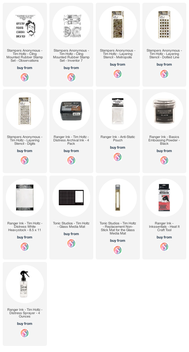
I began with the City Map Layering Stencil for the first layer of my background and used Salvaged Patina Distress Oxide and a first lift. In case you missed it, you can check out my Gel Plate Backgrounds post to learn more about this technique.


For the second layer I used the Dotted Lines Stencil with Fossilized Amber and a first lift. Finally, the third layer was done with the Halftone Stencil and Rusty Hinge.

Once the gel printing background was completed, I added some stamp details using the gears from the Observations stamp set using Pumice Stone Distress Ink.


The gentleman was stamped onto Distress Heavystock using Black Soot Archival Ink and then fussy cut before being adhered to the back panel. I then finished off the card with a sentiment from the Observations stamp set. The finished card is a modified slimline sized to 3.5 x 7.5 inches.


My second card once again features the City Map Layering Stencil. I  began with a piece of Distress Heavystock cut to 4x 5.25 inches. I then placed the stencil at an angle on the paper and ink blended Peacock Feathers, Picked Raspberry, Fossilized Amber and Crackling Campfire Distress Oxide Inks over the stencil.

Found Card by Juliana Michaels featuring Tim Holtz Stampers Anonymous Observations Stamp Set

For a little more interest, I placed the Digits Layering Stencil over the design and ink blended with Picked Raspberry and Peacock Feather Distress Oxide Ink.


With the stenciling completed, I stamped the gears from the Inventor 7 Stamp Set using Hickory Smoke Archival Ink. Before the next step, you want to make sure everything is dry, so either hit it with your heat tool or let it dry overnight. Once it's dry, wipe over the surface with an antistatic pouch, then stamp your gentleman from the Observations stamp set using a black pigment ink, sprinkle with black embossing powder and heat emboss.


To complete the card, add a sentiment from the set and layer the panel onto a piece of black cardstock.


Thank you for stopping by today! I hope you enjoyed this bit of inspiration using the Tim Holtz Stamper Anonymous Observations Stamp Set.

Supplies

Below you can find the products I mentioned in this post along with compensated affiliate links to Scrapbook.com. These links are at absolutely no extra cost to you. If you want to learn more about what an affiliate link is, you can see my full affiliate and product disclosure statement here.

Christmas Card Head Start 2021 | Watercolor Stamped Background

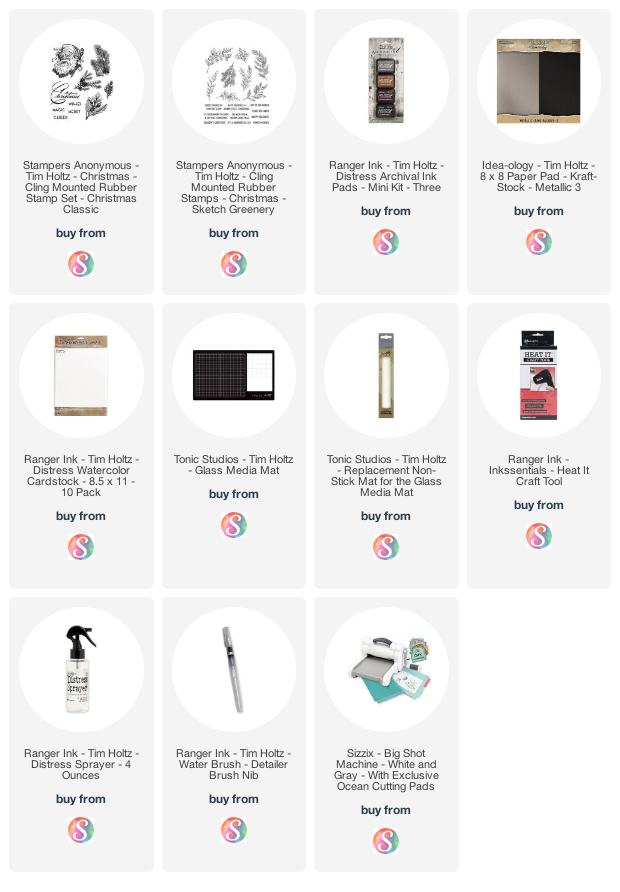
Hey friends! I'm back today to share more Christmas Card Head Start inspiration. Today's cards use an oldie but a goodie and also new to me stamp set called Christmas Classic by Tim Holtz. It was released several years ago, but since none of his stamp sets are ever retired you can alway find these older designs. Another thing I love about these stamp sets is because of the vintage design, they have a classic feel to them that never seems to go out of style. Of course, I wanted the focus to be on Santa, but I also had a lot of fun creating the watercolor stamped background. Keep reading for all the details on how each card came together.

Christmas Cards by Juliana Michaels featuring Tim Holtz Classic Christmas Stamp Set and Watercolor Stamped Backgrounds

To create the background on both cards I used the watercolor stamping technique. I began with a piece of Distress Watercolor paper cut to 4.25 x 5.5 inches. I then selected the various branches images from the set and picked a different Distress Ink color for each image. I used Iced Spruce, Peeled Paint, Bundled Sage and Old Paper.


With the inks selected I applied ink to the stamp and then lightly spritzed it with water using my Distress Sprayer. Seriously a very light spritz! After the spritz, I stamped the image onto the paper. I repeated this process for each different branch. I stamped the images and even slightly overlapped them as I moved around the edge of the paper.


I didn't bother with stamping in the middle since that spot was already saved for Santa! For a bit more distress, I splattered a bit of watered down Peeled Paint Distress Ink onto one panel and Iced Spruce on the other. To finish off the background, I trimmed it down to 4 x 5.25 inches and then inked the edges with Vintage Photo Distress Ink.


For each card, I stamped the Santa using Distress Ink in either Black Soot or Vintage Photo Archival Ink onto Distress Watercolor. I used a water brush to watercolored each image using Peeled Paint, Iced Spruce, Aged Mahogany. For the face I used Antique Linen and then added touches of Spun Sugar. I then added Hickory Smoke to the shadow areas on the beard, eyebrows and hat trim.

Merry Christmas Card by Juliana Michaels featuring Tim Holtz Classic Christmas Stamp Set and Watercolor Stamped Backgrounds

On this first card, I used the Stacked Postage Thinlits to cut out Santa after I had watercolored the image. Before I adhered it to the card front I layered it onto a piece of metallic Kraftstock.


The sentiment is from the Sketch Greenery Stamp Set. To finish off the card I added some gold sequins from my stash.


On this second card, I fussy cut Santa and lightly inked the edges with Vintage Photo Distress Ink.

It's A Wonderful Life Christmas Card by Juliana Michaels featuring Tim Holtz Classic Christmas Stamp Set and Watercolor Stamped Backgrounds

Next, I adhered the image to a die cut stitched oval cut from Metallic Kraftstock and then layered that onto one cut from vellum.


Once again the sentiment is from the Sketch Greenery Stamp Set and I finished it off with some gold sequins.


Thanks for stopping by and I hope you enjoyed another batch of Christmas Card inspiration to help you get a head start on your Christmas cards for this year!

Supplies

Below you can find the products I used to create this project along with compensated affiliate links to Scrapbook.com. These links are at absolutely no extra cost to you. If you want to learn more about what an affiliate link is, you can see my full affiliate and product disclosure statement here.

Subscribe