
Hello friends! Today I'm back to share with you 3 Ways to use Scrapbook.com Pops of Color with Stencils. I've combined the Pops of Color with a variety of other mediums to create a set of handmade notecards. I love the idea stretching my supplies in new and unexpected ways. By mixing these various products you can create your own custom backgrounds with a rainbow of colors and textures that will suit your particular style or the theme of your project.

1. Pops of Color + Ranger Opaque Texture Paste
For this first card, I combined Lemon Chiffon and Orange Sherbet Pops of Color with Opaque Texture Paste to create a beautiful golden yellow color. Opaque Texture Paste is what you would expect. It looks white in the jar and it dries white. So when adding the Pops of Color, you will want to add quite a bit to get this vibrant color however, if you prefer a lighter color feel free to use less. It's up to you and the look you are going for!

Once you have the Pops of Color and Texture Paste mixed, use a palette knife to spread the mix over your stencil. I recommend using Mint Tape to help hold your stencil in place when applying the medium and if you are working on the Scrapbook.com Silicone Mat your paper won't slide around as you apply the mixture.

This mixture of Pops of Color + Opaque Texture Paste provide a wonderful smooth coverage. The only downside to this combination is that you lose the shiny pearlescent finish of the Pops of Color.

2. Pops of Color + Therm O Web Transfer Gel Duo
On this second card I have combined Bubblegum Pops of Color with Therm O Web Transfer Gel Duo to create a gorgeous shimmery background. This gel is white, but it dries clear, which makes it the perfect product to mix in and maintain the beautiful pearlescent finish of the Pops of Color.

I shared a set of cards using this technique before and in my opinion this combination gives you the best results if you are looking for a shiny, pearlescent look on your project.
To apply this mixture you will use the same process as before of applying it to your paper using a palette knife. For this card, I covered the entire panel with the mixture.

3. Pops of Color + Tim Holtz Distress Grit Paste
This final technique combines Pops of Color with Tim Holtz Distress Grit Paste to create a wonderfully textured finish. I made three separate mixtures, one for each color I used: Seafoam, Ocean Waves and Deep Sea. I then applied each of the colors to different areas of the stencil to create a fun, yet colorful background.

This paste is white and dries white, so again you'll want to make sure you mix in enough color to get the look you are going for with your design. As with the Texture Paste, this product also removes the pearlescent finish, but on the flip side, it provides a fabulous amount of texture.

As before, you will apply this mixture to your paper using a palette knife.

Here are some additional tips to keep in mind if you plan on trying any of these techniques:
1. I recommend using a heavy weight paper that can handle moisture, such as Distress White Heavystock or Distress Watercolor Paper.
2. With each of the techniques I'm sharing, I highly recommend that you immediately wash your stencil with soap and water to prevent the mixture from drying on your stencil.
3. Make sure to make time for the stenciled design to dry. I actually allowed mine to dry overnight. I did not attempt to speed up the drying process with a heat tool. However, if you are curious about this, you could certainly give it a try and see what happens.
4. I don't have Ranger Transparent Texture Paste, but it's on my wish list and as soon as I get it, I'm definitely going to take it for a test drive and see how it compares to these other combinations. If you have other mediums in your stash, I highly recommend playing around and seeing what works for you. You never know when you might find that perfect combination!

I hope you enjoyed learning 3 Ways to Use Scrapbook.com Pops of Color with Stencils. I don't know about you, but I absolutely love stretching my supplies and finding new and unexpected ways to use them.
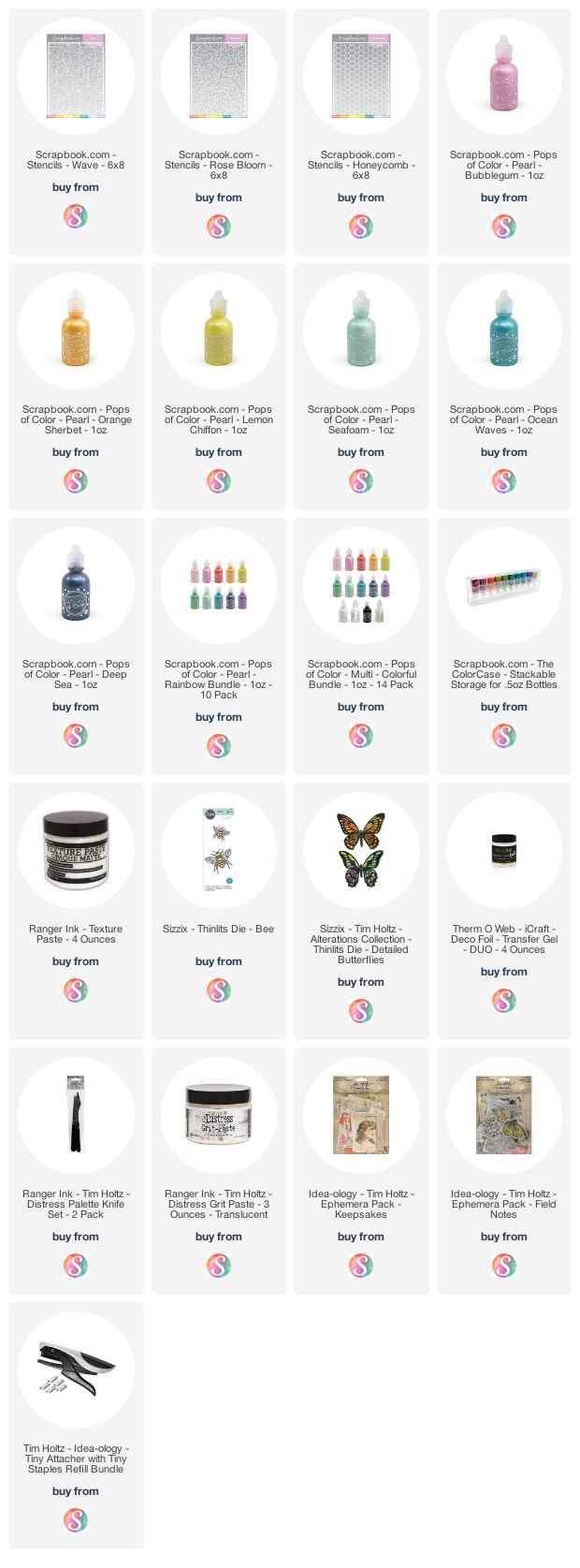
Supplies
Below you can find the products I used to create this project along with compensated affiliate links to Scrapbook.com. These links are at absolutely no extra cost to you. If you want to learn more about what an affiliate link is, you can see my full affiliate and product disclosure statement here.


This is fantastic, Juliana! Beautiful work.
ReplyDeleteThank you so much for these great ideas. I have previously used acrylic paint with texture paste, but not the other mediums. It is good to know that when combined with the clear medium the iridescence remains. You have inspired me to experiment more. I love how you combine the old and new in your compositions. Have a wonderful day. Linda
ReplyDeleteThank you! I’m hoping to try this technique with Transparent Gloss Medium this weekend and I will be sharing my results as soon as I can!
Delete