4 Ways to Use Scrapbook.com Nested Slimline Rectangle Dies

I don't know about you, but I'm loving the whole slimline card craze! I'm on board with this new size and larger space to create and play. Today, I'm sharing some slimline card inspiration with 4 Ways to Use Scrapbook.com Nested Slimline Rectangle Dies. I've combined these dies with the beautiful Pinkfresh Studio Heartfelt Thanks Stamp and Stencils to give you lots of fun options and inspiration. I will warn you though, this is a bit of a long post, with lots of images, but I hope you find all the details helpful.

4 Ways to Use Scrapbook.com Nested Slimline Rectangle Dies by Juliana Michaels

1. Layered Dimensional Frame


For this first idea, I began by creating a card front using the Heartfelt Thanks Layering Stencils and Distress Ink.

Flowers: Dried Marigold, Carved Pumpkin and Crackling Campfire
Leaves: Lucky Clover and Pine Needles

On all of these cards, I cut a piece of cardstock to the exact size of the stencil (4x9 inches) to make lining up each layer of the stencil easier for me. The stencils do have guides etched into them to make this easier, but my old lady eyes I have a hard time seeing them well, so this technique makes it so much easier for me.

Once the stenciling was completed, I took the largest Nested Slimline Rectangle Die and cut out the design to create my card front which is 3.5 x 8.5 inches.


I then took the third largest rectangle, centered it on the panel, used Mint Tape to hold it in place and die cut the panel.


I repeated this process using the fifth largest die.


Once the die cutting was completed, I had three separate pieces.


Next, I cut a piece of typing paper to 3.5 x 8.5 inches to use as a base for adhering all of the layers together. You could skip this step and adhere the layers directly to your card base if so desired.

I began by adhering the outside frame to my base. I used Scrapbook.com 1/4 Inch Double Sided Foam Adhesive to adhere the middle piece to the card base to add some dimension.


Finally, I adhered the center layer to the card base. Here you can see the dimension created by using the foam adhesive.


With all of the layers adhered, it was time to embellish the card. I added some die cut leaves using the Pinkfresh Studio Leafy Branch Die, which I cut from white cardstock, gold metallic Kraftstock and vellum. To finish the card I die cut a label shape from white cardstock and added the sentiment from the Heartfelt Thanks Stamp Set.


2. Alternating Dimensional Layers

I explain how I created this card and the third card in more detail below.


3. Reverse Alternating Dimensional Layers


For the second and third card, I first stenciled a card front using the Heartfelt Thanks Layering Stencil using Distress Ink. I used the same technique for positioning the stencil on this panel as I did the first one and die cut it using the largest Nested Rectangle Die.

Flowers: Tumbled Glass, Salvaged Patina and Peacock Feathers
Leaves: Lucky Clover and Pine Needles


I then created another card front just stamping the image from the Heartfelt Thanks Stamp Set in black ink. Since I knew I was going to cut and alternate layering these pieces I wanted to make sure the stenciled image and the stamped image were in the same places on the paper. To ensure that this happened, I placed the stenciled panel in my MISTI, lined up the stamp with the image and closed the MISTI to pick it up for stamping.


With everything all lined up, I placed a piece of white cardstock cut to 3.5 x 8.5 inches in the MISTI and stamped the image.


Here are the two panels...one stenciled and one stamped.


Next I took the third, fifth and seventh largest dies and evenly spaced them on the stamped panel. I used Mint Tape to hold them in place as I ran them through my die cutting machine.


I repeated the die cutting on the stenciled panel. If you carefully lift up the dies from the first cutting, the tape will hold them together and you can position them to get the same cut on the second panel.


Here are all of the layers ready to mix and match to create the alternating layers.


From here I selected alternating layers to create each card and adhered them to a piece of typing paper as I did on the first card. I also used Double Sided Foam Adhesive to pop up the second frame and center piece to a bit of dimension.


Once all the layers were adhered, it was time to add the sentiment and embellishments.


To embellish each card, I die cut the word thanks from either gold metallic Kraftstock or black cardstock using the Scrapbook.com Classic Type Alphabet Dies. I then added the word "you" in either black or gold from the Pinkfresh Studio Exclusive Thin Words Everyday Dies. (You could also use the Pinkfresh Studio Exclusive Thank You Die as well.)


To finish off each card, I added some more of the beautiful die cut leaves I used on the the first card.


4. Shaker Card


To begin this card I created the stenciled panel using Distress Ink as I did for the previous cards.

Flowers: Shaded Lilac, Wilted Violet and Dusty Concord
Leaves: Lucky Clover and Pine Needles

Next, I followed the same die cutting steps I used on the first card to create a frame. This frame I used to create the shaker box.


Once the frame was die cut, I adhered strips of Scrapbook.com 1/4 inch adhesive tape to the back side. 


I then cut a piece of acetate to size and adhered it to the back side of the frame.


Next, I added strips of Scrapbook.com 1/4 inch Double Sided Foam Adhesive.


With the shaker box completed, I began adhering the layers to a piece of typing paper as I did in the first card.


However, before adding the shaker bits or the shaker box layer, I adhered a couple of the leaves die cut from white cardstock so they would be inside the shaker box.

Next, I added shaker bits from the Lavender Dust Sizzix Sequins and Beads on top of the center panel. I then peeled off the liner from the foam strips and adhered the shaker box in place.


To finish the card, I added some leaves die cut from gold metallic Kraftstock and a sentiment from the Heartfelt Thanks Stamp Set that I heat embossed with white embossing powder on black cardstock.


Well, if you made it through all that I hope you enjoyed all the details I shared. I know this was a long post, but I wanted to make sure that I shared all the the little tips and tricks I used to create each card using the Nested Slimline Rectangle Dies.

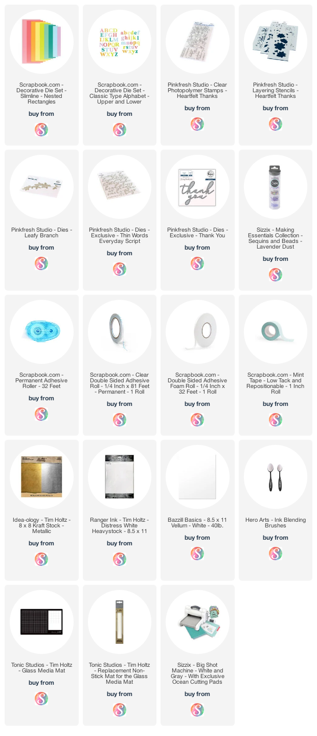
Supplies

Below you can find the products I mentioned in this post along with compensated affiliate links to  Scrapbook.com. These links are at absolutely no extra cost to you. If you want to learn more about what an affiliate link is, you can see my full affiliate and product disclosure statement here.
Christmas Card Head Start 2021 | Christmas Greetings Slimline Card

Long time no post huh?! Well, let's just say life threw a curve ball at me and life as I know it has changed. I'm not quite sure I'm ready to share the details just yet, but I'll take all the prayers and positive vibes you can spare as I begin this next chapter in my life. Thankfully, I still have my creativity and love of paper crafting to provide me with a distraction and at times the therapy I need to take each day as it comes. With that said, I've actually been creating quite a bit with some soon to be released new products from Tim Holtz for both Sizzix and Stampers Anonymous that I know you all are going to love! 

Today I'm back to share another card I created for my Christmas Card Head Start 2021. This is a slimline card and I was inspired by a multitude of makers including Paula Cheney, Emma Williams and Anita Houston and the cards they created using the Poinsettia Stamp Set for the Stampers Anonymous Christmas 2021 release. If you aren't familiar with the slimline size it's typically 3.5 x 8.5 inches and it fits in a standard size number 10 envelope (also known as a business size envelope, is 4.125 x 9.5 inches.


This card started with the background. I stamped the beautiful poinsettia onto Distress Watercolor Cardstock three times with embossing ink and heat embossed it with gold embossing powder. I created a mask to allow me to stamp the images and overlap them to create an illusion of depth. 


This step ended up to not be necessary with how the final design turned out, but it was the first time I had actually created a mask and it was a fun learning process. Plus, I can reuse the mask on a future project.


With the embossing completed, I added some stamping using Vintage Photo Archival Ink and a script stamp. I choose to use this type of ink because I knew I was going to do some watercoloring and I didn't want the stamping to smear.


Next, I did a little controlled ink smooshing using Old Paper Distress Ink. By controlled, I mean that I smooshed the open areas around the flowers into the ink and if any got where I didn't want it, I dabbed it up immediately using a clean paper towel.


Once the ink was dry, I began watercoloring the poinsettia using a water brush and Distress Ink in Festive Berries and Aged Mahogany.


I then added a few splatters of Brushed Corduroy for a bit more of a distressed look. Once dry, I die cut the background it using the Scrapbook.com Nested Tickets Slimline Dies, inked the edged with Brushed Corduroy Distress Ink and layered it onto a piece of cardstock from the Scrapbook.com Boho Slimline Paper Pad.


For the sentiment, I stamped Christmas Greetings onto a piece of Distress Watercolor Cardstock using Vintage Photo Distress Ink. I ink smooshed this piece into some Old Paper Distress Ink and then die cut it using the Stacked Postage Thinlits. I inked the edged with Brushed Corduroy and then layered it onto a piece of scrap pattern paper. I then added some more layers of paper that I die cut using Ticket Booth Framelits. I then finished it off with some coordinating enamel dots.


Thanks for your visit today! Have you started on your Christmas cards yet? If not, maybe this will inspire you to jump in and begin on your Christmas Card Head Start for 2021!

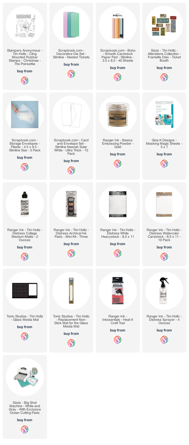
Supplies

Below you can find the products I used to create this project along with compensated affiliate links to Scrapbook.com. These links are at absolutely no extra cost to you. If you want to learn more about what an affiliate link is, you can see my full affiliate and product disclosure statement here.

One Stamp Set Five Ways | Spring Sprigs

Hey crafty friends! Today I'm sharing a One Stamp Set Five Ways blog post. This is something a little different for me, but when I started playing around with the Scrapbook.com Spring Sprigs Stamp Set I just couldn't stop. I came up with so many ideas and I wanted to share all of them with you. I mostly used the Spring Sprigs Stamp Set to create backgrounds, but each technique is totally different. I also mixed in some die cuts for a bit of texture and added interest.

One Stamp Set Five Ways Cards by Juliana Michaels featuring Scrapbook.com Spring Sprigs Stamp Set

Distress Ink Stamp and Smoosh Technique


My first card features a favorite technique of mine...Distress Ink Stamp and Smoosh.

Happy Birthday Card by Juliana Michaels featuring Scrapbook.com Spring Sprigs Stamp Set

Before we get to this technique though, I began this card by randomly stamping the images from the Spring Sprigs Stamp Set onto a piece of Distress White Heavystock using embossing ink. I sprinkled them with white embossing powder and then heat embossed it using a heat gun. I like to use my stamp positioning tool when creating "random" stamped backgrounds. I play around with their position until the space is filled, stamp that section, heat emboss it and then repeat to fill up the rest of the card front.


Once the entire background was stamped and heat embossed, I then used the Distress Ink Stamp and Smoosh technique. For this technique, you stamp your ink pad onto a craft mat, spritz it with water and then smoosh your paper into the ink. Dry the paper with your heat tool and repeat the smooshing and drying until you are happy with the results. On this card I used Salvaged Patina Distress Ink. I then created a little interest by adding some ink splatters using Black Soot Distress Ink. To do this, I just unscrew the lid and then flick the end of the tube to create the splatters.


With the background completed, I trimmed the card down to 4 x 5.25 inches and adhered it to a piece of cardstock from the Scrapbook.com Boho A2 Paper Pad. Next, I added a couple of plain die cuts using the Tim Holtz Wildflower Stems 1 and Wildflower Stem 2.


For the sentiment, I die cut the Happy die from the Scrapbook.com Birthday Celebration Sentiments Dies. I wanted the sentiment to have some dimension, so I adhered the paper to a strip of 2" Double Sided Foam Adhesive and then die cut the word from it. It's a little tricky removing the die from the paper, but it's so much easier in my opinion than trying to glue layers of die cuts together to get the same look. To finish off the card, I  added the word "birthday" which I typed out, trimmed to size and adhered with strips of double sided foam adhesive.


Distress Oxide Stamp and Smudge Technique


This second card uses one of my favorite techniques - Distress Oxide Stamp and Smudge.

Thank You Card by Juliana Michaels featuring Scrapbook.com Spring Sprigs Stamp Set

It's such a fun and easy technique. You simply stamp each image using Distress Oxide Ink. After you stamp the image you use a paper towel or soft cloth to smudge the ink while it is still wet. On this card I used Distress Oxide Ink in Rustic Wilderness, Bundled Sage, Salvaged Patina and Peacock Feathers. To create this background, I randomly stamped the images onto the paper to create my own custom background. I then inked the edges with a bit of Salvaged Patina Distress Ink.


To finish off the card, I added a die cut sentiment from the Scrapbook.com Thank You Sentiments Dies and used the same technique I used on the first card.


Circular Stamping Technique


My third card only uses one stamp from the set, but I love the effect. All I did was stamp the image in a circular pattern from the center of the card front. 

Hugs Card by Juliana Michaels featuring Scrapbook.com Spring Sprigs Stamp Set

I used a stamp block to stamp the image but still placed my card on my stamp positioning tool to help hold the paper in place and to utilize the foam padding for a nice crisp image. I choose to use a stamp block because it was easier than having to reposition the stamp on the stamp platform each time.


With the background completed, I die cut it using this beautiful Diagonal Stitched Rectangles die from Pinkfresh Studio. I then layered on a die cut butterfly created using the Tim Holtz Butterflies Thinlits. For the sentiment I used the same technique with the paper and double sided foam adhesive with a word die from the Pinkfresh Studio Exclusive Thin Words Everyday Script Dies.


Wreath Stamping Technique
Tone on Tone Background Technique


On this 4th and final card, I used the Spring Sprig Stamps in two ways. I created a wreath and a tone on tone background. To make the wreath, I choose three stamps to use and I trimmed a piece of cardstock to a square. I then placed my stamp near the top of my paper and used my stamp positioning tool to stamp the image. I then rotated the paper a quarter turn and stamped the image again. This way the square paper is important. As you turn the paper, the stamp stays in the same place and creates a circle.
Hello Wreath Card by Juliana Michaels featuring Scrapbook.com Spring Sprigs Stamp Set

I repeated this rotating and stamping for a total of four times which created my first part of the wreath. I repeated this stamping and rotating for the second stamp and then the third stamp. I used Black Soot Archival Ink and then water colored the image using a water brush and Distress Ink in Salvaged Patina, Bundles Sage and Rustic Wilderness. Once the coloring was completed, I used a pair of scissors to fussy cut the wreath.


For the tone on tone background, I once again created a background by laying out my stamps using my stamp positioning tool. I then stamped them with Salvaged Patina Distress Ink onto a slightly lighter color of cardstock from the Scrapbook.com Cools A2 Paper Pad.


To finish off the card, I added a die cut sentiment using the Scrapbook.com Thank You Sentiments Dies. I die cut it from white cardstock adhered to double sided foam adhesive, like I did on the previous cards. However, I also die cut it from black cardstock and slightly offset it to achieve a shadowed effect.


I hope you all enjoyed my One Stamp Set 5 Ways blog post today. It was definitely a fun challenge for me to use one set multiple times and with a slightly different technique each time. By using similar colors throughout though, it made the process rather easy and enjoyable.


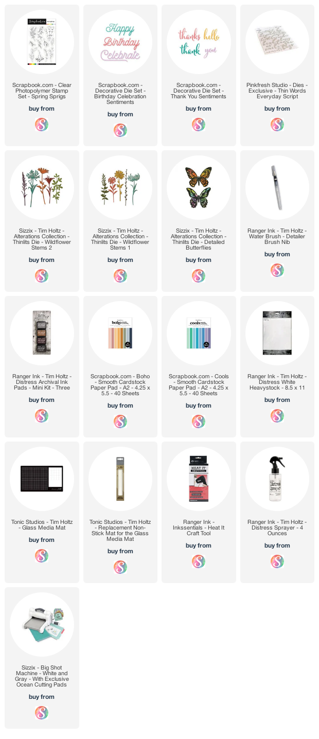
Supplies

Below you can find the products I used to create this project along with compensated affiliate links to Scrapbook.com. These links are at absolutely no extra cost to you. If you want to learn more about what an affiliate link is, you can see my full affiliate and product disclosure statement here

3 Ways to Use Scrapbook.com Pops of Color with Stencils

Hello friends! Today I'm back to share with you 3 Ways to use Scrapbook.com Pops of Color with Stencils. I've combined the Pops of Color with a variety of other mediums to create a set of handmade notecards. I love the idea stretching my supplies in new and unexpected ways. By mixing these various products you can create your own custom backgrounds with a rainbow of colors and textures that will suit your particular style or the theme of your project.

3 Ways to Use Scrapbook.com Pops of Color with Stencils Notecards by Juliana Michaels

1. Pops of Color + Ranger Opaque Texture Paste


For this first card, I combined Lemon Chiffon and Orange Sherbet Pops of Color with Opaque Texture Paste to create a beautiful golden yellow color. Opaque Texture Paste is what you would expect. It looks white in the jar and it dries white. So when adding the Pops of Color, you will want to add quite a bit to get this vibrant color however,  if you prefer a lighter color feel free to use less. It's up to you and the look you are going for!


Once you have the Pops of Color and Texture Paste mixed, use a palette knife to spread the mix over your stencil. I recommend using Mint Tape to help hold your stencil in place when applying the medium and if you are working on the Scrapbook.com Silicone Mat your paper won't slide around as you apply the mixture.


This mixture of Pops of Color + Opaque Texture Paste provide a wonderful smooth coverage. The only downside to this combination is that you lose the shiny pearlescent finish of the Pops of Color.


2. Pops of Color + Therm O Web Transfer Gel Duo


On this second card I have combined Bubblegum Pops of Color with Therm O Web Transfer Gel Duo to create a gorgeous shimmery background. This gel is white, but it dries clear, which makes it the perfect product to mix in and maintain the beautiful pearlescent finish of the Pops of Color. 


shared a set of cards using this technique before and in my opinion this combination gives you the best results if you are looking for a shiny, pearlescent look on your project.

To apply this mixture you will use the same process as before of applying it to your paper using a palette knife. For this card, I covered the entire panel with the mixture.


3. Pops of Color + Tim Holtz Distress Grit Paste


This final technique combines Pops of Color with Tim Holtz Distress Grit Paste to create a wonderfully textured finish. I made three separate mixtures, one for each color I used: Seafoam, Ocean Waves and Deep Sea. I then applied each of the colors to different areas of the stencil to create a fun, yet colorful background.


This paste is white and dries white, so again you'll want to make sure you mix in enough color to get the look you are going for with your design. As with the Texture Paste, this product also removes the pearlescent finish, but on the flip side, it provides a fabulous amount of texture.


As before, you will apply this mixture to your paper using a palette knife.


Here are some additional tips to keep in mind if you plan on trying any of these techniques:
1. I recommend using a heavy weight paper that can handle moisture, such as Distress White Heavystock or Distress Watercolor Paper.
2. With each of the techniques I'm sharing, I highly recommend that you immediately wash your stencil with soap and water to prevent the mixture from drying on your stencil.
3. Make sure to make time for the stenciled design to dry. I actually allowed mine to dry overnight. I did not attempt to speed up the drying process with a heat tool. However, if you are curious about this, you could certainly give it a try and see what happens.
4. I don't have Ranger Transparent Texture Paste,  but it's on my wish list and as soon as I get it, I'm definitely going to take it for a test drive and see how it compares to these other combinations. If you have other mediums in your stash, I highly recommend playing around and seeing what works for you. You never know when you might find that perfect combination!


I hope you enjoyed learning 3 Ways to Use Scrapbook.com Pops of Color with Stencils. I don't know about you, but I absolutely love stretching my supplies and finding new and unexpected ways to use them.

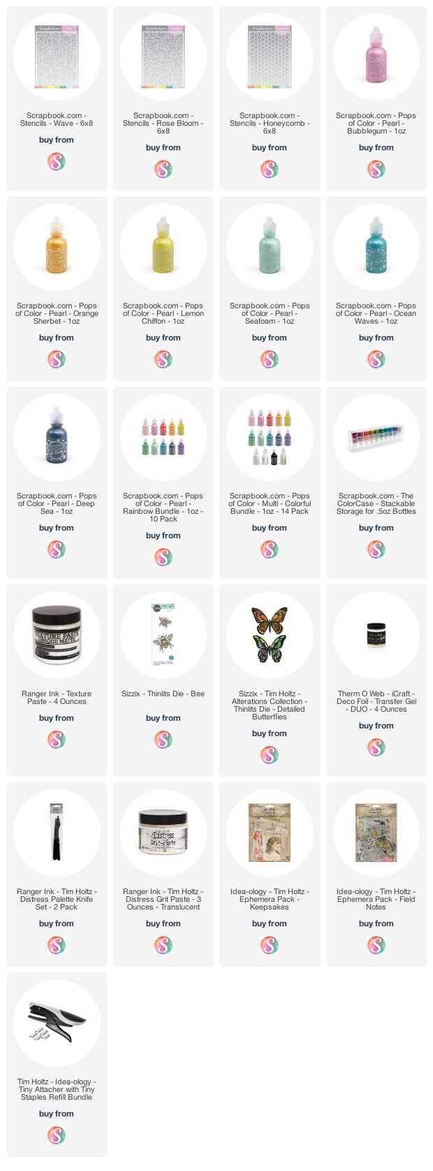
Supplies

Below you can find the products I used to create this project along with compensated affiliate links to Scrapbook.com. These links are at absolutely no extra cost to you. If you want to learn more about what an affiliate link is, you can see my full affiliate and product disclosure statement here

Subscribe