More Pops Of Color Card Ideas

Hello my crafty friends! In this blog post, I'm sharing 3 more card ideas and techniques using the Scrapbook.com Gloss Pops of Color. These new Gloss Pops of Color have a beautiful shine to them and are a perfect accent to add to any card project.

More Pops Of Color Card Ideas by Juliana Michaels featuring Scrapbook.com Pops of Color

If reading and scrolling aren't your thing, I also have a video over on my YouTube channel that you can check out!

Thinking Of You Card

Finished size: 4.25x5.5 inches

On this first card, I was inspired by a card I made a couple of years ago. I came across it and was inspired to recreate it with some new products including the Scrapbook.com Pops of Color. To get started, I die cut some butterflies using the Tim Holtz Flutter Thinlits and Scrapbook.com Sprigs Dies from Distress Heavystock. I applied some Mint Tape to the backside of the butterfly bodies and the sprigs. I then applied Distress Oxide Ink in Salvaged Patina, Milled Lavender and Saltwater Taffy to the butterflies. If you don't want to ink the paper, you could also die cut them from colored cardstock.


Thinking Of You Card by Juliana Michaels featuring Scrapbook.com Pops of Color

After I finished inking the butterflies, I dried them using my heat tool. Before starting the next step, it's very important that the ink is dry.

Next, I did some heat embossing using the Tim Holtz Tapestry Stamp Set. I stamped it using clear embossing ink, sprinkled it with clear embossing powder and heat embossed it using a heat gun. Heat embossing was one of the first card making techniques I learned nearly 20 years ago and I still absolutely love watching the powder transform and become shiny! It's like a magic trick that never gets old!


Now it's time to add the Pops of Dots! I used Scrapbook.com Gloss Pops of Color to add dots of color to each of the butterflies wings. I always like to do a practice squeeze with each bottle before I start working with the Pops of Color to make sure the medium is ready to come out of the bottle nice and even. On these butterflies, I'm using Pops Of Color Gloss in Sky Blue, Summer Peach and Soft Lavender. I then set these to the side to dry and started working on the rest of my card.

For the background, I took a piece of Distress Watercolor and used the ink smooshing technique to add some color to it. I smooshed Old Paper and Vintage Photo Distress Ink Pads directly onto my craft mat, spritzed them with some water using my Distress Sprayer and then smooshed my paper into the ink. I used my heat tool to dry the paper and then smooshed the paper back onto my craft mat to pick up some of the remaining ink. I repeated this process until I was happy with the look of my paper.


Next, I added some stamping using a script stamp from the Tim Holtz Entomology Stamp Set with Vintage Photo Archival Ink. I then spritzed the paper with water and used a paper towel to dry and lift off some of the ink. I then used my heat tool to dry the paper. For another touch of interest, I decided to tear off the paper along the left hand side of the paper. I then inked the edges with some Vintage Photo Distress Ink and used the back side of my scissor to distress the torn edge a bit more.

For the sentiment, I used the Friendly Bouquet Stamp Set from Scrapbook.com with Versafine Pigment Ink in Onyx. I like to use this ink with clear stamps because it doesn't tend to stain them like Archival Ink will and the stamped image is still permanent.

When it came time to adding the other die cuts, I did quite a bit of futzing around with their placement. After I finally settled on the placement of the sprigs and butterflies I used a some double sided foam adhesive strips to adhere the butterflies to the one sprig and then tucked the other pieces behind and adhered them with Distress Collage Medium. I then adhered the sentiment using the foam adhesive strips. To finish off the card, I added a mat of colored cardstock using a piece of paper from the Scrapbook.com Floral Paper Pad.


Hello Card

Finished Size: 4.25 x 5.5 inches

To get started on this card, I adhered the Scrapbook.com Spring Florals Stencil to a piece of Distress Watercolor paper using Mint Tape. I then applied Distress Oxide Inks using a sponge dauber and a Detail Blending Tool. I used Salvaged Patina on the butterflies, Mowed Lawn on the leaves and Saltwater Taffy on the flowers. Except for a couple of flowers that I added Salvaged Patina too just to get a bit more of this color on the design. I tended to use the sponge dauber for the larger openings and the detail blender for the smaller spots where the sponge dauber was too big. I also like to apply the ink using a twisting motion as I find this gets the ink into the corners of the stencil a bit better.

Hello Card by Juliana Michaels featuring Scrapbook.com Pops of Color

After I had finished stenciling the image, I spritzed it with some water using my Distress Sprayer to give it a slightly distressed look, and dabbed it with a paper towel to remove some of the ink and then dried it with my heat tool.

Next, I went about adding dots of Pops of Color to the various images, using the the same technique as on the first card.
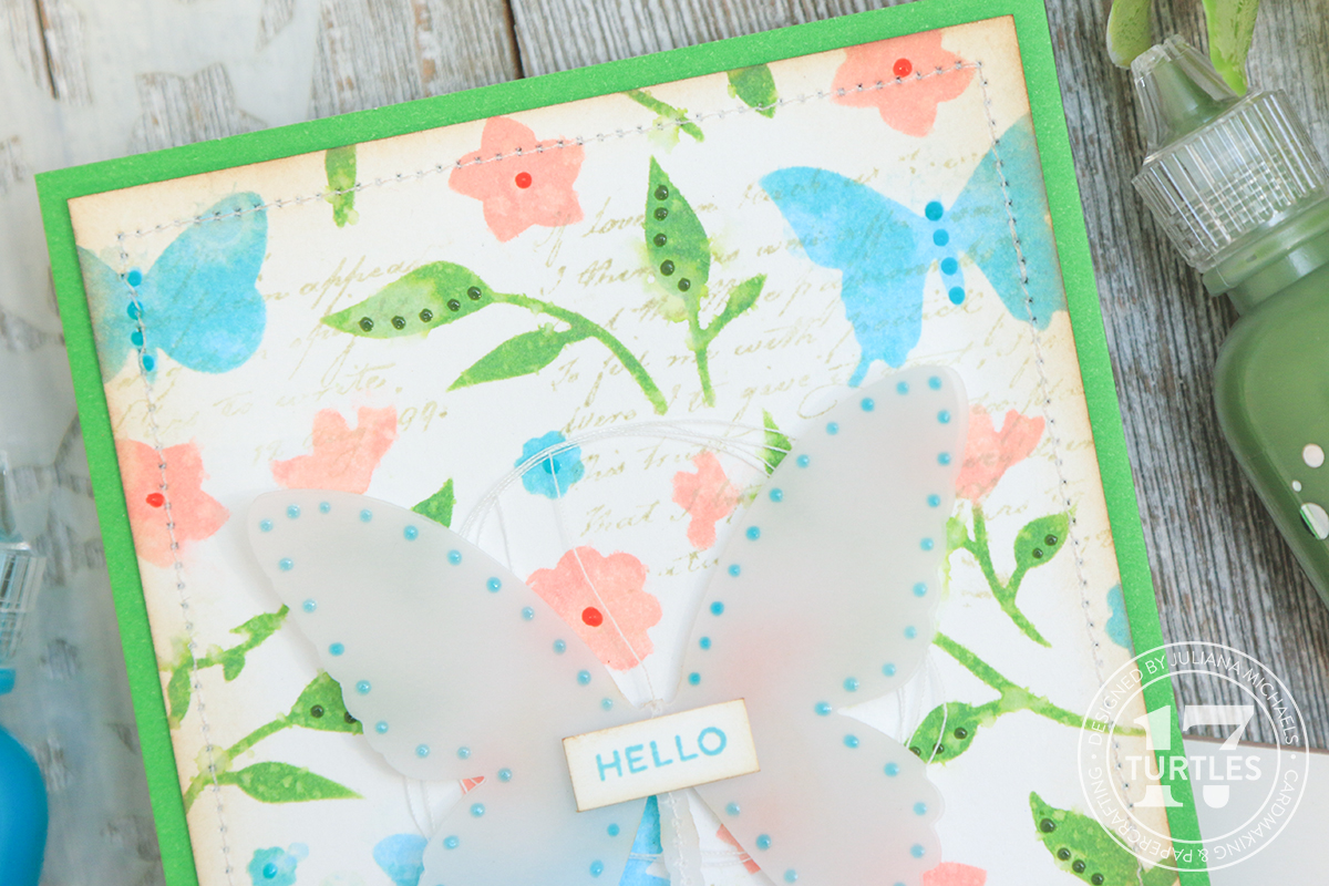

As an embellishment for this card, I die cut 2 butterflies from vellum using the Tim Holtz Detail Butterflies Dies. I used my sewing machine to stitch them together, but you could certainly skip this step and adhere them using an adhesive of your choice. I then adhered the sentiment to the center of the butterfly.

To add a little more texture, I machine stitched around the outside edge of the card panel. Next, I applied Vintage Photo Distress Ink to the edges of the card panel to grunge it up just a tiny bit. I also decided to add some stamping using the script image from the Tim Holtz Dearly Departed Stamp Set. I didn't want it to be a stark image, so I applied Old Paper Distress Ink to my craft mat and then picked up the ink with the stamp before stamping the image onto the paper.
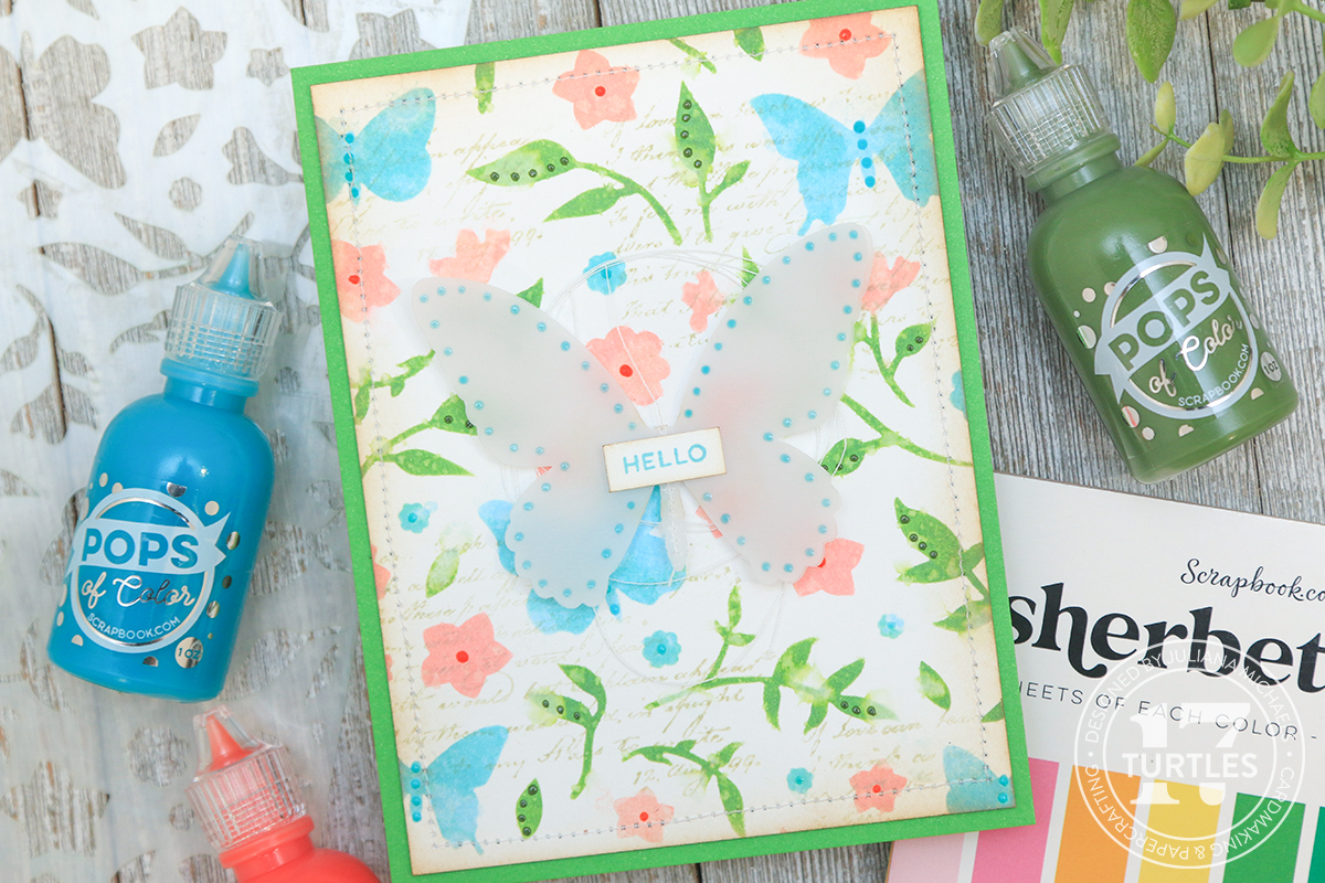

For the sentiment on this card, I used the same stamp set as the first card. This time I stamped it using Distress Oxide Ink in Salvaged Patina.

The mat for this card is a piece of green paper from the Scrapbook.com Sherbet Paper Pad adhered using Scrapbook.com Permanent Refillable Adhesive Roller. I then adhered it to the center of the butterfly using double sided foam adhesive.

At this point, I thought I was finished, but after setting the card to the side and looking at it later, I decided to add some Turquoise Waters Pops of Color to the vellum butterfly and a bit of white sewing thread behind it. I used the Scrapbook.com Permanent Refillable Adhesive Roller to tack it in place.


Dreamer Of Dreams Card

Finished Size: 4.25x5.5 inches

This third and final card kind of goes off on it's own little tangent. I've been wanting to try mixing Pops of Color with Texture Paste Transparent Gloss to see if it would work with a stencil AND keep the shiny look of the Pops of Color. Spoiler alert...it works perfectly!!!

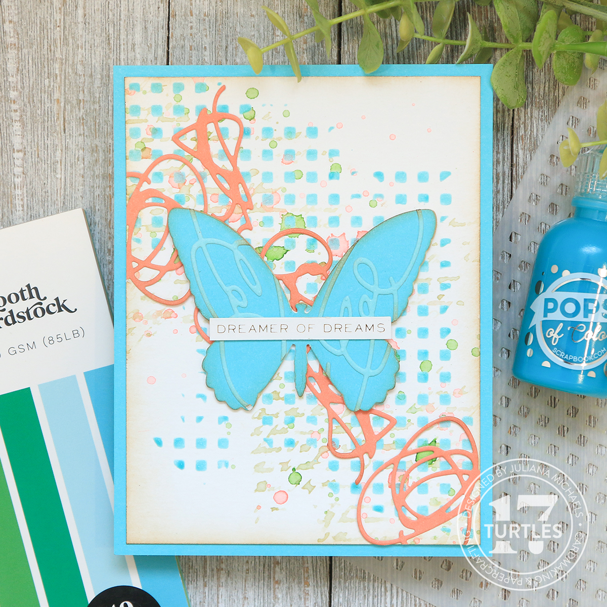
For this card, I used the Scrapbook.com Little Boxes Stencil and used a piece of Mint Tape to hold the stencil in place on a piece of Distress Watercolor paper. I then mixed some Turquoise Waters Pops Of Color and Transparent Gloss Paste together using my palette knife until it was thoroughly mixed together. I then applied it through the stencil using my palette knife, carefully removed the stencil to clean it and set the paper to the side to dry.

On a side note, I wanted to share that I think the Texture Paste Transparent Gloss is the same thing as the newly released Distress Texture Paste Translucent. So if you already have some of this, make sure to use it up first.
Dreamer Of Dreams Card by Juliana Michaels featuring Scrapbook.com Pops of Color

For the next part, I adhered a Scrapbook.com adhesive sheet to the back side of the lighter blue paper from the Sherbet Paper Pad. I used this to die cut some of the scribbly shapes from the Tim Holtz Abstract Faces Dies.

I then took the darker blue paper from the Sherbet Paper Pad and die cut a butterfly using the Tim Holtz Detailed Butterflies Dies.

Using a craft pick, I removed the liner from the adhesive and adhered the scribbly die cuts to the butterfly. I then took a pair of scissors and trimmed off the overhanging parts of the die cuts.


Now it's back to the background paper. I smooshed some Saltwater Taffy Distress Ink onto my craft mat, spritzed it with water and used a paint brush to splatter it onto the paper. If you shake the brush in a downward motion you will get the larger droplets and if you tap the brush with your finger you will get the smaller splatters. I used my heat tool to dry the splatters. I then repeated the splattering process using Mowed Lawn Distress Ink.


For a little more interest, I used the script stamp from the Tim Holtz Dearly Departed Stamp Set applying the same technique I used on the second card with Old Paper Distress Ink. And of course, I had to ink the edges of the card panel and the die cuts with Vintage Photo Distress Ink.


I also added some more scribbly die cuts from the Abstract Faces Dies and cut them from a salmon colored paper from the Florals Paper Pad. I adhered them with Distress Collage Medium and added a sentiment from the Tim Holtz Metallic Sticker Book. I then finished off the card by matting it onto the same piece of blue paper I used to die cut the butterfly. This is a little paper saving trick for those of you who hate to waste paper!

More Pops Of Color Card Ideas by Juliana Michaels featuring Scrapbook.com Pops of Color

Thanks for stopping by! I sure hope you enjoyed learning some new ideas for adding Scrapbook.com Pops of Color to your next card project. I also can't wait to do some more stenciling with the Transparent Gloss Paste in the near future!

SUPPLIES

Below you can find the products I used to create this project along with compensated affiliate links to Scrapbook.com. These links are at absolutely no cost to you. When you shop through the links below, I receive a small commission from Scrapbook.com. These links are at absolutely no cost to you and the commission I receive helps me cover the costs of my blog and other expenses, which allows me to continue to provide you with FREE inspiration and tutorials. If you want to learn more about what an affiliate link is, you can see my full affiliate and product disclosure statement here. Thank you so much for your love and support!

Give Me All The Butterflies | Tim Holtz Sizzix Brushstroke Butterflies

Hello friends! Today I'm so excited to be sharing the three cards I created for the Tim Holtz Sizzix Chapter 2 Release. If you didn't catch Tim's YouTube Live, you can always watch the replay on either his blog or YouTube channel.

As the title of this post suggests, and for any of you that know me, I have a bit of a thing for butterflies. Just look at my most recent card shares and you can see for yourself! So you can only imagine my excitement when I saw the Brushstroke Butterflies! I had to have them and I had to use them on all of my cards! I really couldn't help myself!  But it's not all butterflies, I did mix and match them with some of the other new dies including Abstract Faces, Brushstroke Flowers 4, Bold Text Set 2 and the Linen 3D Texture Fade Embossing Folder. So without further ado, let's get on with the makes!

Don't Forget To Fly | Brushstroke Butterflies and Abstract Faces

Finished size: 4.25 x 5.5 inches

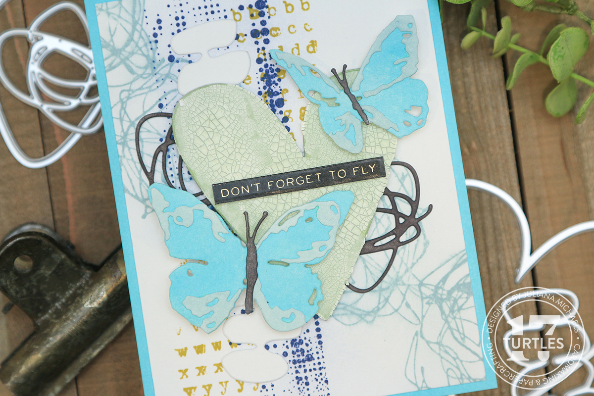
On this first card I combined the Brushstroke Butterflies with the Abstract Faces. At first glance the Abstract Faces might seem a bit odd and maybe not even appeal to you, but when you take a look at the individual dies that come in this set, you have a truly great mix of abstract shapes that are perfect for layering and adding interest to your design.

Don't Forget To Fly Card by Juliana Michaels featuring Tim Holtz  Brushstroke Butterflies and Abstract Faces

For this card, I began by stamping the background panel using a mix of stamps from the Tim Holtz Grunged and Documented Stamp Sets. I stamped the images from the Grunged set using Distress Oxide Inks in Chipped Sapphire and Speckled Egg and smudged the ink after I stamped them for a bit of a distressed look. I stamped the image from the Documented set using Crushed Olive Archival Ink. I later layered this piece onto a piece of Distress Heavystock, which I inked the edges of with Salvaged Patina Distress Oxide so it would match my die cuts.


Now for the die cuts. The Heart from the Abstract Faces was cut from Distress Watercolor and inked with Bundled Sage Distress Oxide. I then applied a layer of Crackle Paste to it and set it to the side to dry. The Brushstroke Butterflies were also cut from Distress Heavystock. I then inked the pieces with Salvaged Patina, Speckled Egg and Black Soot Distress Oxide inks before adhering the pieces together.


To assemble the card, I adhered the heart and butterflies using double sided foam adhesive for dimension. I then tucked the other abstract shapes, which I die cut from white and black cardstock, behind these pieces. The card was then finished off with a sentiment from the Metallic Sticker Book.


You Make Me Smile | Brushstroke Butterflies and Bold Text 2

Finished size: 5x7 inches

This card features the Brushstroke Butterflies and the Bold Text 2. I have to admit, I was super tempted to do some more shaker cards but I decided to mix it up and instead layer some texture behind the Bold Text die using the Linen 3D Embossing Folder. Because I left it white, it doesn't show up well in the photos, but the texture it adds to the card in real life is really quite fabulous!

You Make Me Smile Card by Juliana Michaels featuring Tim Holtz  Brushstroke Butterflies and Bold Text Set 2

For this card, I began with the piece of Distress Heavystock cut to 4.25 x 5.5 inches. I then ink blended the entire panel with Bundled Sage Distress Oxide Ink. I then stamped two of the beautiful images from the Tim Holt Floral Outlines Stamp Set in each corner using Peeled Paint Archival Ink.


After all of the inking and stamping was completed, I centered the You Make Me Smile die in the center, used a bit of Mint Tape to hold it in place and ran it through my die cutting machine. (make sure to safe the inside of your O so you can add it in later! someone I know forgot to do this and had to redo things to get another one!) Next, I added machine stitching around the outside edge of this piece.

With the background completed, I then cut a piece of Distress Heavystock slightly smaller than the main panel, spritzed it my Distress Sprayer until it was slightly damp and then embossed it using the Linen 3D Texture Fade Embossing Folder. I then adhered this behind the panel so you could see the texture behind the cut out letters.


The butterflies were cut from Distress Heavystock and the main part was inked with Tattered Rose Distress Oxide. I used my finger to apply Distress Foundry Wax in Gilded to the detail pieces and body for each butterfly. I then used my heat tool to set the wax while at the same time giving the pieces loads of shine! If you haven't checked out the new Distress Foundry Wax, I have a blog post and video where I share some tips and tricks on using it.)

The final step was to adhere the panel to a piece of Distress Heavystock trimmed to 5x7 inches.


You Make Me Smile | Brushstroke Butterflies and Brushstroke Flowers 4

Finished size: 4.25 x 5.5 inches

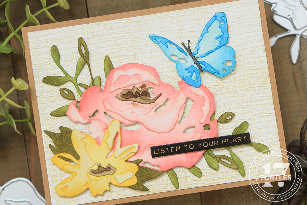
On this card, I combined the Brushstroke Butterflies with the beautiful Brushstroke Flowers 4. This flower coordinates with the other Brushstroke Flowers and is another fabulous addition to this series. I die cut the flowers and the butterflies from Distress Heavystock and then inked them with Distress Ink.

You Make Me Smile Card by Juliana Michaels featuring Tim Holtz  Brushstroke Butterflies, Brushstroke Flowers 2 and 3D Linen Texture Fade Embossing Folder

I used the following colors: Saltwater Taffy, Worn Lipstick, Tattered Rose, Mustard Seed, Fossilized Amber, Frayed Burlap, Ground Espresso, Peeled Paint, Forest Moss, Tumbled Glass, Salty Ocean, and Black Soot.


For the background, I embossed a piece of Distress Watercolor using the 3D Linen Texture Fade Embossing Folder. Before I embossed the paper, I rubbed the Antique Linen Distress Ink Pad over the surface of the embossing folder. I then spritzed the paper with water using my Distress Sprayer, placed the paper inside the folder and ran it through my Sizzix Foldaway to emboss the design. By applying the ink to the folder, it pushed the inked into the design adding this subtle bit of color to the paper.


To finish the card, I layered it onto a piece of kraft cardstock and added a sticker from the Metallic Sticker Book.


Thanks for stopping by today and checking out the cards I created using the Brushstroke Butterflies, Brushstroke Flowers 4, Bold Text Set 2 and 3D Linen Texture Fade Embossing Folder from the Tim Holtz Sizzix Chapter 2 Release.

SUPPLIES
Below you can find the products I used to create this project along with compensated affiliate links to Scrapbook.com. These links are at absolutely no cost to you. When you shop through the links below, I receive a small commission from Scrapbook.com. These links are at absolutely no cost to you and the commission I receive helps me cover the costs of my blog and other expenses, which allows me to continue to provide you with FREE inspiration and tutorials. If you want to learn more about what an affiliate link is, you can see my full affiliate and product disclosure statement here. Thank you so much for your love and support!

Tim Holtz Distress Foundry Wax | Tips, Tricks, Card Ideas & Inspiration

Hello friends and welcome! In this blog post I'm sharing all about the brand new Tim Holtz Distress Foundry Wax and how I used it to create 2 cards. Distress Foundry Wax is the latest new product from Tim Holtz and I have to admit that I haven't been this excited about a new product in a very long time. I think this one has me so excited because it's something I've been hoping Tim Holtz would add to his line of products, but with a twist that only Tim Holtz knows how to do! After having time to play and create with it, he has definitely achieved just that!

Tim Holtz Distress Foundry Wax Card Ideas & Inspiration by Juliana Michaels


For those of you who would prefer to watch how I created these cards, I also have a video doing just that. You can check it out below. If the video isn’t showing up, click HERE to watch it.


For even more information and inspiration make sure you check out Tim Holtz's Distress Foundry Wax YouTube Live: https://youtu.be/DlOZapkfeqY

HOW TO USE DISTRESS FOUNDRY WAX

You may or may not be familiar with the various wax products that are currently available. Most of them are beeswax based and come in a tube or jar. You can apply it to paper, metal, wood or resin pieces to add a metal-like finish.

Tim Holtz Distress Foundry Wax Card Ideas & Inspiration by Juliana Michaels


Distress Foundry Wax is quite different in that it's not beeswaxed based. It's actually a liquid and you must shake the bottle until you hear the mixing ball start rattling. Once mixed, squeeze some of the liquid onto your craft mat and then use a brush (or your finger) to apply it to your chosen surface (which includes wood, metal, resin, paper, etc.). If you have sensitive skin I do suggest using a brush to apply it. You will notice that once you squeeze it onto your craft mat and start moving it around, it begins to thicken and become more cream like. It will continue to thicken until it is dry, however, it's not permanent at this point and will flume or rub off.

To stop the fluming and to make it permanent, you must apply heat to it using a heat gun. I prefer the same type of heat tool you use for heat embossing as it will get you to the finish point faster than the Ranger Heat It Tool. When you're heating the wax is when the real magic happens! I love watching it transform from metal-like to a truly metal look as the heat is applied! Once you have heat set the wax, you can add another color or more of the same color and heat it again. I didn't have much luck adding another color or more of the same until I heat set the first layer.

DISTRESS FOUNDRY WAX TIPS & TRICKS

A couple of tips and tricks I have to share include recapping the bottle after each use AND to make sure you DO NOT leave the bottle next to where you are heating the wax. This will heat the wax inside the bottle and ruin it!

The Tim Holtz Tonic Studios Non-stick Craft Mat or any non-stick craft mat is the best surface to use when working with this product. I tried working from my glass mat and the wax stayed as a liquid and when I went to apply it, it seemed to just soak into the surface instead of me being able to apply it to the raised surface.

Another thing I love about the Foundry Wax is that it has no odor and it cleans up easily with a bit of rubbing alcohol. I use a Mini Mister filled with 91% Isopropyl alcohol, which is actually the same one I use when I'm working with Alcohol Inks.

Now let's get onto how I used the Foundry Wax on the 2 cards I created.

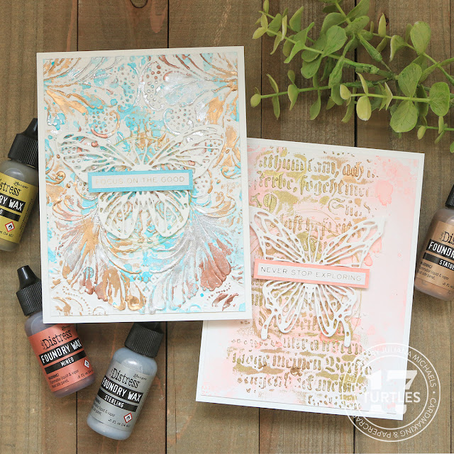
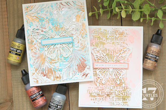
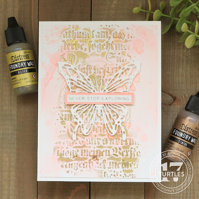
NEVER STOP EXPLORING CARD | DISTRESS FOUNDRY WAX & TEXTURE PASTE

On this first card, I wanted to try using the Foundry Wax on a textured surface. I began with a piece of Distress Watercolor Paper trimmed to 4x5.25 inches. I then did a little ink smooshing. I took the Saltwater Taffy Distress Ink pad and smooshed it directly onto my craft mat. I spritzed this with some water and smooshed my paper into the ink. I then used my Heat It tool to dry the ink. I repeated this process of ink smooshing until I was happy with the ink coverage.

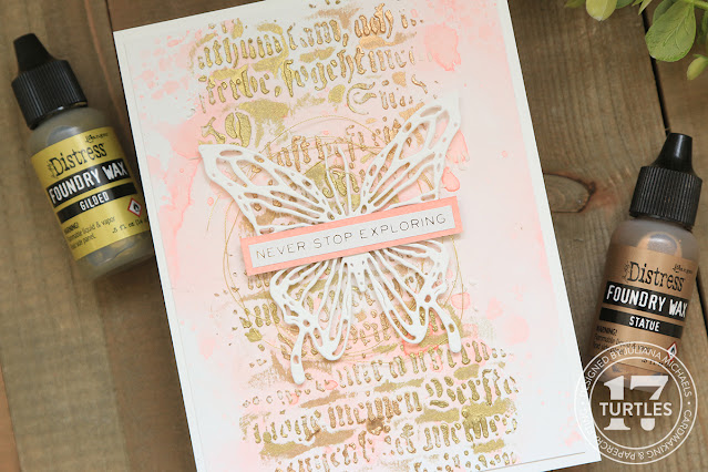
Never Stop Exploring Card by Juliana Michaels featuring Tim Holtz Distress Foundry Wax and Texture Paste


Once I had the inky background completed, I took the Tim Holtz Script Layering Stencil and used some Mint Tape to hold the stencil in place on the paper and used a palette knife to apply Distress Texture Paste through the stencil. I intentionally didn't apply it evenly so as to get a slightly distressed effect. I gently removed the stencil to wash it and set the paper to the side to let the paste dry.

After the paste was dry, I pulled out the Gilded and Statue Foundry Waxes. I shook each bottle until the mixing ball was moving. I then applied a bit of each color to my craft mat. After applying the colors, I pulled out my heat gun and heat set the wax. I love watching the magic happens as it takes on that truly metal-like and permanent finish!

Never Stop Exploring Card by Juliana Michaels featuring Tim Holtz Distress Foundry Wax and Texture Paste


I ended up applying another layer of the wax to make it even more metallic looking. Once the background was completed, I adhered it to a piece of white cardstock. For the embellishment, I added a bit of gold thread and a die cut butterfly. Yes, more butterflies! This time I used the Tim Holtz Scribbly Butterflies and die cut it from white cardstock. I couldn't bear to cover up that beautiful background I had just created!

For the sentiment, I used a sticker from the Metallic Sticker Book and layered it onto a piece of cardstock inked with Saltwater Taffy Oxide and trimmed to size. I just love the rich metallic effect the Foundry Wax adds to this textured background!

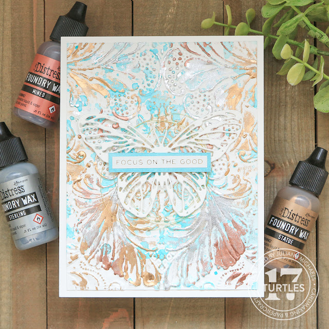
FOCUS ON THE GOOD CARD | DISTRESS FOUNDRY WAX & EMBOSSING FOLDER

On this second card, I'm sharing how I added the Foundry Wax to an embossed background.

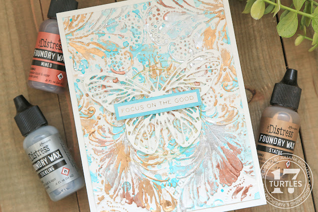
Focus On The Good Card by Juliana Michaels featuring Tim Holtz Distress Foundry Wax and Texture Paste


I began with a piece of Distress Watercolor paper. I spritzed the paper with some water and then embossed it using the Tim Holtz 3D Texture Fades Damask Embossing Folder. Spritzing the paper with water until it is damp, helps soften the paper fibers and gives you a better impression. It can also help prevent your paper from tearing or ripping when working with these 3D Embossing folders. After I embossed the paper, I dried it with my heat tool. I then added some ink smooshing, but this time I used Salvaged Patina Distress Ink.

Next it was time to apply the Foundry Wax to the panel. I used Sterling, Mined and Statue on this card. Once again, I made to shake each bottle until I heard the mixing ball rattle around. I applied the first 2 colors and decided I should go ahead and heat set these before trying to add another color. I had already discovered that trying to layer colors while they were still wet didn't work so well, unless of course you just want to mix the colors. I like to be able to see the various colors, so I prefer to heat set them in between adding another color or even more color. You can always add more color!

Personally, I'm mesmerized every time I heat set the wax! I just love watching it go from ok to AMAZING as I heat it! As on the first card, I couldn't bear to cover up too much of the background, so I opted for another simple butterfly die cut and sentiment. Even on embossed paper the Foundry Wax is just magical!


Thanks so much for stopping by to check out this blog post featuring the Tim Holtz Distress Foundry Wax.

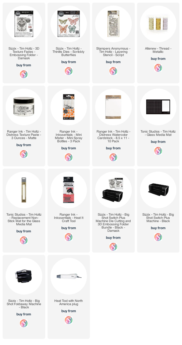
SUPPLIES
Below you can find the products I used to create this project along with compensated affiliate links to Scrapbook.com. These links are at absolutely no cost to you. When you shop through the links below, I receive a small commission from Scrapbook.com. These links are at absolutely no cost to you and the commission I receive helps me cover the costs of my blog and other expenses, which allows me to continue to provide you with FREE inspiration and tutorials. If you want to learn more about what an affiliate link is, you can see my full affiliate and product disclosure statement here. Thank you so much for your love and support!

4 Must Try Mixed Media Stencil Techniques

Hello friends and welcome! In this blog post (and video) I'm sharing 4 Must Try Mixed Media Stencil Techniques that feature layering stencils combined with Scrapbook.com Pops of Color, Distress Inks and Crackle Texture Paste. I've mixed and matched these various mediums to create 4 different cards. 


4 Must Try Mixed Media Stencil Techniques by Juliana Michaels featuring Scrapbook.com Pops of Color, Distress Ink and Crackle Paste

As I mentioned above, I've created a video sharing these various techniques and the cards I created using them. You can check it out below. If the video isn’t showing up, click HERE to watch it.


Below are the cards from my video. I've included some of basic information along with the main products I used on each card. If you are interested in more details on how I created each card and the techniques I used, make sure to check out my video. And as always, you can find a complete supply list at the end of this post.

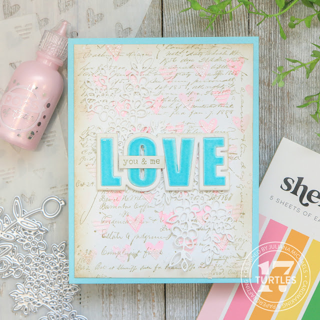
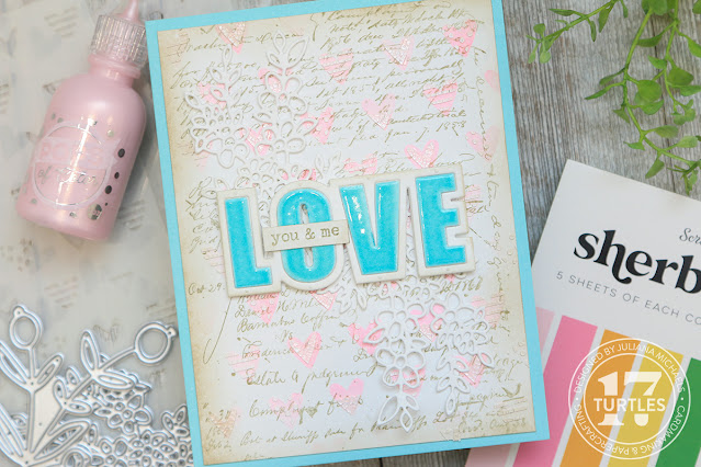
Before I get started on the cards, I want to share that I used the same basic background. Each card base is a piece of Distress Watercolor Paper trimmed to 4x5.25 inches and stamped in Frayed Burlap Archival Ink with the Tim Holtz Ledger Script Stamp Set.

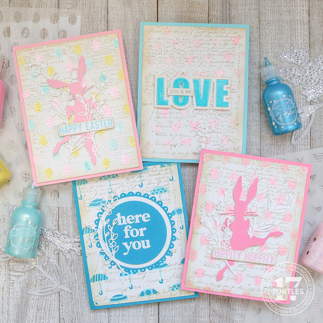
Love You & Me Card | Mixed Media Stencil Techniques No. 1

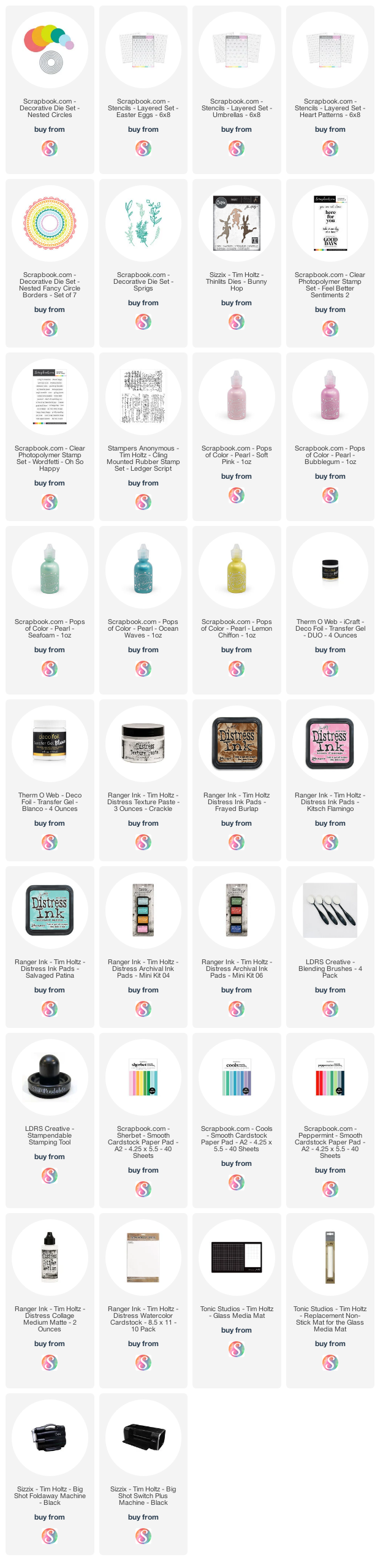
On this first card I used the Scrapbook.com Heart Patterns Layering Stencil combined with Kitsch Flamingo Distress Ink, Distress Crackle Paste and Scrapbook.com Spun Sugar Pops of Color. The dies I used include the beautiful Scrapbook.com Sprigs Decorative Dies and Love Die for the sentiment.

Love You & Me Card | Mixed Media Stencil Techniques No. 3

To make the sentiment pop I added Salvaged Patina Embossing Glaze and then finished it off with the "you & me" from the Scrapbook.com Wordfetti Oh So Happy Stamp Set.


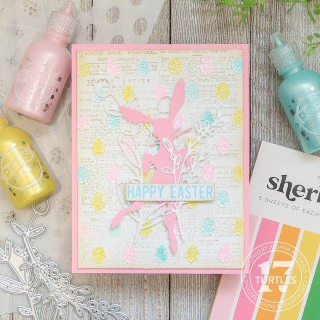
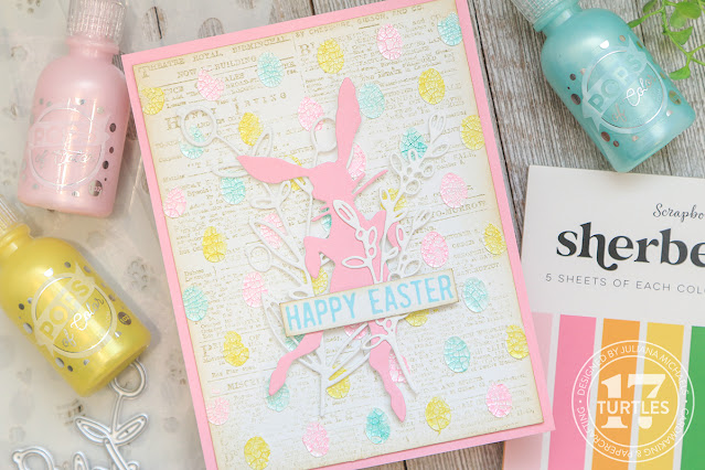
Happy Easter Card | Mixed Media Stencil Techniques No. 2

For this second card, I used the Scrapbook.com Eggs Layering Stencil along with the Distress Crackle Paste and Pops Of Color in Spun Sugar, Seafoam and Lemon Chiffon. Although these photos don't show it well, these Pops of Color have a pearl finish that really adds some fun shimmer and shine to this card.

Happy Easter Card | Mixed Media Stencil Techniques No. 3

To embellish this card, I added some die cuts using the Tim Holtz Bunny Hop Thinlits and Scrapbook.com Sprigs Dies. For the sentiment I used the Tim Holtz Spring Shadows stamp set.


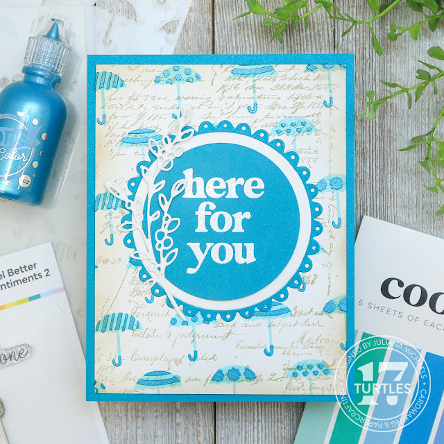
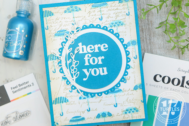
Here For You Card | Mixed Media Stencil Techniques No. 3

This third card features the Scrapbook.com Umbrellas Layering Stencil. Here I've combined it with Salvaged Patina Distress Ink and Pops of Color in Ocean Waves.

Here For You Card | 4 Must Try Mixed Media Stencil Techniques by Juliana Michaels featuring Scrapbook.com Pops of Color, Distress Ink and Crackle Paste

For the main embellishment on this card I used the Scrapbook.com Nested Fancy Circles Dies along with some basic circle dies. And yes, the gorgeous Sprig Die Set is back in action once again! I seriously can't get enough of this beautiful die set! To create the sentiment I used the Scrapbook.com Feel Better Sentiments 2 Stamp Set.


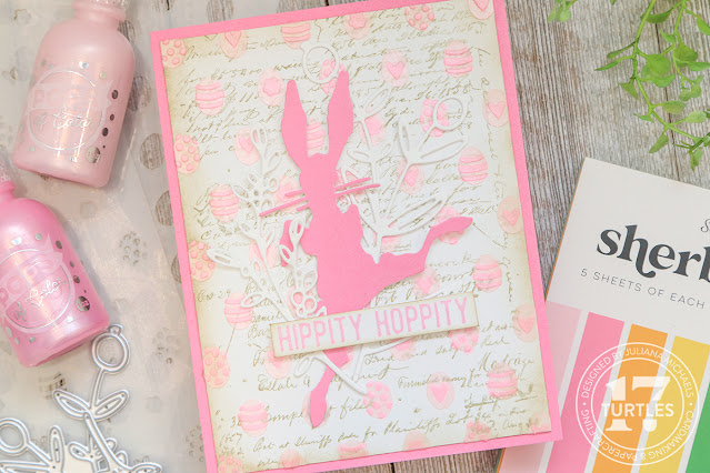
Hippity Hoppity Easter Card | Mixed Media Stencil Techniques No. 3

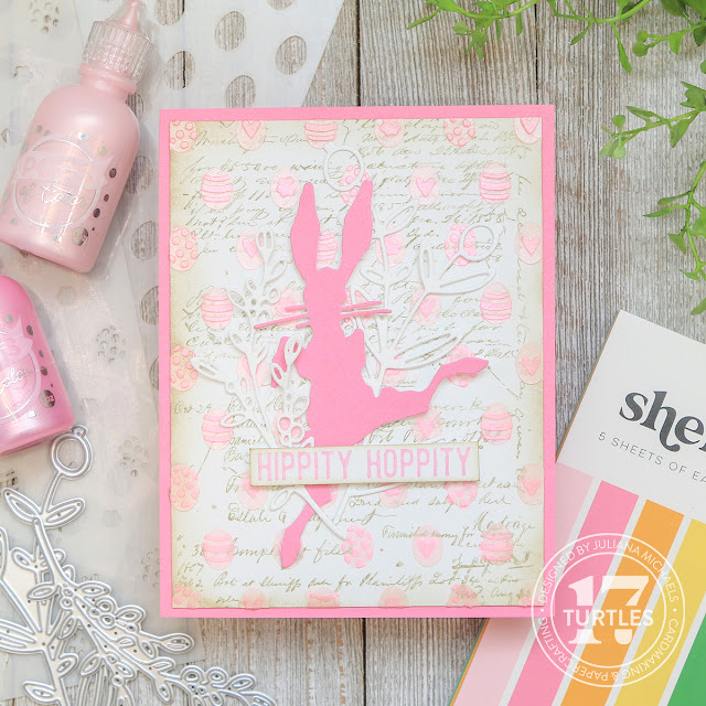
Now for the final card! Here I used the Scrapbook.com Eggs Layering Stencil along with Pops of Color in Spun Sugar and Bubblegum.

Hippity Hoppity Easter Card | Mixed Media Stencil Techniques No. 3

This card is quite similar to the Happy Easter card in that I once again used the Tim Holtz Bunny Hops Thinlits, Spring Shadows Stamp Set and Scrapbook.com Sprigs Die Set. 


Thanks so much for stopping by today and checking out my 4 Must Try Mixed Media Stencil Techniques Blog Post and Video. I hope you are inspired to give these techniques a try!

Supplies

Below you can find the products I used to create these cards along with compensated affiliate links to Scrapbook.com. These links are at absolutely no cost to you. When you shop through the links below, I receive a small commission from Scrapbook.com. These commissions help me cover the costs of my blog and other expenses, which allows me to continue to provide you with FREE inspiration and tutorials. If you want to learn more about what an affiliate link is, you can see my full affiliate and product disclosure statement here. Thank you so much for your love and support! 

New Tim Holtz Distress Color | Saltwater Taffy Card Ideas & Inspiration

Hello friends! I'm so excited to be sharing some card inspiration with you using the new Tim Holtz Distress Color Saltwater Taffy. I have 3 cards to share with you AND I made a video for one of them! I decided to only do the one video since the technique on that card is a bit unique as compared to the ones I used on the other 2 cards. But never fear, I have all the details on how I created the other two cards in this blog post, along with some swatches I created comparing the new color. And if you would like a video for the other 2 cards, let me know and I'll put one together!

I want to thank Scrapbook.com for their generosity in sending me this New Distress Color to create with!

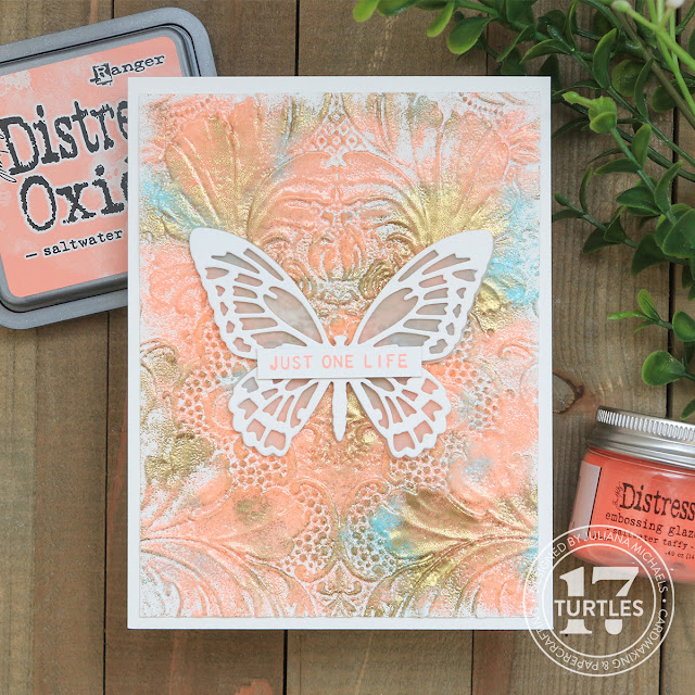
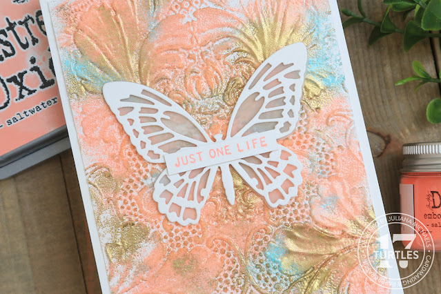
Just One Life Card by Juliana Michaels featuring Tim Holtz Distress Color Saltwater Taffy

Saltwater Taffy Swatches

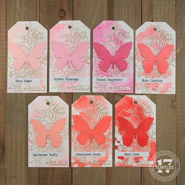
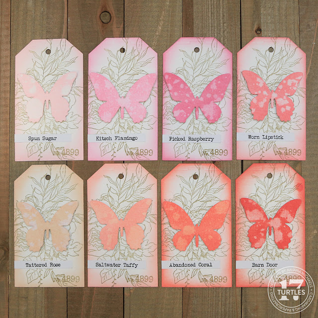
Before I get into the card details, I wanted to share the swatches I created for the new ink. I was inspired to up my swatch game after seeing the one's Zoe Hillman created for the recent Archival Ink release. I decided it would be fun to swatch them in the ways I tend to use them the most. I grabbed the Distress Ink in all the colors that are somewhat close to Saltwater Taffy. As I was doing this, I realized I didn't have Victorian Velvet in Distress Ink. Guess that's going to have to change ASAP! Next, I die cut a bunch of tags from Distress Watercolor paper and some butterflies from Distress Watercolor for the Oxide swatches and some from Distress Heavystock for the Distress Ink Swatches. I used this paper since it is the one I used the most frequently.

On the Distress Ink Swatches, I ink blended the butterfly and then did some ink smooshing on the background. These are two of the more common ways I use this type of ink, so I love that this will give me a good feel for how it will look on a project.

Distress Ink Swatches


Tim Holtz Saltwater Taffy Distress Ink Swatches

As you can see Saltwater Taffy color definitely fills an opening in the color palette by being a lighter version of Abandoned Coral but as always, these colors can be chameleons when you start mixing and layering!

For the Oxides, I ink blended the Butterfly, but then spritzed it with some water to activate the oxide and to again give me a better feel for how it will look. I then ink blended the edges of the tag to show that effect.

Distress Oxide Swatches


Tim Holtz Saltwater Taffy Distress Oxide Swatches

Now, let's get on with the making! Here's the video I created using Saltwater Taffy Embossing Glaze. You can check it out below. If the video isn’t showing up, click HERE to watch it.


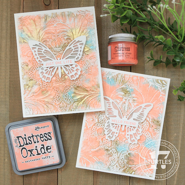
Just One Life Card | Embossed Embossing Technique

This first card (I actually ended up making 2 of them so I could create the video) was made using Distress Embossing Glaze, an embossing folder and embossing powder. Which is why I'm calling it embossed embossing! I invite you to check out my video for all the details. You can find a complete supply list at the end of this post.

Cards by Juliana Michaels featuring Tim Holtz Saltwater Taffy Distress Embossing Glaze


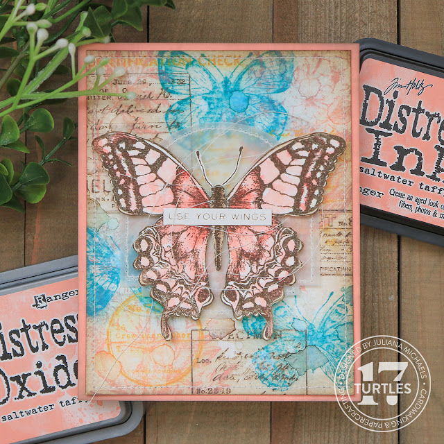
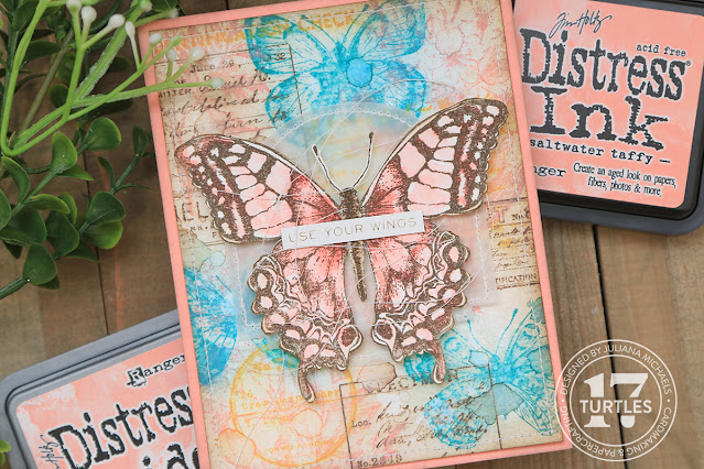
Use Your Wings Card | Distress Oxide Stamp and Smudge Technique

On this card, I used Distress Oxide and the Stamp and Smudge Technique to create the background. I began with a piece of Distress Watercolor paper trimmed to 4 x 5.25 inches. I then selected a mix of stamps including: Flutter, Illustrated Garden and Field Notes. I started by stamping images from the Field Notes set in Ground Espresso Distress Oxide. While the ink was still wet, I took a clean paper towel and smudged (smeared) the ink. For the second layer, I stamped images from Illustrated Garden in Saltwater Taffy and repeated the smudging. I stamped some butterflies from the Flutter stamp set using Peacock Feathers and for the final bit of stamping I stamped a couple more images from Field Notes using Wild Honey. With each color, I stamped and then smudged the ink while it was still wet. Once the stamping was completed, I inked the edges with a bit of Ground Espresso Distress Ink. I then spritzed the entire panel with a bit of water and dried it with my heat tool.

Use Your Wings Card by Juliana Michaels featuring Tim Holtz Saltwater Taffy Distress Color

Now onto the butterfly. I stamped the image using the butterfly from the Perspective Stamp Set using Ground Espresso Archival Ink. I smooshed the Saltwater Taffy and Abandoned Coral Distress Inks onto my craft mat and used a waterbrush to pick up the ink and color in the image. I then fussy cut the image using a pair of scissors. Behind it I placed a piece of vellum die cut using the Tim Holtz Label Thinlits. I added some machine stitching around the outside edge before I adhered it to my card.

The card panel was attached to a piece of Distress Heavystock that I ink blended with Saltwater Taffy Distress Oxide creating my own custom cardstock. 
I then finished off the card with a sentiment from the Tim Holtz Idea-ology Metallic Stickerbook.


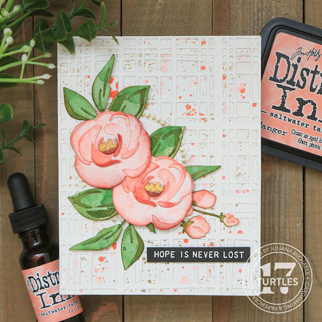
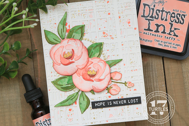
Hope Is Never Lost Card | Ink Smooshing Die Cuts Technique

For this card, I began by taking several pieces of Distress Watercolor paper (4.25 x 5.5 inches but any size will work). I then smooshed some Saltwater Taffy Distress Ink onto my craft mat, spritzed it with water and then smooshed one of the pieces of paper into the ink. I dried the paper and then repeated the smooshing until I was pleased with the look. I repeated this process on a second piece of paper, this time with Rustic Wilderness Distress Ink. I also took a couple of small watercolor paper scraps and ink smooshed one with Aged Mahogany and another one with Fossilized Amber. Next, I took Tim Holtz Bloom Colorize Thinlits Dies and cut out the various parts of the flower from the different pieces of inked paper. To give the layers of the flower a bit more contrast, I inked some of the pieces and edges of the paper with Abandoned Coral Distress Ink. For the flower center ( the pieces die cut from Aged Mahogany and Fossilized Amber) I inked the edges with Frayed Burlap Distress Ink. With the leaves, I inked the main background piece and the edges of the layers with Forest Moss Distress Ink. I then adhered all of the layers using Distress Collage Medium.

Hope Is Never Lost Card by Juliana Michaels featuring Tim Holtz Distress Saltwater Taffy

Behind the flowers, I added a Seal die cut created using the Seal Switchlit. I lightly rubbed a bit of embossing ink over the raised areas and heat embossed it with gold embossing powder.

For the background, I took a piece of Distress Watercolor paper trimmed to 4.25 x 5.5 inches and repeated stamped the ink splatter stamp from the Tiny Toadstools Stamp Set and heat embossed it with gold embossing powder. I then added some ink splatters using the Saltwater Taffy Distress Ink Reinker and a bit of water. I then added more water to get a lighter ink splatter. I completed the background by layering a piece of Distress Heavystock die cut using the Simply Plaid Thinlits Die.

To finish the card, I stamped a sentiment from the Tiny Text Stamp Set onto black cardstock and heat embossed it with white embossing ink.


I sure hope you enjoyed the card inspiration and video I've shared featuring the new Tim Holtz Distress Color Saltwater Taffy. Thanks so much for your visit!

Supplies

Below you can find the products I used to create these cards along with compensated affiliate links to Scrapbook.com. These links are at absolutely no cost to you. When you shop through the links below, I receive a small commission from Scrapbook.com. These commissions help me cover the costs of my blog and other expenses, which allows me to continue to provide you with FREE inspiration and tutorials. If you want to learn more about what an affiliate link is, you can see my full affiliate and product disclosure statement here. Thank you so much for your love and support! 

Subscribe