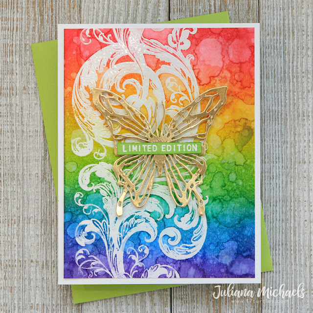
Hello friends! Today I'm sharing a set of 6 cards that focus on creating rainbow and analogous color backgrounds using Alcohol Ink and Distress Ink. I was originally inspired by the Iron Off Resist technique shared by Jennifer McGuire. However, in my laziness of not wanting to deal with getting out the iron and ironing board, I went a different route and ended up with the set of cards I'm sharing today. It just goes to show how inspiration is everywhere and how it can be a jumping off point for your own creative process.
Ok. so now back to these rainbow and analogous color backgrounds. We all know what rainbow color is, but... you might be asking yourself what analogous colors are? Analogous colors are groups of three colors that are next to each other on the colour wheel. For example: red, orange and yellow. Working with analogous colors makes for easy blending as you never have to worry about the colors getting muddy or brown.
Alcohol Ink Rainbow and Analogous Color Backgrounds
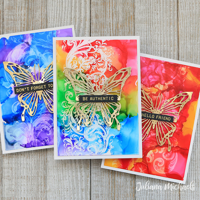
This first set of cards uses Alcohol Inks on Yupo paper to create the backgrounds. I made one card with a rainbow color palette and the other two with analogous colors.
The stamped image on all three of these cards is from the Tim Holtz Stampers Anonymous Baroque Stamp Set. For the focal point, I die cut a butterfly from gold Metallic Kraft Stock using the Sizzix Scribbly Butterflies Thinlits Die. The sentiment is from the Tim Holtz Stampers Anonymous Tiny Text Stamp Set. It is stamped on black cardstock with embossing ink and heat set with gold embossing powder. I used this same focal point on each of the Alcohol Ink cards, but switched up the sentiment on each one.
For the rainbow pattern, I applied the colors in rainbow order from top to bottom and used the Ranger Alcohol Ink Air Blower to move the inks around. I also used a tiny bit of Alcohol Ink Blending Solution.
I used the following Alcohol Inks for this card: Gumball, Sunset Orange, Sunshine Yellow, Mojito, Glacier and Purple Twilight.
Once the Alcohol Ink was dry, I rubbed the entire panel with a Ranger Anti-Static Pouch just to make sure no stray embossing powder would stick to it. I then stamped the Baroque image with embossing ink and heat set it with white embossing powder.
This next card uses the analogous colors of red, orange and yellow. I used the following Alcohol Inks: Gumball, Sunset Orange and Sunshine Yellow.
I used the same stamp image, but this time I stamped it with Alcohol Lift Ink. After stamping the image, I used a paper towel to dab and lift off the ink to reveal the image. It creates a subtle effect, but adds a nice bit of interest to the background.
On this final alcohol ink card, I used the analogous colors of blue, indigo and violet. The Alcohol Inks I used are: Glacier, Purple Twilight and Monsoon. The stamped image is the same one I used previously and again I used it with Alcohol Lift Ink.
Another analogous color combination that I didn't do, but that would be a great option is yellow, green and blue. Wouldn't that be gorgeous?
Distress Ink Rainbow and Analogous Color Backgrounds
Now onto the second set of cards. This time I used Distress Ink with watercolor paper, but continued with the rainbow and analogous color combinations.
On these cards, I used the Tim Holtz Stampers Anonymous Baroque Stamp Set and the Glorious Garden Stamp Set. I stamped the image with embossing ink and heat embossed it with white embossing powder. I found that Super Fine White Embossing Powder worked better in keeping the details of the Glorious Garden image as compared to regular embossing powder. With all of these, I made sure the inked background was completely dry and ran an Anti-Static Pouch over the surface before stamping and heat embossing.
For the focal point, I again die cut butterflies from gold Metallic Kraft Stock using the Sizzix Scribbly Butterflies Thinlits Die. The sentiment is from the Tim Holtz Stampers Anonymous Tiny Text Stamp Set. This time I stamped it onto white cardstock with embossing ink and heat set with white embossing powder. I then inked the white paper with Distress Ink to coordinate it with the card.

On each of these cards, I used Distress Ink to create the background. For the rainbow effect, I used an Ink Blending tool to apply ink in stripes at a diagonal along a piece of watercolor paper. I then used the blending tool to blend the colors next to each other together. Next, I spritzed the paper using the Distress Sprayer, making sure to apply enough water to get the inks to create the distressed look. I did a combination of spritzing and drying with a heat tool and spritzing and dabbing dry with a paper towel to get the inks to blend and move. The Distress Ink colors I used on the rainbow background are: Festive Berries, Spiced Marmalade, Mustard Seed, Mowed Lawn, Salty Ocean and Wilted Violet.

This next card uses an analogous color scheme. This time I used the following Distress Inks: Picked Raspberry, Festive Berries and Wild Honey. When applying the ink, I again used a foam blending tool, but I applied the various inks to the card in different areas, blended the colors next to each other and then used the spritz and dry methods I used on the previous card. As I mentioned earlier, I used Super Fine White Embossing Powder when I stamped and embossed the Glorious Garden Stamp.
On my final card, I used Wilted Violet, Salty Ocean and Blueprint Sketch Distress Ink with the same technique as mentioned on the previous card.
That's it friends! I sure hope you enjoyed learning how to create these Rainbow and Analogous Color Backgrounds using Alcohol Ink and Distress Ink. Thanks so much for stopping by and as always, if you have any questions, don't hesitate to ask.
Supplies
You can find a supply list of the products I used to create this project below. This post contains compensated affiliate links to Scrapbook.com and Simon Says Stamp at no cost to you. If you want to learn more about what an affiliate link is, you can see my full affiliate and product disclosure statement
here.


these cards are so inspiring! I love the technique and the bright colors...to be honest I cannot even pick a favorite because they are all so wonderful!!
ReplyDeleteEres admirable
ReplyDeleteBesos desde México
These are all really beautiful cards!!!!!!! Love, LOVE them!!!!!!!!
ReplyDelete