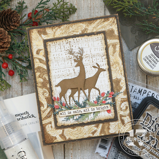
Merry Christmas in July friends! In this post I'm continuing my Christmas in July series with a fun background technique involving an embossing folder, Distress Ink, Luster Wax and Glitter! For those of you just stopping by, each week during the month of July I'm sharing how I created a Christmas card using supplies from my stash in a video over on my YouTube channel.
My hope is to inspire you to get a jump start on your Christmas cards and actually use some of those products you haven't used yet!
In each video I'm sharing some great techniques, along with some helpful tips and tricks to make your Christmas crafting more enjoyable. Here on my blog, I'll be sharing the basic steps to complete the card. you can watch the video below or head over to my YouTube Channel. And while you're there, I'd love for you to consider subscribing to my channel!
If you're interested in using the exact products I have used, they will be linked in the supplies list below and when you shop through those links, it helps support me and I really appreciate that so much!
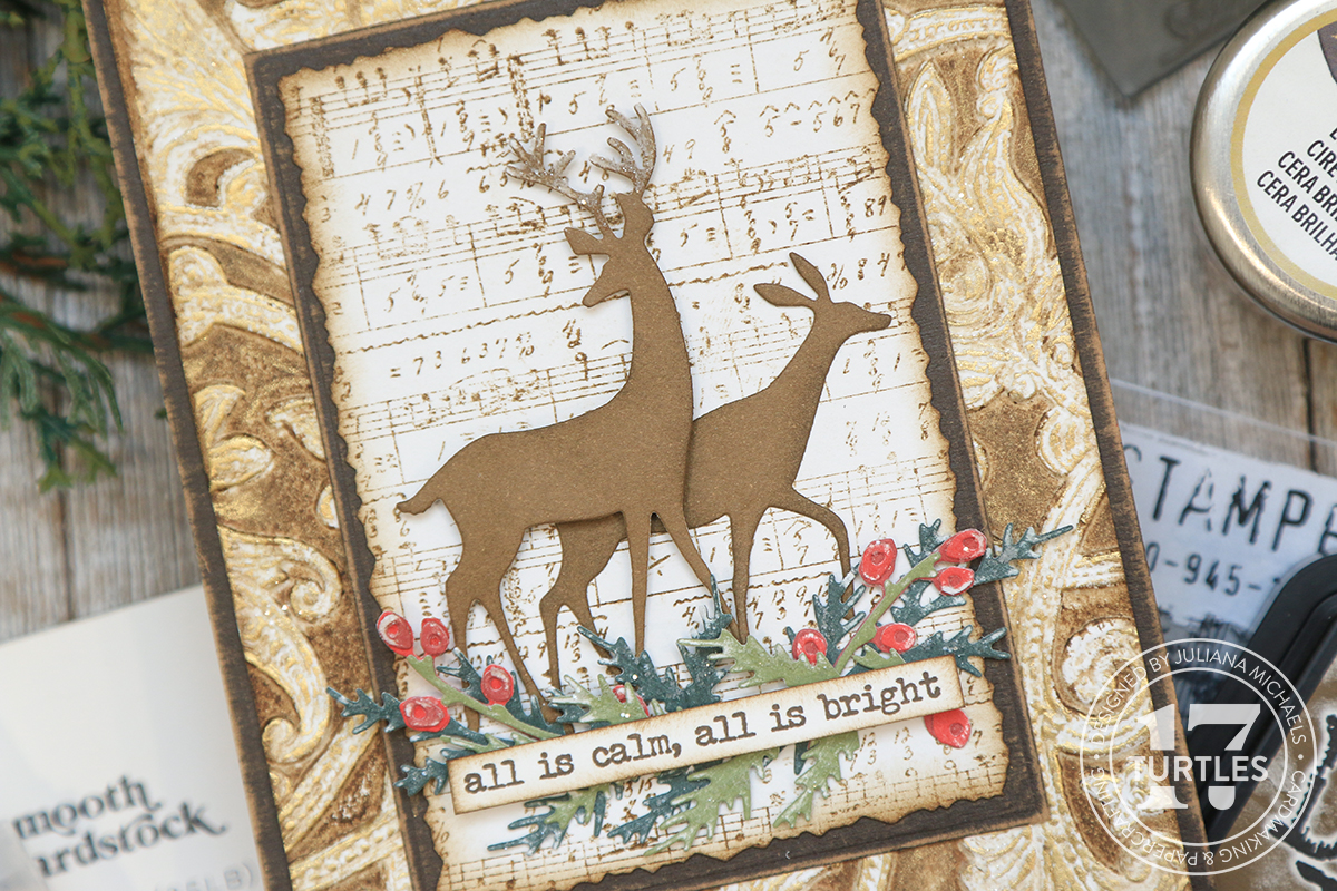
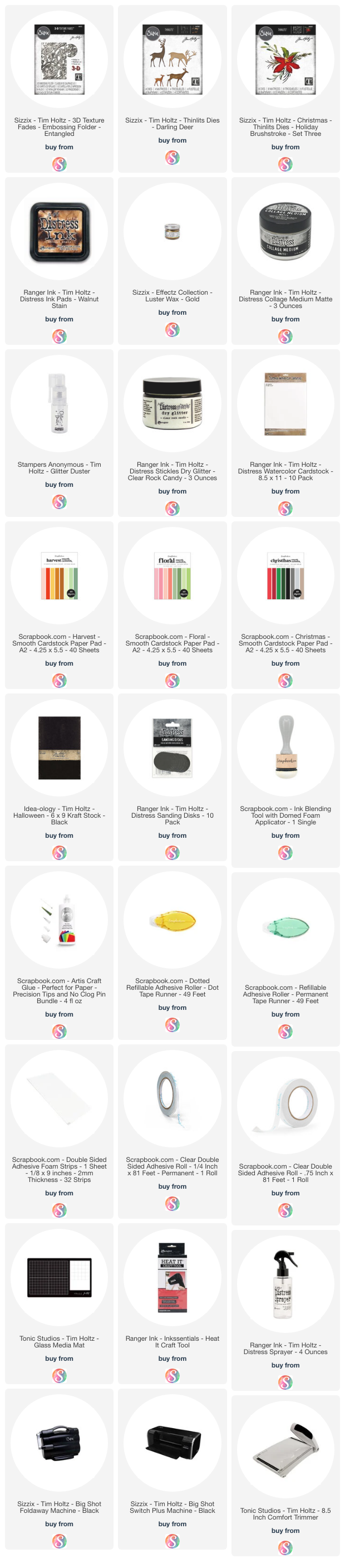
For this card, I'll be working with the Tim Holtz Sizzix Darling Deer Die Set, some of the greenery from the Tim Holtz Sizzix Holiday Brushstroke 3 Die Set and the Tim Holtz Entangled Embossing Folder. I'll also be using the Tim Holtz Tiny Text Christmas Stamp set and the Tim Holtz Music and Advert Stamp set. If you don't have these exact dies and stamps, feel free to take a look in your stash and find something similar. To create the background for the card, I'll be using Walnut Stain Distress Ink and Sizzix Gold Luster Wax. I'll also be using Distress Collage Medium and a Glitter Duster filled with Rock Candy Distress Glitter.
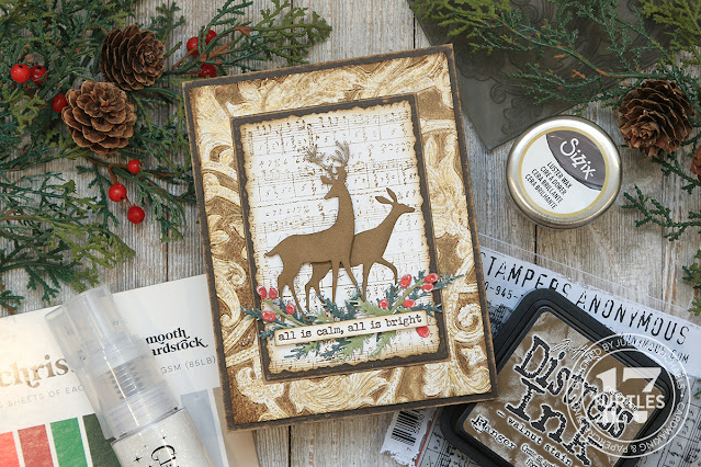
ALL IS CALM CHRISTMAS CARD
I started off with a piece of Distress Watercolor paper cut to 4 x 5.25 inches. I took the Entangled Embossing Folder and rubbed the Walnut Stain Distress Ink pad directly onto the deep textured side of the embossing folder. Once the folder was covered with ink I lightly misted the piece of watercolor paper, placed the paper into the embossing folder and ran it through my die cutting machine.
Next, I applied Sizzix Gold Luster Wax to the raised areas of the embossed paper. This really made the details of the embossed design pop!
For the next step, I applied Distress Collage Medium to some of the raised areas. I then used a Glitter Duster to apply Rock Candy Distress Glitter to the areas where I applied the adhesive.
For the base of the card, I cut a piece of Black Kraftstock to 4.25 x 5.5 inches. I then took a rectangle die and cut the center from this same piece of cardstock. This is a great way to save paper, especially if it's a paper like this that is maybe more expensive than just plain black cardstock. I used the same rectangle die to cut a piece of white cardstock to the same size. I used a sanding disk to sand the edges of the Black Kraftstock to reveal the kraft core.
Next I stamped the music image from the Tim Holtz Music and Advert Stamp Set onto the white cardstock with Walnut Stain Distress Ink. Next, I went a little old school and used my Deckle Edge Scissors to trim the edges of the piece so that it was just slightly smaller than the black rectangle. If you happen to have the Tim Holtz Deckle Edge Trimmer, you could also use that. Once it was trimmed to size, I inked the edges with Walnut Stain Distress Ink.
For the die cuts, I used a variety of colors from some Scrapbook.com paper pads. These paper have a white core, but feel free to use any cardstock you have. I also cut the deer from white cardstock and adhered the layers together to make them a little more sturdy. With some of the greenery, I sanded the pieces to reveal the white core of the paper. I love how this makes them look like there is snow on them! If you'd like to learn more about this, I shared some tricks for doing this in my first Christmas in July video.
For the sentiment I used the Tiny Text Christmas Stamp Set. I stamped it in Ground Espresso Archival Ink onto white cardstock, trimmed it down and inked the edges with Walnut Stain Distress Ink.
To add some interest to the die cuts, I applied Artis Glue to the antlers and some of the greenery and then applied Rock Candy Glitter using the Glitter Duster.
I seriously love the sparkle and shine achieved with the dusting of glitter to the die cuts AND the combination of the Luster Wax with the glitter on the background! I hope you enjoyed learning how this card came together and are inspired to create something similar. What technique or tip did you find most helpful?
SUPPLIES FOR ALL IS CALM CHRISTMAS CARD
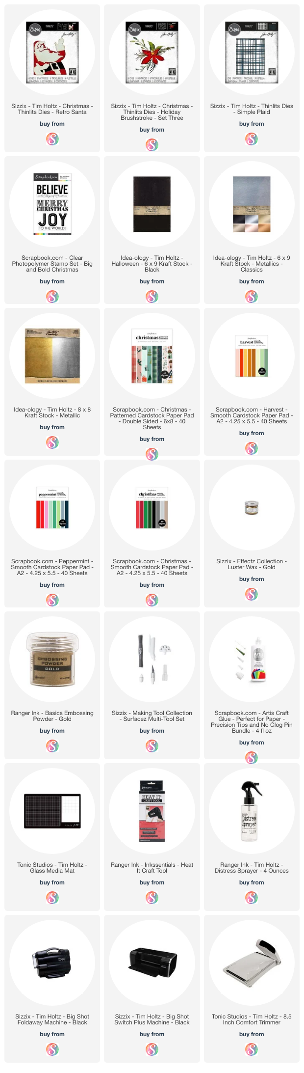
Below you can find the products I used to create this card along with compensated affiliate links to Scrapbook.com. These links are at absolutely no cost to you. When you shop through the links below, I receive a small commission from Scrapbook.com. These links are at absolutely no cost to you and the commission I receive helps me cover the costs of my blog and other expenses, which allows me to continue to provide you with FREE inspiration and tutorials. If you want to learn more about what an affiliate link is, you can see my full affiliate and product disclosure statement here. Thank you so much for your love and support!
It has been ages since I did a Workspace Wednesday post. But, I recently acquired a couple of new products that are changing the way I work in my craft room and I wanted to share about them with you.
SELF-HEALING WORKSPACE MAT
First up is the new Self-Healing Workspace Mat. While I love my Tim Holtz Glass Media Mat, when I'm filming my videos, I can't use it because of the glare from my lights. This new mat from Scrapbook.com is absolutely perfect for filming my videos, plus it has some great features that make it a wonderful mat to work on when I'm creating.
It is made of recycled materials, which are a self-healing cutting material. This means you can use your craft knives and other sharp tools on it without damaging it. The self-healing property is a wonderful feature to have for nearly every crafting project. It measures 23" x 17" which is a great size for protecting your work surface.
My favorite part however, is that it has marked white grids in a 1 inch system. Many of the mats out there have the metric system on them as well, but I don't use that measuring system very often, so I frequently get frustrated trying to measure something on my mat and I just want to know the inches.
8.5 X 11 STACKABLE PAPER TRAYS
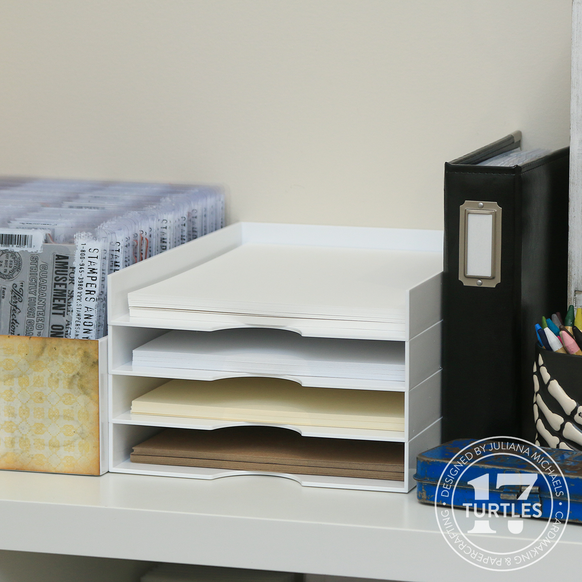
The next new item are these 8.5 x 11 Stackable Paper Trays. They are sold in packs of two and each tray measures 9 x 11.5 inches and is approximately 1.46 inches tall. Each tray holds approximately 100 pieces of paper per tray, depending on the thickness of your paper.
I'm using them to store and organize my Tim Holtz Distress Papers. Here I'm using them to store my Distress Watercolor, Distress Heavystock, Mixed Media Heavystock and Kraft Heavystock. They come in both white and clear, so you have options to choose from when selecting which one might fit your craft room style.
If 8.5 x 11 is not your preferred paper size, these trays are also available in a 12x12 size.
So, do either of these products interest you? Are they something you would like to have in your craft room? I'd love to hear your thoughts on them and if you have any questions, just ask.
MORE STORAGE & ORGANIZATION IDEAS
For more storage and organization ideas, make sure to check out my Craft Room Tour 2023.
Or some of my past Workspace Wednesday and Organization posts:
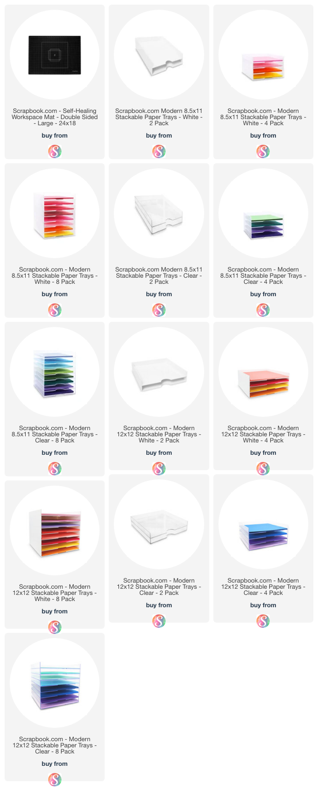
Below you can find links to the Self-Healing Workspace Mat and Stackable Paper Trays. These are compensated affiliate links to Scrapbook.com and there is absolutely no cost to you when you click on them. When you click on them and then shop through them, I receive a small commission from Scrapbook.com. This helps support me and I truly appreciate that so very much! If you want to learn more about what an affiliate link is, you can see my full affiliate and product disclosure statement here. Thank you so much for your love and support!
Hello beautiful crafty people and welcome! In this post, I'm kicking off my Christmas in July series where each week during the month of July I'll be sharing a new video over on my YouTube channel and creating a Christmas card using supplies from my stash. My hope is to inspire you to get an early start on your Christmas cards and use some of those amazing products you already own!
In the write up below I'll be sharing the highlights for creating this card. If you would like more details, including tips and tricks, make sure to watch the video below or you can check it out over on my YouTube Channel.
If you're interested in using the exact products I have used, they will be linked in the supplies list below and when you shop through those links, it helps support me and I really appreciate that so much!
For this card, I'll be working with the Tim Holtz Sizzix Retro Santa Die Set, the Tim Holtz Sizzix Simple Plaid Die Set, the greenery from the Tim Holtz Sizzix Holiday Brushstroke 3 Die Set and the Scrapbook.com Big and Bold Christmas Stamp set. If you don't have these dies look to see what you have in your stash that is similar.
I'll be using papers from the Scrapbook.com Christmas, Peppermint and Harvest Smooth Cardstock Paper Pads and the Christmas Patterned Paper Pad. I also use a small piece of gold metallic cardstock and for the plaid die I use a piece of Tim Holtz Black Kraftstock. But feel free to use any cardstock you have on hand.
BELIEVE IN THE MAGIC CHRISTMAS CARD
I began by die cutting all of my pieces from different colors of cardstock. The paper I'm using here has a white core and to add a little distress, I'm going to sand the edges of all of the greenery pieces, the plaid die cut and the red layer of the Retro Santa to reveal that white core. I used a Ranger Sanding Disk attached to a blending brush handle, but you could also use a piece of sandpaper. If you are working with regular cardstock, you can skip this step. If you are wanting to add some interest you might consider inking the edges of the paper with a darker color of ink or my favorite Vintage Photo Distress Ink!
Before I assembled the Santa I trimmed off the face part of this layer to leave just the beard, mustache and hat trim. Because I removed the white part, I needed to fill that in with something besides red, so I cut that layer twice, once from red and once from a skin toned color. Next, I added pink highlights on the skin toned paper to his nose and cheek areas using Spun Sugar Distress Oxide Ink. I then trimmed off the areas that I wanted to remain red, which are his hat and coat.
After trimming these pieces, I inked the edges of the white die cuts using Walnut Stain Distress Ink. I then assembled the layers using a new to me adhesive...Artis Glue from Scrapbook.com. It comes with 3 different tips to allow you to apply more or less glue and a pin for cleaning them. It's a fast drying adhesive that dries clear but is water based so it cleans up easily. And I'm must say, I'm loving it! This is also my first time to use a precision tip and it is such a game changer when trying to apply adhesive to small and intricate die cuts.
Now onto the plaid die cut. I cut this from Black Kraftstock, which has a kraft core, but you can use any black cardstock if you prefer. I then applied a bit of Sizzix Luster Wax in Gold here and there for a bit of shine and interest. This is another step you could skip if you wanted to.
The size of this card is A6 which is 4.5 x 6.25 inches. I cut a piece of white cardstock to this size and then a piece of patterned paper to 4.25 x 6 inches to layer on top of it. I ink the edges of the white cardstock with Walnut Stain Distress Ink. Next, I used the distressor tool, which is part of the Sizzix Surfacez Multi-Tool Set, to distress the edges of the piece of patterned paper. This adds a little bit of texture, but you could easily skip this step. I then lightly inked the edges of this with Walnut Stain Distress Ink.
Next I trimmed down the plaid die cut to fit inside the patterned paper. I cut it down to 4 inches wide. I also trimmed the frame part off of the top edge. The bottom part is hidden underneath the sentiment, so I didn't trim anything off of that end.
For the sentiment I used the Believe in the Magic stamp from the Scrapbook.com Big Bold Christmas Stamp Set. I stamped it using Versamark Watermark Stamping Pad which is an embossing ink onto white cardstock. I sprinkled it with Gold Embossing Powder, tapped off the excess and heat set it using my heat tool. I trimmed this piece down to 1.75 x 4 inches to fit along the bottom of the card and then inked the edges with Walnut Stain Distress Ink.
Next, I adhered the card base layers together. I then adhered the plaid die cut, using the Artis Glue and the precision tip which was perfect for adhering this delicate die cut.
Before adding the greenery, I adhered the Santa but only put adhesive on the left side of the die cut so that I could more easily tuck the greenery pieces behind it. I then adhered them using the Artis Glue. Once I got all of the greenery pieces adhered, I added more adhesive to the back side of the Santa.
And there you have it! I hope you enjoyed this first Christmas card in my Christmas in July Series! Stay tuned for card number 2, coming next week.
SUPPLIES FOR BELIEVE IN THE MAGIC CHRISTMAS CARD
Below you can find the products I used to create this card along with compensated affiliate links to Scrapbook.com. These links are at absolutely no cost to you. When you shop through the links below, I receive a small commission from Scrapbook.com. These links are at absolutely no cost to you and the commission I receive helps me cover the costs of my blog and other expenses, which allows me to continue to provide you with FREE inspiration and tutorials. If you want to learn more about what an affiliate link is, you can see my full affiliate and product disclosure statement here. Thank you so much for your love and support!
If you struggle when it comes to adhering small, delicate die cuts, they you must check out Artis Glue by Scrapbook.com. It's an adhesive game changer! With Artis Glue and it's precision tip there will be no more frustration when it comes to adhering those tiny die cuts. If you aren't familiar with Artis Glue, keep scrolling to find out why you need Artis Glue by Scrapbook.com.
I don't know about you, but I am constantly frustrated when it comes to adhering small, delicate die cuts. Nothing is more irritating than getting adhesive where you don't want it or getting too much adhesive that squishes out all over the place. Artis Glue is a fast drying adhesive that is perfect for all of your favorite paper crafting and mixed media projects!
Artis Glue is non-toxic, acid free and photo safe. It dries clear with a glossy finish and is wrinkle and clump resistant. It can be used to adhere paper, fabric, wood and leather. It is also water based, which makes clean up much easier. Along with these fabulous qualities it comes with 3 different tips
It comes with 2 interchangeable tips for applying the glue that include a fine tip made from plastic and an ultra fine precision tip made from stainless steel. It also comes with a pin that you can use to clean out the ultra fine tip. The pin however, is not made from stainless steel, so they recommend that you only use it for cleaning out the tip. When you aren't using the adhesive they recommend replacing the application tip with the storage tip.
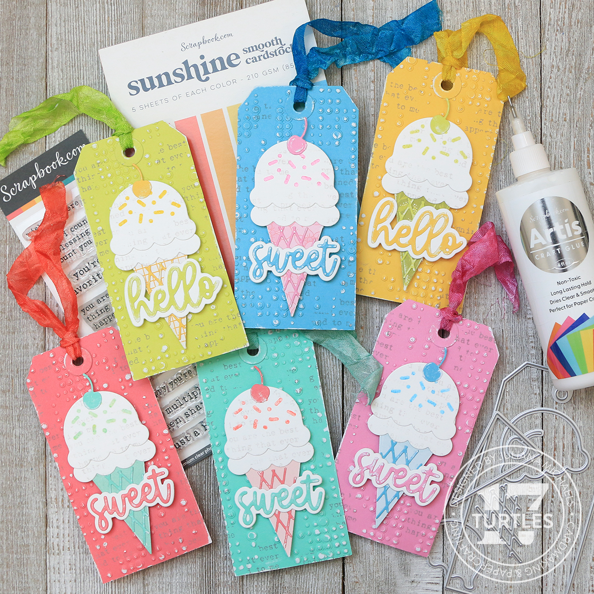
Now that you know a little bit more about Artis Glue from Scrapbook.com, let me share set of gift tags I made using this game-changing adhesive. It's sure to become your favorite new adhesive!
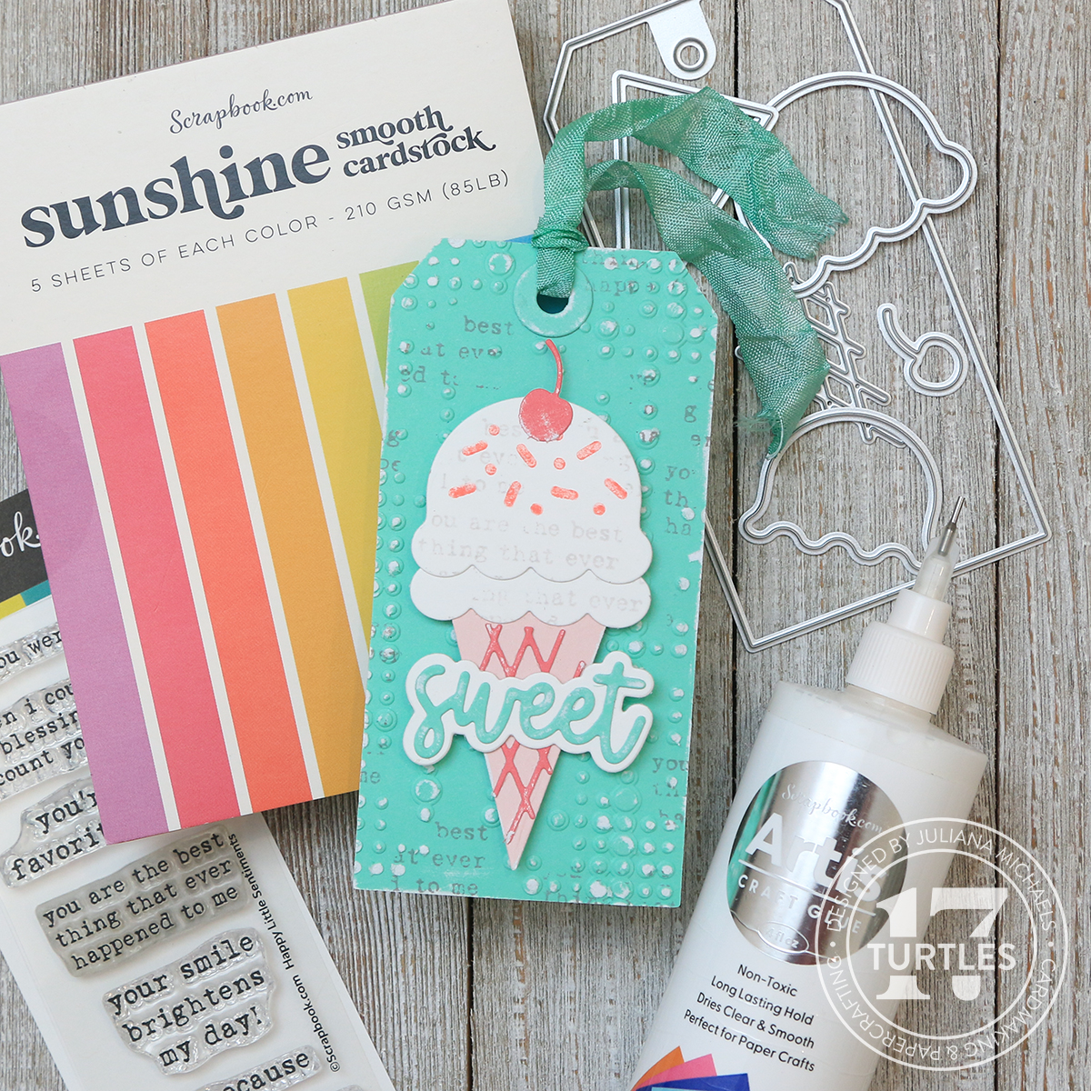
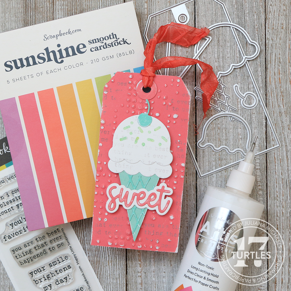
I used Artis Glue in several locations on each tag in combination with the Sweet Scoops Die Set. I used it to adhere the delicate die cut layer on top of the ice cream cone. The ultra fine precision tip allows you to easily apply the tiniest amount of adhesive without getting more than you want or getting it all over where you don't want adhesive. I also used it to adhere the die cut sentiment layers together.
It came in handy once again to adhere the cherry on top of the ice cream scoops as well as for a the hole reinforcer on the tag.
With each use, I fell more in love with this glue and that ultra fine tip took it too the next level!
Of course the tags aren't all about adhesive, so I'll share a couple of other details on how I created them. The tag base is cut from the Sunshine Paper Pad by Scrapbook.com using the Yay Tag Die Set. I then embossed each one using the Tim Holtz Dotted Embossing Folder and lightly sanded it using a Ranger Sanding Disk to reveal the white core and add a touch of texture and interest.
I added some stamping detail using a stamp from the Happy Little Sentiments Stamp Set. I inked it with Hickory Smoke Distress Oxide Ink and then used my fingers to randomly stamp small sections of the image onto the tag.
I used this same stamping technique to add interest to the ice cream scoop layers with Lost Shadow Distress Oxide Ink. The sprinkle details were stamped using the Sweet Scoops Stamp Set in various colors of Distress Oxide Ink that I stamped first onto a piece of scrap paper and then onto the die cut to lighten the color. The Distress Oxide colors I used are Abandoned Coral, Cracked Pistachio, Picked Raspberry, Salty Ocean, Mustard Seed, and Twisted Citron.
The final touch on each tag was the addition of ribbons, which are hand dyed using Distress Ink and Hug Snug Seam Binding. The Distress Ink colors I used are Abandoned Coral, Cracked Pistachio, Picked Raspberry, Salty Ocean, Mustard Seed, and Twisted Citron.
I hope you enjoyed learning about Artis Glue from Scrapbook.com and how a precision tip can be game changing for adhering small, delicate die cuts!
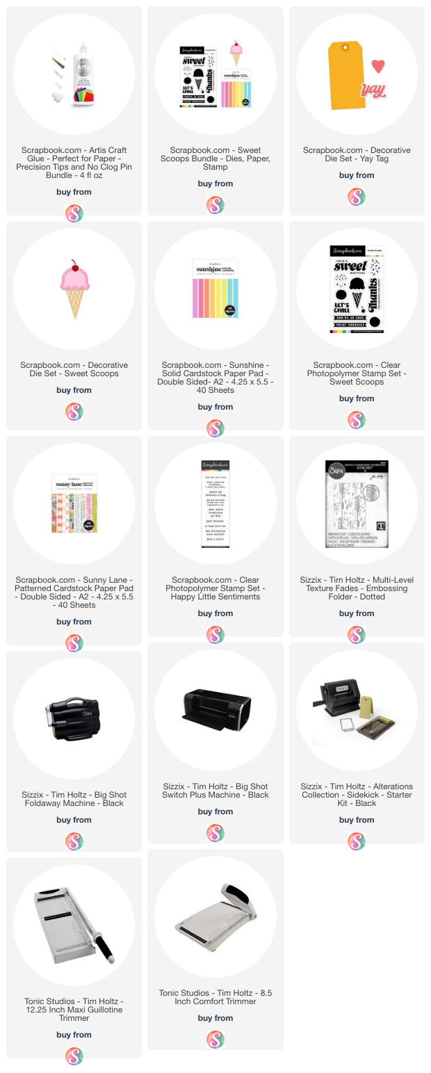
Below you can find links to the products I used in this post. These are compensated affiliate links to Scrapbook.com and there is absolutely no cost to you when you click on them. When you click on them and then shop through them, I receive a small commission from Scrapbook.com. This helps support me and I truly appreciate that so very much! If you want to learn more about what an affiliate link is, you can see my full affiliate and product disclosure statement here. Thank you so much for your love and support!
Hello friend! Thanks for stopping by today. I'm excited to share that I have a new video up on the Scrapbook.com YouTube Channel where I'm sharing how you can mix and match just three Distress Oxide Ink colors to create a rainbow of possibilities for card backgrounds. I'd love for you to check it out!
If you want to check out any of the supplies I'm using I have them linked down below. Using those links helps support me, so I really appreciate it! But please don't feel you need to use these exact supplies. You can certainly use what you already have that may be similar. Now let's get on with the making!
COLOR WHEEL
Many of you probably learned about the color wheel in elementary school and about the primary colors of red, yellow and blue. These colors can not be created by mixing other colors together, which is why they are called the primary colors. And when you mix together any 2 of these 3 primary colors you create the secondary colors which are orange, green and purple!
I used Distress Oxide Inks in Picked Raspberry, Mustard Seed, and Salty Ocean as my primary colors, with Picked Raspberry as the red, Mustard Seed as the yellow and Salty Ocean as the blue. But feel free to use any combination of colors you have on hand just as long as they are a red, yellow and blue.
I mixed 2 of these colors to create a secondary color and you can get a completely different look just by switching which color you start with and you can create a rainbow of backgrounds when you mix and match just 2 of the colors.
OTHER PRODUCTS USED
Here are the other products I used, but feel free to use any similar type products you have in your stash. Along with Distress Oxide Inks in Picked Raspberry, Mustard Seed, and Salty Ocean I also used Frayed Burlap. I used the Wordfetti Sunny Days Stamp set for the sentiments and scroll stencil from the Tim Holtz Mini Stencil Set 25. I also worked with the 3 leaf dies from Scrapbook.com Layered Roses Bundle Die Set and the detailed butterfly images from the Scrapbook.com Butterflies 1 Die Set. And last but not least, I used the largest circle and rectangle shapes from the Tim Holtz Vintage Labels Thinlits Die Set.
INK SMOOSHING TECHNIQUE DISTRESS OXIDE INKS
The paper I used is Distress Watercolor Paper cut down to 4.25 x 5.5 inches. I highly recommend using a paper made for getting wet such as watercolor paper for this technique as it can handle the water. For the first two backgrounds I created, I combined Picked Raspberry and Mustard Seed using the Ink Smooshing Technique. I used this same technique to create all of the backgrounds, but I used different color combinations for each one.
For this technique, all you do is take an ink pad and smoosh it onto a craft mat, spritz it with some water (I use a Distress Sprayer to spritz the water) and then smoosh your paper into the ink. The gentler you smoosh and the less paper you smoosh into the ink, the less ink you pick up. The harder you smoosh and the more paper you smoosh into the ink, the more ink you pick up.
I started off by applying Picked Raspberry to my craft mat and spritzed it with water. Before I smooshed the paper into the ink, I used my finger to gently tap into the ink and break up the harsh edges and create some larger droplets. Next, I gently smooshed the paper into the ink, pushing small sections of the paper into the ink so that I didn't completely cover the paper with ink. This allowed me to leave some white areas for the next step. I then used my heat tool to dry the ink.
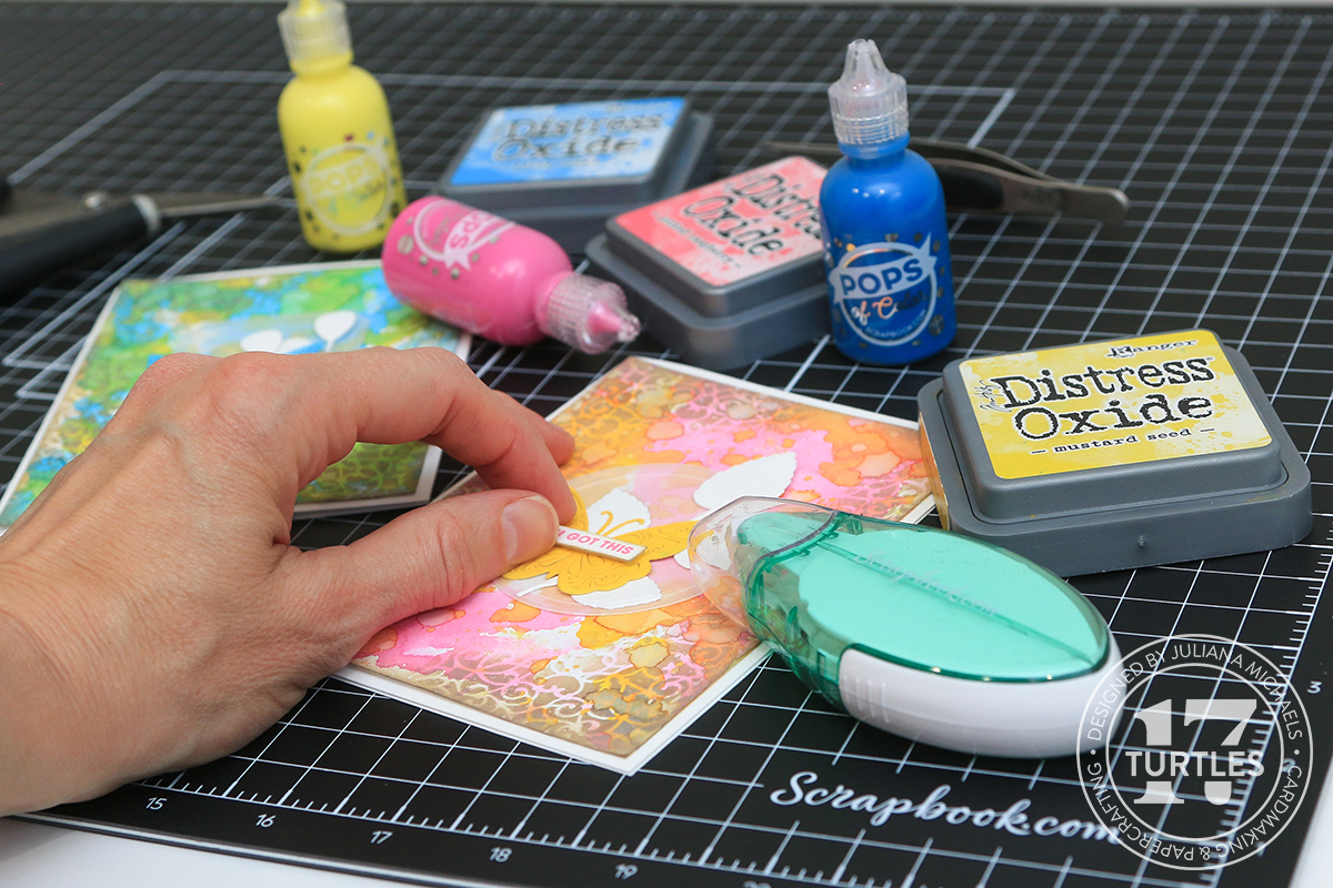
Next up, I started mixing colors. I cleaned off my craft mat and smooshed the Mustard Seed Ink Pad onto my craft mat, spritzed it with water and tapped around the ink to break up the droplets. I then smooshed the piece of Distress Watercolor Paper with the Picked Raspberry on it into the Mustard Seed ink. I made sure to get some of the yellow ink onto the white areas and onto the pink ink areas as well. By mixing it into the pink you get a gorgeous orange color! If you have a small area where you want a bit more color, you can use your finger to kind of finger paint the ink where you want it. You can also use a brush to pick up some of the ink from your craft mat and add some splatters.
With that panel completed, I repeated the same process but I started with Mustard Seed and then added Picked Raspberry.
Here's a look at the two backgrounds I created by mixing the Picked Raspberry and Mustard Seed. The one on the right is the one where I used Picked Raspberry first and then Mustard Seed and with this one you get a more vibrant orange. The one on the left is the one where I used Mustard Seed first and then added Picked Raspberry. On this one the colors when mixed together create a beautiful coral color. Isn't it amazing how the same two colors create such different looks just by switching which color you start with?! Do you have a favorite? (I will also share that this is much more obvious in real life and even in the video as compared to the photos seen here.)
For this next set of backgrounds, I used Mustard Seed and Salty Ocean. I repeated the exact same process as above. Below you can see the two backgrounds I created by mixing the Salty Ocean and Mustard Seed. The one on the left is the one where I used Mustard Seed first and then added Salty Ocean. On this one the colors when mixed together create a turquoise color. The one on the right is the one where I used Salty Ocean first and then Mustard Seed and with this one you get more of and chartreuse color. Once again it just amazes me how the same two colors create such different looks when you switch which color you start with! Which one do you like better?
Now I'm moving on to the third and final color combination....Salty Ocean and Picked Raspberry. And here's a look at the two backgrounds I created by mixing the Salty Ocean and Picked Raspberry. The one on the left is the one where I used Salty Ocean first and then added Picked Raspberry and the one on the right is the opposite mix. I was surprised by the result here because when these two colors are mixed they make a beautiful purple color and they seem to create the same purple color regardless of which color you start with.
Once I had the backgrounds completed, I took my paper trimmer and cut each one down to 4 x 5.25 inches because I'm going to mat them later on to create a standard A2 size card which is 4.25 x 5.5 inches. You could also do this step to start before you begin applying the ink.
STENCILS WITH DISTRESS OXIDE INK
Now it's time to add some stencil detail. I used the Ornate stencil from the Tim Holtz Mini Stencil Set 25, but feel free to use any stencil you like. I love the delicate design of this one. I applied the ink using an ink blending brush. I personally prefer to use a blending brush when I apply ink through a stencil as it tends to get into the tiny nooks of stencils and create a more detailed design.
I applied Frayed Burlap Distress Oxide ink through the stencil in the upper left hand corner and then the right lower corner to bring your eye across the background. I repeat this process on each of the background papers. I probably should have switched up the stencil, but I was on a roll and I really love the design of this one.
Once I was finished with the stencil work. I applied Frayed Burlap to the edges of the backgrounds using a foam blending tool. You can apply it directly to the edge of the paper or you can lay the paper flat and apply the ink in a circular motion going from the craft mat onto the edge of the paper. When doing it this way, I like to tilt the tool at an angle so I don't get more ink on the paper than I want.
After I finished all of the inking, I spritzed each panel with my Distress Sprayer to reactivate the inks and create a little more interest. I then used my heat tool to dry them.
DIE CUTS
With the backgrounds finished, I moved onto creating some embellishments. I picked three of the backgrounds I created to make the completed cards. I used the Tim Holtz Vintage Labels Thinlits to die cut some vellum. These dies have a inside border that is embossed into the paper when you run it through your die cutting machine. I've found the Scrapbook.com Magic Mat to produce the most noticeable embossing as compared doing it with a regular cutting plate because the surface is self-healing.
Next up, I die cut the three different butterflies using the Scrapbook.com Butterflies 1 Die Set from Neenah White Cardstock. I left the die cuts in the paper to help hold them in place while I added color to them using Distress Oxide Inks. I used an ink blending brush to apply Picked Raspberry, Mustard Seed, and Salty Ocean to each of the butterflies. Normally I would knock the insides of the die cuts out, but I kind of liked how these looked with all the little pieces still in place. If yours want to fall out, you could always put some washi tape on the backside to help hold them in place, or you could remove the insides to get a more delicate look.
For another layer of interest, I die cut some of the leaves from the Scrapbook.com Layered Roses Bundle Die Set from Neenah White Cardstock. From there it was just a matter of mixing and matching the labels, butterflies and leaves to create a little cluster for each card. Once I was happy with each arrangement, I adhered it to the card front using Scrapbook.com Refillable Permanent Adhesive Roller. I then finished off each card with a sentiment from the Scrapbook.com Wordfetti Sunny Days Stamp set which I stamped in each of the Distress Oxide colors onto Neenah White Cardstock. I then trimmed each into a strip, inked the edges with Frayed Burlap Distress Oxide Ink and adhered them to the card front using Scrapbook.com Double Sided Adhesive Foam Strips.
DISTRESS INK PAD STORAGE TIN & MORE COLOR COMBINATIONS
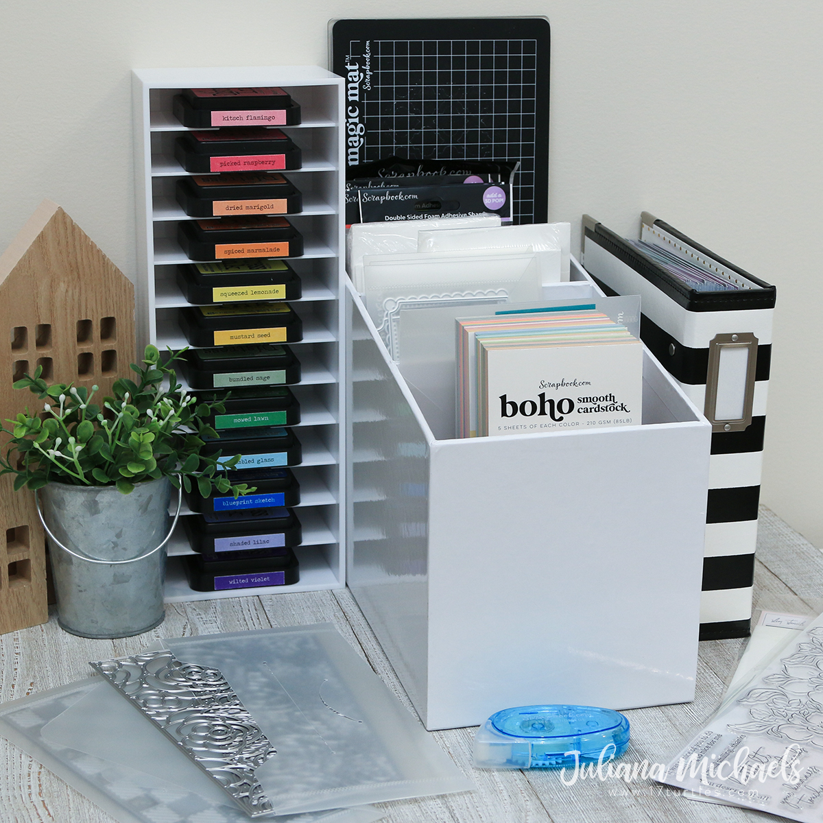
Before I go, I want to share with you about a way to store your Distress Oxide Inks using the Distress Ink Pad Storage Tin. This metal tin has a hinged lid with a clasp. It also has an insert that will hold 15 Distress Ink Pads.
After creating with Picked Raspberry, Mustard Seed, and Salty Ocean to make the cards I shared with you, I was inspired to pull together some other color combinations and colors to fill up the tin. Fossilized Amber, Lumberjack Plaid and Uncharted Mariner would be great for a slightly more moody primary color combination. To get a little more on the lighter side Scattered Straw, Saltwater Taffy and Salvaged Patina would make a great combo. I then had to add in a couple of my favorite neutrals which included Vintage Photo and Brushed Corduroy. And because in my book one can never have too many neutrals, I added in Walnut Stain, Lost Shadow and Black Soot. This is just what I would fill my tin with, but you could certainly add in whatever colors tickle your fancy. Create your own rainbow of colors by adding in some secondary colors such as Carved Pumpkin, Mowed Lawn and Wilted Violet. What colors would you add to your tin?
I hope you enjoyed the techniques and inspiration I shared using Distress Oxide Inks for creating your own rainbow of colorful backgrounds and cards.
SUPPLIES
Below you can find the products I used to create these cards along with compensated affiliate links to Scrapbook.com. These links are at absolutely no cost to you. When you shop through the links below, I receive a small commission from Scrapbook.com. These links are at absolutely no cost to you and the commission I receive helps me cover the costs of my blog and other expenses, which allows me to continue to provide you with FREE inspiration and tutorials. If you want to learn more about what an affiliate link is, you can see my full affiliate and product disclosure statement here. Thank you so much for your love and support!