Hey crafty friends! Today I'm sharing a One Stamp Set Five Ways blog post. This is something a little different for me, but when I started playing around with the Scrapbook.com Spring Sprigs Stamp Set I just couldn't stop. I came up with so many ideas and I wanted to share all of them with you. I mostly used the Spring Sprigs Stamp Set to create backgrounds, but each technique is totally different. I also mixed in some die cuts for a bit of texture and added interest.

Distress Ink Stamp and Smoosh Technique
My first card features a favorite technique of mine...Distress Ink Stamp and Smoosh.

Before we get to this technique though, I began this card by randomly stamping the images from the Spring Sprigs Stamp Set onto a piece of Distress White Heavystock using embossing ink. I sprinkled them with white embossing powder and then heat embossed it using a heat gun. I like to use my stamp positioning tool when creating "random" stamped backgrounds. I play around with their position until the space is filled, stamp that section, heat emboss it and then repeat to fill up the rest of the card front.

Once the entire background was stamped and heat embossed, I then used the Distress Ink Stamp and Smoosh technique. For this technique, you stamp your ink pad onto a craft mat, spritz it with water and then smoosh your paper into the ink. Dry the paper with your heat tool and repeat the smooshing and drying until you are happy with the results. On this card I used Salvaged Patina Distress Ink. I then created a little interest by adding some ink splatters using Black Soot Distress Ink. To do this, I just unscrew the lid and then flick the end of the tube to create the splatters.

With the background completed, I trimmed the card down to 4 x 5.25 inches and adhered it to a piece of cardstock from the Scrapbook.com Boho A2 Paper Pad. Next, I added a couple of plain die cuts using the Tim Holtz Wildflower Stems 1 and Wildflower Stem 2.

For the sentiment, I die cut the Happy die from the Scrapbook.com Birthday Celebration Sentiments Dies. I wanted the sentiment to have some dimension, so I adhered the paper to a strip of 2" Double Sided Foam Adhesive and then die cut the word from it. It's a little tricky removing the die from the paper, but it's so much easier in my opinion than trying to glue layers of die cuts together to get the same look. To finish off the card, I added the word "birthday" which I typed out, trimmed to size and adhered with strips of double sided foam adhesive.

Distress Oxide Stamp and Smudge Technique
This second card uses one of my favorite techniques - Distress Oxide Stamp and Smudge.

It's such a fun and easy technique. You simply stamp each image using Distress Oxide Ink. After you stamp the image you use a paper towel or soft cloth to smudge the ink while it is still wet. On this card I used Distress Oxide Ink in Rustic Wilderness, Bundled Sage, Salvaged Patina and Peacock Feathers. To create this background, I randomly stamped the images onto the paper to create my own custom background. I then inked the edges with a bit of Salvaged Patina Distress Ink.

To finish off the card, I added a die cut sentiment from the Scrapbook.com Thank You Sentiments Dies and used the same technique I used on the first card.

Circular Stamping Technique
My third card only uses one stamp from the set, but I love the effect. All I did was stamp the image in a circular pattern from the center of the card front.


With the background completed, I die cut it using this beautiful Diagonal Stitched Rectangles die from Pinkfresh Studio. I then layered on a die cut butterfly created using the Tim Holtz Butterflies Thinlits. For the sentiment I used the same technique with the paper and double sided foam adhesive with a word die from the Pinkfresh Studio Exclusive Thin Words Everyday Script Dies.

Wreath Stamping Technique
Tone on Tone Background Technique
On this 4th and final card, I used the Spring Sprig Stamps in two ways. I created a wreath and a tone on tone background. To make the wreath, I choose three stamps to use and I trimmed a piece of cardstock to a square. I then placed my stamp near the top of my paper and used my stamp positioning tool to stamp the image. I then rotated the paper a quarter turn and stamped the image again. This way the square paper is important. As you turn the paper, the stamp stays in the same place and creates a circle.

I repeated this rotating and stamping for a total of four times which created my first part of the wreath. I repeated this stamping and rotating for the second stamp and then the third stamp. I used Black Soot Archival Ink and then water colored the image using a water brush and Distress Ink in Salvaged Patina, Bundles Sage and Rustic Wilderness. Once the coloring was completed, I used a pair of scissors to fussy cut the wreath.

For the tone on tone background, I once again created a background by laying out my stamps using my stamp positioning tool. I then stamped them with Salvaged Patina Distress Ink onto a slightly lighter color of cardstock from the Scrapbook.com Cools A2 Paper Pad.

To finish off the card, I added a die cut sentiment using the Scrapbook.com Thank You Sentiments Dies. I die cut it from white cardstock adhered to double sided foam adhesive, like I did on the previous cards. However, I also die cut it from black cardstock and slightly offset it to achieve a shadowed effect.

I hope you all enjoyed my One Stamp Set 5 Ways blog post today. It was definitely a fun challenge for me to use one set multiple times and with a slightly different technique each time. By using similar colors throughout though, it made the process rather easy and enjoyable.

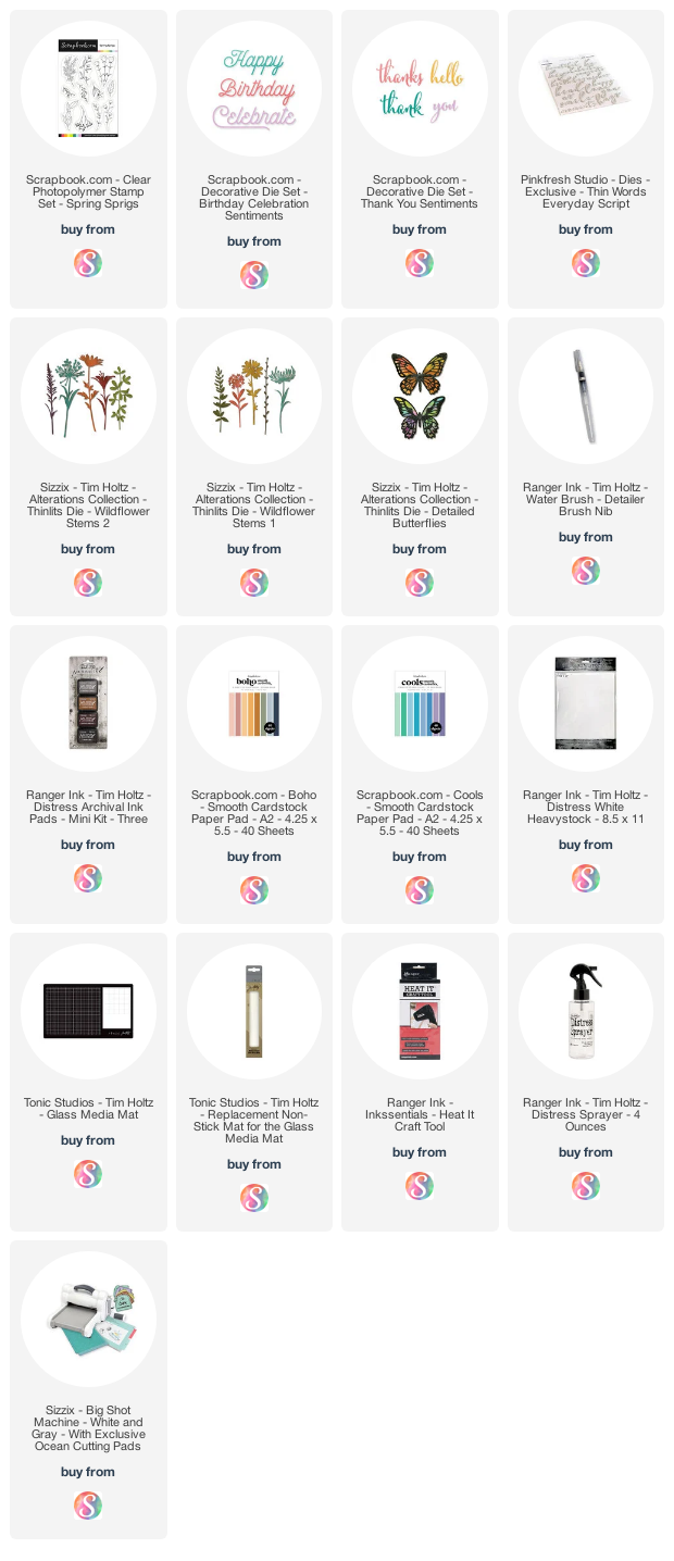
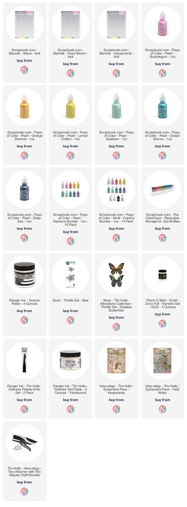
Supplies
Below you can find the products I used to create this project along with compensated affiliate links to Scrapbook.com. These links are at absolutely no extra cost to you. If you want to learn more about what an affiliate link is, you can see my full affiliate and product disclosure statement here.