Showing posts with label Christmas. Show all posts

Christmas Home Decor Tag | Tim Holtz Sizzix Colorize + Accessories

If the Halloween tag I shared earlier this week had you excited about the new Sizzix Colorize + Accessories collection, just wait until you see this one! Meet Harrison the lion — and he is dressed to the nines and ready for Christmas!

Christmas Toys Harrison the Lion Christmas Tag by Juliana Michaels featuring Tim Holtz Sizzix Harrison Colorize and Accesories

This project was also featured in Tim's live release party on YouTube, so if you caught the live you may have already spotted him! If you missed it, the replay is up on Tim's channel and I cannot recommend it enough. Seeing all of the inspiration from the designers in one place is so much fun, and this collection truly lends itself to so many creative possibilities. The Mini Colorize characters, the re-released originals, and the Accessories dies are such a brilliant combination — you really can create something unique for every season and occasion.

Harrison is wearing his best top hat with a sprig of holly and a dapper bow tie, surrounded by Christmas gifts and that gorgeous pine trim along the bottom. I used Christmas themed ephemera for the background to give it that warm, vintage holiday feel. Just like with my Halloween tag, I colored all of the die cut pieces with Distress Paints and I cannot imagine going back to anything else. The paint holds up so beautifully during assembly — no worrying about smudging or smearing while you're layering everything together.

The Distress Paint colors I used for Harrison are: Antique Linen, Frayed Burlap, Brushed Corduroy, Gathered Twigs, Walnut Stain and Black Soot.

The Distress Paint colors I used for the presents and the hat trim are: Lumberjack Plaid, Peeled Paint and Rustic Wilderness.

This is also made on a Tim Holtz Etc Tag, so just like Winifred's Halloween tag, Harrison is sturdy enough to display as a home decor piece all through the Christmas season. I am already thinking about where to put him! And this size is even small enough that this could easily be turned into a Christmas ornament by adding a bit of ribbon or twine!

I'd love to know — are you planning to create with this collection? Which character is calling your name? Let me know in the comments!

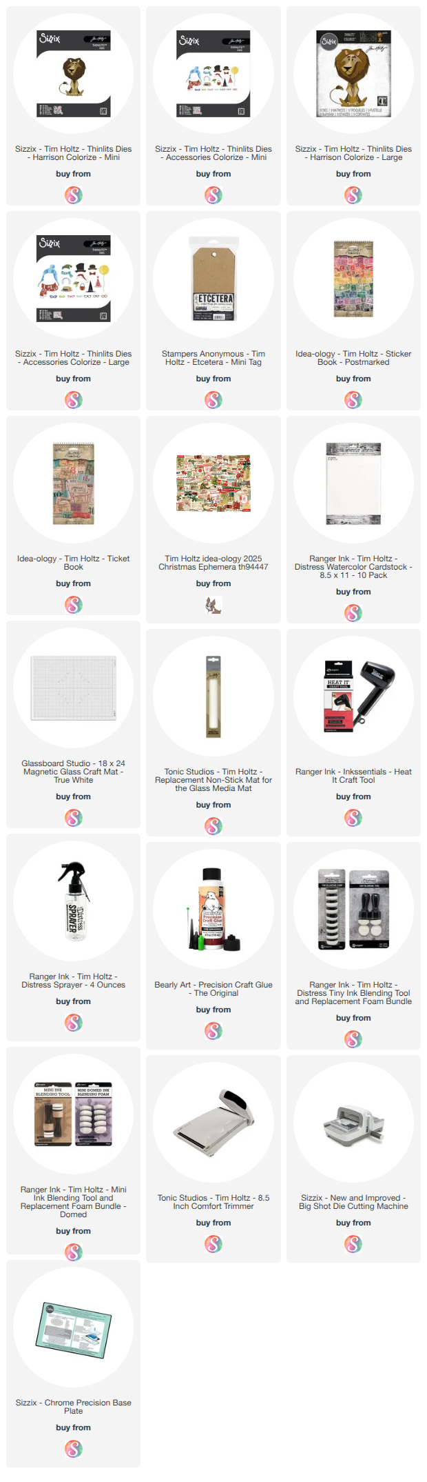
Supplies

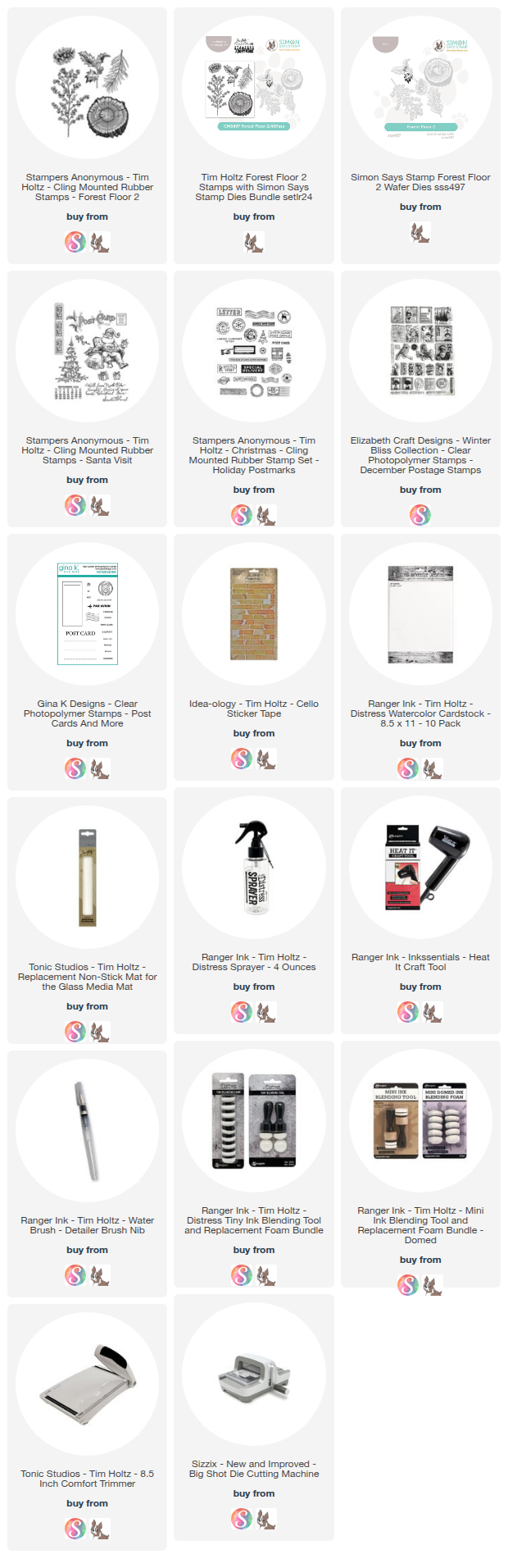
Below you will find links to the supplies I used to create this project. When you shop through these links—whether you purchase that exact item or something else entirely—you're supporting me at no extra cost to you. The commission I receive helps me cover the costs of my blog and other expenses, and allows me to continue providing you with FREE inspiration and tutorials. If you want to learn more, you can see my full affiliate and product disclosure statement here. Thank you so much for your love and support!

Watercoloring with Tim Holtz Mini Distress Oxides | Vintage Christmas Card Tutorial

I don't know about you, but I'm super excited that the final 24 Mini Distress Oxides from Tim Holtz and Ranger Ink are here! This means the entire Distress palette is now available in mini oxide form—perfect news for those of us with "whole collection syndrome"!

Why I'm loving the minis:

  • They take up less space in your craft room and on your work surface
  • They enable techniques that are difficult (or impossible) with larger pads
  • When watercoloring, you're not wasting nearly as much ink
  • They create a beautiful creamy, dreamy watercolor effect

Watercoloring with Distress Oxides: Yes, You Can!

You might be wondering: can you actually watercolor with Distress Oxides? Yes! They're water reactive, just like regular Distress Inks. The only catch? You'll want to restamp your images after watercoloring to bring back the crisp details. The result is that gorgeous creamy, dreamy effect—dimensional watercolor with rich, opaque color and sharp definition. I'll show you exactly what I mean in this tutorial.

A Sweet Personal Touch

Before we dive into the technique, I have to share a special detail on this card. That vintage postage stamp? It's a real stamp from the Netherlands, sent to me by my sweet friend Saskia! Look closely and you'll see the stamp features my name—it's a Queen Juliana stamp (she was Queen of the Netherlands). Saskia generously sent me several of these treasures, and while I usually struggle with "ruining" anything vintage by actually using it, I forced myself to incorporate it here. It was the perfect finishing touch for my faux vintage postcard background, and I couldn't love it more!

Now let's get into the making of it!

Creating the Vintage Postcard Background

I started with Distress Watercolor Cardstock cut to 4 x 5.25 inches. I ink smooshed it into Old Paper Distress Ink spritzed with water, then dried it with my heat tool.

Next, I stamped various postcard images onto the paper using Black Soot Archival Ink and stamps from Tim Holtz, Elizabeth Craft Designs, and Gina K Designs. (I might or might not have a small collection of postcard and postage-themed stamps!) I hand-wrote a note, added a festive faux address, and stamped a postmark cancellation image in the bottom left corner to add another touch of red and create a visual triangle.

After inking the edges with Frayed Burlap and then Scorched Timber Distress Oxide, I added the vintage postage stamp and additional postmark cancellation images. I distressed the edges with the backside of my craft knife and added a few pieces of Tim Holtz Cellotape for vintage flair.

The finished background was adhered to kraft cardstock that I'd inked with Scorched Timber Distress Oxide and spritzed with water for a beautifully aged effect.

The Watercoloring Technique

Here's where the magic happens! For the focal images, I used stamps from Tim Holtz's Forest Floor 2 collection, stamping them with Black Soot Archival Ink onto Distress Watercolor cardstock.

Pro tip: I highly recommend using a stamping platform for this technique. Here's the step-by-step process:

Step 1: Stamp Your Image

Stamp your image with Black Soot Archival Ink (or any permanent, waterproof ink) onto Distress Watercolor cardstock. Leave the paper in the exact same spot in your stamping platform—don't move it!

Step 2: Prepare Your Colors

Smoosh your chosen Distress Oxide color onto your craft mat. Use a waterbrush or paintbrush with water to pick up the ink.

Step 3: Apply Lighter Colors First

Apply your lighter colors to the open areas of the stamped image. Work from light to dark for the best results.

My color choices:

  • Berries: Barn Door (light) and Aged Mahogany (dark)
  • Leaves: Shabby Shutters (light) and Forest Moss (dark)
  • Stem and tree slice: Frayed Burlap (light) and Scorched Timber (dark)

Step 4: Add Darker Shades

Once the lighter colors are applied, add your darker shades to the shadow areas indicated in the stamped image. This creates beautiful dimension.

Step 5: Let It Dry

Allow your watercoloring to dry completely before the next step.

Step 6: Restamp for Crisp Details

Here's the game-changer! Once your watercoloring is dry, reink the stamp and restamp your image right over the watercolored area. Look how it brings the image back to life!

Why Restamping Makes All the Difference

Because Distress Oxides contain pigment ink (along with dye ink), they're more opaque than regular Distress Inks. This creates that beautiful, creamy, dreamy watercolor effect—but it can also cover up fine stamping details. Working in your stamping platform allows you to perfectly restamp the image and restore all those delicate lines and details.

The result? Gorgeous, dimensional watercolored images with crisp definition. It's the best of both worlds!

Adding the Sentiment

The final touch was the "Merry" sentiment, which I die cut multiple times to create dimension. I used the Simon Says Stamp Festive Sentiments die set (sadly no longer available) and cut the sentiment from both black cardstock and gold metallic cardstock. I offset the gold layer slightly to create a shadow effect that adds visual interest.

Since my watercolored focal images were adhered with 1mm foam adhesive, I needed to build up the sentiment to match that same height. I die cut the sentiment several additional times from black cardstock and stacked them together using liquid adhesive. As I added each layer, I trimmed off portions depending on where they hit the other layers to keep everything level and create a smooth, even build-up.

Once all the layers were stacked and dry, I adhered the dimensional sentiment to the card using liquid adhesive, positioning it over the watercolored images to complete the design.

Give It a Try!

I hope this technique inspires you to try watercoloring with your Distress Oxides! The creamy, dreamy effect they create is truly beautiful, and the mini pads make it so easy to work with multiple colors without taking over your entire craft space.

If you give this a try, I'd love to see what you create! Feel free to share your projects with me on Instagram or in the comments.

Supply List

Below you can find the supplies I used to create this card. When you shop through those links—whether you purchase that exact item or something else entirely—you're supporting me at no extra cost to you. The commission I receive helps me cover the costs of my blog and other expenses, and allows me to continue to provide you with FREE inspiration and tutorials. If you want to learn more about what an affiliate link is, you can see my full affiliate and product disclosure statement here. Thank you so much for your love and support!

Mass Producing Christmas Cards: 2 Vintage Grungy Card Tutorials

I'm excited to share not one, but TWO vintage grungy Christmas cards with you today—and even better, I'm going to show you how to use compartmental cardmaking techniques to mass produce them! If you need to make multiples this holiday season, this tutorial is going to be a total game changer. I'll walk you through two different card designs that share a similar aesthetic but offer different complexity levels, so you can choose the version that works best for your time and supplies.

Mass Producing Christmas Cards by Juliana Michaels | 2 Vintage Grungy Card Tutorials

What is Compartmental Cardmaking?

If you're not familiar with compartmental cardmaking (also called batch making or assembly line cardmaking), it's all about breaking down your cardmaking process into individual steps and completing each step for ALL your cards at once. Instead of making one card from start to finish, then starting the next card, you do all the background stamping for every card, then all the spray inking, then all the stenciling, and so on. This approach saves SO much time and makes the process much more efficient when you need multiples.

Joy To The World Christmas Card by Juliana Michaels A Vintage Grungy Card Tutorials

Two Cards, Two Complexity Levels

Both of these cards feature vintage typewriters, holiday greenery, and that moody, textured aesthetic I love. The "Joy to the World" card is a bit more involved with layered techniques including Distress Spray Stains, Distress Spritz, Grit Paste, and embossing powder. The "Holiday Greetings" card gives you a similar vintage grungy look but with fewer steps—perfect if you're short on time or want to simplify your supply list.

The beauty of these designs is that you can batch make either version, or even make both cards in the same session using compartmental techniques!

Holiday Greetings Christmas Card by Juliana Michaels A Vintage Grungy Card Tutorials

Watch the Full Tutorial

Ready to see all the details, tips, and tricks for creating these cards AND how to approach them with mass production in mind? You can watch the complete tutorial in the video below, or head over to my YouTube channel to check it out.

I'd love to hear from you—are you planning to mass produce cards this year, or do you prefer making one-of-a-kind designs? Leave a comment below and let me know! And if you make your own version of these cards, I'd absolutely love to see them. Share your creations with me on social media!

Supplies

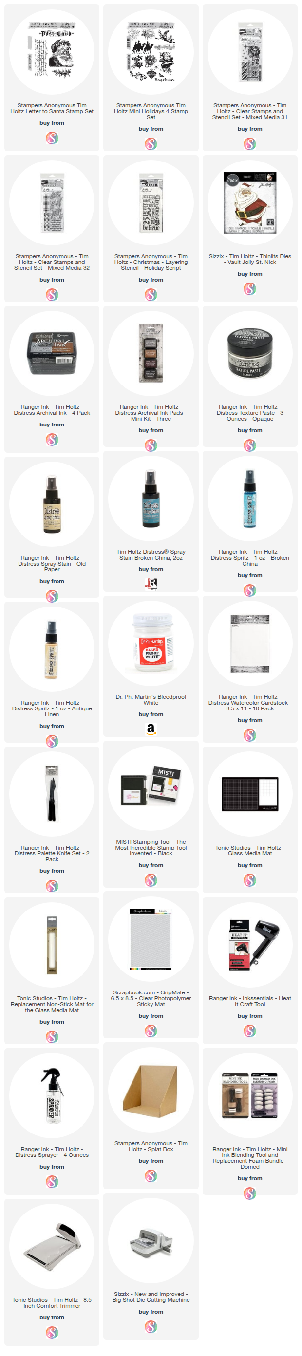
Below you'll find the supplies I used to create these cards. When you shop through these links—whether you purchase that exact item or something else entirely—you're supporting me at no extra cost to you. The commission I receive helps me cover the costs of my blog and other expenses, and allows me to continue providing you with FREE inspiration and tutorials. If you want to learn more, you can see my full affiliate and product disclosure statement here. Thank you so much for your love and support!

Mixed Media Christmas Card Background Tutorial—Shop Your Stash!

I'm so excited to share this mixed media Christmas card project with you today! While I'm using stamps and stencils from the Stampers Anonymous Christmas Curations, I really want you to think about what you already have in your own collection. These layered background techniques are incredibly versatile and will work beautifully with any of your favorite stamps and stencils. We'll build a gorgeous festive background together using Distress Spray Stains, Distress Spritz, and Texture Paste, and I'll also share how I finished the card plus give you a couple of alternative ideas to make it your own.

Mixed media Christmas card featuring Santa Claus die-cut on layered background with turquoise and gold Distress Spray Stains, texture paste through stencils, and Season's Greetings sentiment, surrounded by Tim Holtz products including Distress Spray Stain and stamps

Creating the Background

The magic of this project is in the layering! I started by stamping my images onto the background using waterproof ink—this is key because it allows the stamped images to stay crisp through all the wet media we'll be adding on top.

Next, I applied Distress Texture Paste through a stencil to add dimensional interest. Once that dried completely, I layered on Distress Spray Stains and Distress Spritz to build up rich, blended color. The combination of these products creates such beautiful depth and movement in the background.

To finish things off, I added some distress ink to the edges and white ink splatters for that perfect final touch—but you'll want to see exactly how I did all of this in the video!

Watch the Full Tutorial

Ready to see all the details, tips, and tricks? You can watch the complete tutorial in the video below, or head over to my YouTube channel [LINK] to check it out.

[VIDEO EMBED HERE]

I'd love to see your take on this project! Feel free to use whatever stamps, stencils, and colors you have in your stash to create your own version. Share your creations with me on social media or leave a comment below—I love seeing what you make!

Supplies

Below you'll find the supplies I used to create this card. When you shop through these links—whether you purchase that exact item or something else entirely—you're supporting me at no extra cost to you. The commission I receive helps me cover the costs of my blog and other expenses, and allows me to continue providing you with FREE inspiration and tutorials. If you want to learn more, you can see my full affiliate and product disclosure statement here. Thank you so much for your love and support!

Merry Christmas! Building Cards with Foundation & Focal Points

When I sat down to create this Christmas card, I decided to focus on something I don't always consciously think about: foundation and focal points. What grounds the design? What draws the eye first? These fundamentals work whether you're doing mixed media or clean paper layering.

Stripping away my usual texture paste and gesso forced me to be really intentional about every choice. And honestly? That clarity felt good. Working with the Scrapbook.com Yuletide Paper Pad made the process even smoother—when you start with a beautifully coordinated collection of patterns and colors, half the design decisions are already made for you. Those rich greens and reds with vintage patterns? They work together effortlessly, leaving me free to focus purely on composition and hierarchy instead of wondering if my colors clash.

Christmas greeting card featuring centered 'Merry Christmas' die cut in black with shadow layer, flanked by red poinsettias and green leaves above and below on cream vintage label shape with distressed edges against green patterned background

Foundation & Focal Points: Building a Strong Design

Before I dive into the how, let me share the design principle that makes this card work.

Every great card needs two things: a solid foundation and a clear focal point. Think of the foundation as your stage—it sets the tone, anchors the design, and creates visual boundaries. The focal point is your star performer—the element that draws the eye first and holds attention.

For this Christmas card, my foundation is that vintage label shape with distressed edges. It grounds everything and creates a frame. My focal point? That bold "Merry Christmas" sentiment—impossible to miss, layered for impact, and centered to create a strong, balanced composition.

When these two elements work together, your design feels intentional and professional, even when you're layering multiple patterns and colors.

Why This Card Works

Here's what makes this design successful:

  • Clear hierarchy — Your eye goes to "Merry Christmas" first (the focal point), then travels around the supporting elements
  • Strong foundation — The vintage label creates boundaries and anchors the busy elements
  • Contrast creates impact — Black sentiment against lighter backgrounds equals instant drama
  • Strategic distressing — Sanding and inking add vintage character without overwhelming the design
  • Symmetrical balance — The centered sentiment with florals clustered above and below creates stability and classic appeal

With that framework in mind, here's how I built this card:

Building the Card

Step 1: Create Your Focal Point

I began by die cutting "Merry Christmas" from black cardstock using the Scrapbook.com Christmas Joy die set. This is my focal point, so I made it impossible to miss—black for maximum contrast. I then die cut the shadow layer from a piece of patterned paper from the Yuletide Paper Pad to add depth and visual interest. I centered the sentiment on my foundation to create a strong, balanced composition—sometimes symmetry is exactly what a design needs.

Step 2: Build Your Foundation

The foundation anchors everything. I flipped through the Yuletide Paper Pad and selected a neutral monochromatic pattern to die cut the Nested Vintage Classic Labels. By keeping it neutral, it doesn't compete with the bold sentiment or vibrant poinsettias. It's like creating a frame that says "look here" without shouting.

Step 3: Add Definition

I inked the edges of that label with Distress Ink in Walnut Stain using a foam blending tool. This serves two purposes: it adds depth and shadow (making the foundation feel grounded), and it creates separation from the background, which helps your focal point pop.

Step 4: Choose Your Background

I selected a background paper from the Yuletide Paper Pad that had that vintage Christmas feel—rich color with subtle pattern that wouldn't compete with my focal elements.

Step 5: Create Supporting Elements

For the florals, I die cut the poinsettias and some of the greenery from papers in the Yuletide Paper Pad. I wanted a couple more solid colors for the greenery, so I went to my cardstock stash and selected a warm green and dark grey to coordinate with the other colors.

The poinsettias support the focal point—I clustered one arrangement above the sentiment and one below to create balanced, symmetrical framing. This creates visual stability while the florals naturally guide your eye to the words in the center.

Step 6: Add Vintage Character

I used a Ranger Sanding Disc—which is just a piece of fine grit sandpaper like you can get at the hardware store—to lightly sand the edges of the papers from the Yuletide Paper Pad. Those papers have a white core, so when you rub the sandpaper over it, it removes the printed color to reveal the white core. A nice touch of distress to add to the vintage vibe.

Step 7: Build Dimension

I used double-sided foam adhesive to pop up the main sentiment, the poinsettias, and the entire focal piece to add interest and dimension. This reinforces the hierarchy—what pops up physically is what should pop visually.

Foundation & Focal Points in Action

Here are the techniques that bring this principle to life:

Creating a Strong Foundation:

  • Use neutral or monochromatic patterns that support rather than compete
  • Add definition through inking or distressing edges
  • Choose shapes that create natural frames or boundaries
  • Keep it substantial enough to anchor your design

Making Your Focal Point Unmissable:

  • Use high contrast (like black on light backgrounds)
  • Add dimension with foam adhesive
  • Layer shadow pieces for depth
  • Center for classic, balanced appeal—symmetry creates strength
  • Make it bold enough to command attention

Supporting Elements:

  • Florals and greenery should guide the eye, not distract
  • Balance floral clusters above and below for symmetrical framing
  • Use odd-numbered groupings for natural appeal
  • Vary sizes to create flow
  • Position elements to reinforce your focal point

A Different Kind of Foundation

In my mixed media work, I build foundations with layers of gesso, texture paste, and stamping. Here, the Yuletide Paper Pad and thoughtful die cutting did that job. The sanding and inking? That's my nod to the distressing I'd normally do with heavy texture.

Different tools, same principle: create a strong base that supports your focal point. This process reminded me that good design isn't about the medium—it's about understanding hierarchy, contrast, and intentional placement.

Coming Up in This Series

This is the second of four cards I'm sharing using Scrapbook.com Exclusives—each exploring paper-only cardmaking from a different angle:

  • Previous: Halloween card — Character & Whimsy (Check it out here)
  • Next: Love card — Dimension & Movement
  • Finally: Thinking of You — Vintage Vibes

Each card taught me something different about design principles that work across any style, mixed media or not.

Let's Connect!

Ready to create your own? Grab these Scrapbook.com exclusives using the supply list below.

I'd love to hear from you: What's your favorite part of Christmas card design—bold sentiments or intricate florals? Drop a comment!

If you make this card, please tag me—I absolutely love seeing your versions!

Don't miss the rest of this series! Subscribe to my email newsletter so you never miss a new project, post, or video.

Supply List

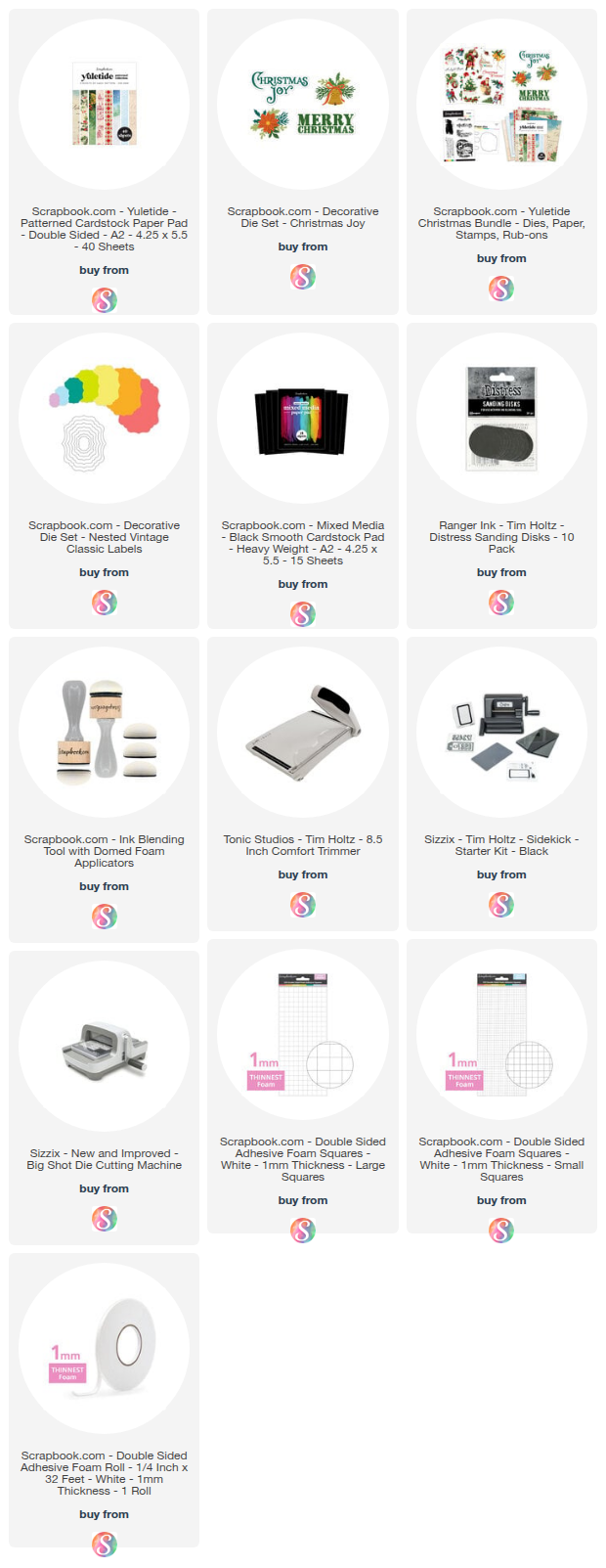
Below you can find the supplies I used to create this card. When you shop through those links—whether you purchase that exact item or something else entirely—you're supporting me at no extra cost to you. The commission I receive helps me cover the costs of my blog and other expenses, and allows me to continue to provide you with FREE inspiration and tutorials. If you want to learn more about what an affiliate link is, you can see my full affiliate and product disclosure statement here. Thank you so much for your love and support!

Mixed Media Christmas Card Ideas | Seth Apter + Distress Oxides

I’m switching gears from spooky to merry today with a festive twist on mixed media! You may remember the two Halloween cards I recently shared using Seth Apter’s newest Sizzix release. Those designs had me completely inspired — and I couldn’t resist seeing how the same dies and embossing folder could work for a Christmas card.

Most Wonderful Christmas Card by Juliana Michaels featuring Seth Apter Dies and Embossing Folder 

His Sizzix designs are so versatile — full of organic texture and layered detail — that they’re perfect for every season. In this new video, I’m showing you how I combined Seth’s collection with a few Tim Holtz favorites to create a Christmas card that’s full of dimension, shine, and that signature pretty grunge vibe.


IN THE VIDEO

In my latest YouTube video, you’ll see how I:
  • Use Distress Oxides and embossing powders to build a richly textured background
  • Layer Seth Apter’s dies with Tim Holtz elements for a festive focal point
  • Add simple mixed media touches that work with any dies or embossing folders you already have
These techniques aren’t limited to holiday cards — you can easily adapt them for any season or occasion.

🎥 Watch the full video HERE or below.


Please feel free to use products from your stash to recreate something similar. However, if you are interested in any of the products I’m using, you can find the supply list with links down below. Using these links does not cost you anything extra and it helps support my business. It also allows me to continue offering free content and keep my class costs low. I appreciate your support!

MORE INSPIRATION

If you missed my earlier projects featuring Seth’s new release, you can check them out below. Each one explores a different way to use his dies and embossing folder to build layers, color, and texture — and you’ll see how easily these same techniques transition from spooky to sparkly!


Caught In A Spider's Web Halloween Card by Juliana Michaels featuring Seth Apter Dies and Embossing Folder


A Wicked Thing Halloween Card by Juliana Michaels featuring Seth Apter Dies and Embossing Folder

I hope these project inspire you to look at your favorite dies and embossing folders in a whole new way. With a little color, texture, and shine, you can create cards that feel festive and full of mixed media magic.

SUPPLIES

Below you can find the supplies I used to create this card. When you shop through those links and whether you purchase that exact item or something else entirely, you’re supporting me at no extra cost to you. The commission I receive helps me cover the costs of my blog and other expenses, and allows me to continue to provide you with FREE inspiration and tutorials. If you want to learn more about what an affiliate link is, you can see my full affiliate and product disclosure statement here. Thank you so much for your love and support!

Halloween & Christmas Gift Card Packages | Tim Holtz Sizzix Christmas 2025

One of the new to me dies from the recent Tim Holtz Sizzix 2025 Christmas Vault Release is the Gift Card Package Die Set. It’s designed to create a quick and easy gift card holder—perfect for holiday giving! Since I’ve been bouncing back and forth between Christmas and Halloween crafting lately, I thought it would be fun to make two versions: one for Christmas and one for Halloween. The best part? By simply switching up your paper choices, this die can work for any holiday or celebration.

Halloween and Christmas Gift Card Holders by Juliana Michaels featuring Tim Holtz Sizzix Gift Card Package Die Set

CHRISTMAS GIFT CARD PACKAGE

For the Christmas version, I used a piece of patterned paper from my stash of Tim Holtz Backdrops to create the base of the package. I topped it with a coordinating solid cardstock bow and added some festive greenery using the Holiday Greens Mini Die Set (a longtime favorite of mine—so happy it’s back!). I then inked the edges with some Ground Espresso Distress Ink for a touch of grunge.

Christmas Gift Card Holders by Juliana Michaels featuring Tim Holtz Sizzix Gift Card Package Die Set

The greenery was cut from shades of green and blue colored cardstock, coated with Glossy Accents and then dusted with Distress Snowflakes for a frosted effect. I added Rudolph Red Pops of Color to the berries to bring in a traditional pop of red. While the Pops of Color was still wet I applied some Rock Candy Glitter using a Glitter Duster to a touch of shimmer. To finish it off, I stamped a sentiment onto a die-cut kraft tag and tied it on with a bit of white string.


HALLOWEEN GIFT CARD PACKAGE

For the Halloween version, I followed the same process but swapped in Halloween patterned paper for the base. The greenery was cut from black, gray, and deep green cardstock, then accented again with Glossy Accents and Distress Snowflakes for a spooky shimmer.

Halloween Gift Card Holders by Juliana Michaels featuring Tim Holtz Sizzix Gift Card Package Die Set

This time, I used Terracotta Pops of Color for the berries and of course dusted it with some Rock Candy Glitter. I then added a Halloween sentiment to finish it off.


READY TO GIFT

The final touch was sliding in a gift card—and just like that, these little packages were ready for gifting!

Thanks so much for stopping by today. I hope this gave you a bit of inspiration for using the Tim Holtz Gift Card Package Die Set in both festive and unexpected ways.

Halloween and Christmas Gift Card Holders by Juliana Michaels featuring Tim Holtz Sizzix Gift Card Package Die Set

SUPPLIES

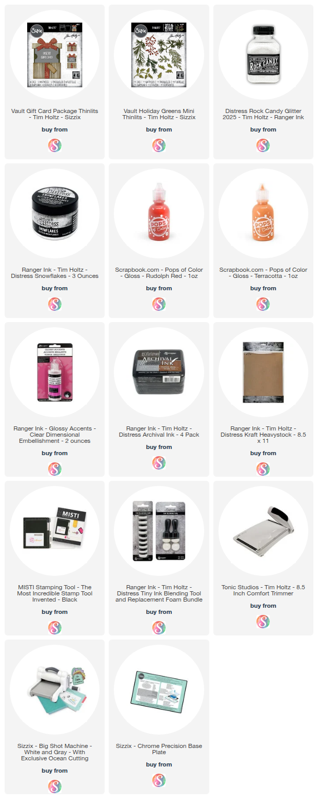
Below you can find the supplies I used to create this card. When you shop through those links and whether you purchase that exact item or something else entirely, you’re supporting me at no extra cost to you. The commission I receive helps me cover the costs of my blog and other expenses, and allows me to continue to provide you with FREE inspiration and tutorials. If you want to learn more about what an affiliate link is, you can see my full affiliate and product disclosure statement here. Thank you so much for your love and support!

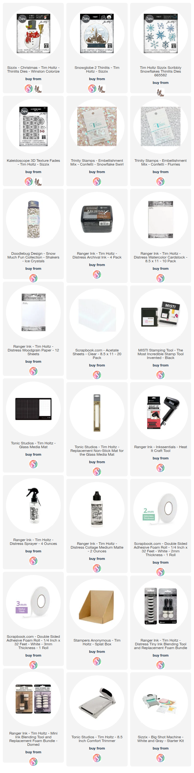
Winston the Snowman Snowglobe Shaker Card | Tim Holtz Sizzix Christmas 2025

Winston’s back and still as adorable as ever! For my second card with the Tim Holtz Sizzix Christmas 2025 release, I turned Winston into the star of a playful shaker card. This version leans pretty + festive with a pink scarf and extra inking over an embossed background. My original sample kept things classic—red scarf and no extra inking—so you’ll see two easy ways to change the mood with small choices.

Question for you: Which look do you prefer—pink + inked or classic red + clean? Tell me in the comments!

Winston the Snowman Snowglobe Shaker Card  by Juliana Michaels featuring Tim Holtz Sizzix Christmas 2025

WHAT'S IN THE VIDEO

This video is all about options—color shifts, background choices, and smart stash substitutions—so you can make a similar look with what you already own. You’ll see:
  • How lightly inking an embossed background adds instant depth
  • How to create and build a shaker card
  • Simple ways to fill a shaker (sequins, glitter, beads—mix and match!)
  • Substitutions if you don’t have the exact dies, inks, colors or embellishments

You can either watch the video below or head over to my YouTube Channel HERE to check it out.


Please feel free to use products from your stash to recreate something similar. However, if you are interested in any of the products I’m using, you can find the supply list with links down below. Using these links does not cost you anything extra and it helps support my business. It also allows me to continue offering free content and keep my class costs low. I appreciate your support!


DESIGN NOTES & IDEAS

  • Snowglobe Magic: Framing Winston inside a snowglobe makes the shaker feel extra interactive and festive.
  • Color Play: Switching up the scarf color completely changes the mood—try pink for whimsical, red for classic, or even icy blues.
  • Background Texture: Lightly inking over embossed cardstock adds dimension without overwhelming the scene.
  • Shaker Fillers: Sequins, glitter, or beads all give a snow-like effect—mix and match for more movement.

STASH FRIENDLY SUBSTITUTIONS

  • No Winston? Use any snowman, a Santa, or critter die as your focal point.
  • No Scribbly Snowflakes? Use any snowflake dies you might have or even snowflake punches or skip the snowflakes all together and add more color with your sequin mix.
  • No shaker snowflakes? Fill the shaker with any combination of sequins, glitter, mica flakes, beads, small punched shapes or any shaker pieces you may have that fit the color/theme of your card.
  • No Distress Inks or Distress Spray Stains? Use any ink you have to color your cardstock by ink blending or spraying. You can also use colored cardstock.

Winston the Snowman Snowglobe Shaker Card  by Juliana Michaels featuring Tim Holtz Sizzix Christmas 2025

TIPS & TRICKS

Window Clarity: Wipe acetate with an microfiber cloth before sealing to clean it before you add your shaker pieces. You can also use an antistatic tool to reduce cling, but it may leave a residual powder on the acetate so I don't tend to do this.
Dimension with Control: Make sure your foam tape is thicker than what you are using for your shaker pieces.
Use any solid die shape to create your own shaker window. You don't have to create a snowglobe to still get the shaker effect. 


SUPPLIES

Below you can find the supplies I used to create this card. When you shop through those links and whether you purchase that exact item or something else entirely, you’re supporting me at no extra cost to you. The commission I receive helps me cover the costs of my blog and other expenses, and allows me to continue to provide you with FREE inspiration and tutorials. If you want to learn more about what an affiliate link is, you can see my full affiliate and product disclosure statement here. Thank you so much for your love and support!

LET'S STAY CONNECTED

✔️ Subscribe on YouTube for more cardmaking tutorials, tips, and seasonal inspiration
✔️ Follow me on Instagram for sneak peeks and behind-the-scenes
✔️ Sign up for my Newsletter to stay updated on new releases and crafty resources
✔️ Take one of my online Classes to learn fun techniques and build your cardmaking confidence at your own pace


Thanks for stopping by—and until next time, stay crafty, my friend!

Festive Vintage Christmas Card Inspiration | Tim Holtz Sizzix Christmas 2025

Bring a touch of classic holiday charm to your cardmaking with this vintage-style Christmas card! I combined some of the new Tim Holtz Sizzix Christmas 2025 Vault dies and resized embossing folders with a few of my favorite older pieces to create a card that’s both timeless and festive.

Making Spirits Bright Christmas Card by Juliana Michaels featuring Tim Holtz Sizzix Mini Holiday Greens, Merry and Bright, and Engraved Embossing Folder

INSPIRATION & CREATIVE TIPS

This project is all about thinking outside the box and using what you have while experimenting with textures, inks, and embellishments. Even if you don’t own the exact new products, you can achieve a similar vintage holiday feel by layering, adding dimension, and mixing shimmer and shine.


TECHNIQUES FEATURED

With each of the techniques in the video I share ideas for substitutions of things that you may already have in your stash.
  • Embossed Backgrounds with Distress Ink & Embossing Glaze: Add texture, depth, and shimmer to your cards.
  • Custom-Colored Watercolor Cardstock: Layered greenery created with Distress Spray Stains, accented with berries and shimmer.
  • Dimensional Accents: Glossy Accents, Distress Snowflakes, Distress Rock Candy Glitter, and Distress Mica Flakes add festive sparkle and shine.
  • Focal Points with Dies: Combine new and retired dies, like the classic Holiday Mini Greenery and the Dashing Deer, for a layered, professional look.
  • DIY Tim Holtz Black Kraftstock: Painted and distressed cardstock can stand in for discontinued or unavailable colors.

WATCH & CRAFT ALONG

Watch the video to see these techniques in action and get ideas for creating your own festive vintage Christmas cards! You can either watch the video below or head over to my YouTube Channel HERE to check it out. 

In the video, I share creative ways to use these new dies and embossing folders while also showing stash-friendly substitutions so you can make a similar card even if you don’t have the exact products.


Please feel free to use products from your stash to recreate something similar. However, if you are interested in any of the products I’m using, you can find the supply list with links down below. Using these links does not cost you anything extra and it helps support my business. It also allows me to continue offering free content and keep my class costs low. I appreciate your support!


SUPPLIES

Below you can find the supplies I used to create this card. When you shop through those links and whether you purchase that exact item or something else entirely, you’re supporting me at no extra cost to you. The commission I receive helps me cover the costs of my blog and other expenses, and allows me to continue to provide you with FREE inspiration and tutorials. If you want to learn more about what an affiliate link is, you can see my full affiliate and product disclosure statement here. Thank you so much for your love and support!
Subscribe