When I sat down to create the final card in this series, I wanted to celebrate something special: how the right paper collection can make design decisions effortless. The Halloween card taught character and whimsy. The Christmas card explored foundation and focal points. The Love card was all about dimension and movement. This one? It's about creating authentic vintage vibes—and how a beautifully coordinated collection does most of the heavy lifting for you.

The Scrapbook.com Oak Lane collection is a vintage lover's dream. Warm autumn tones, subtle patterns, and that perfect balance of muted sophistication. But here's what makes it brilliant: it's versatile enough to go modern and clean OR lean into full vintage nostalgia. I chose the latter, adding ephemera tickets, postage stamps, and distressed edges to amp up that collected, timeless feel.
The best part? There's an Oak Lane Bundle that includes the paper pad, coordinating die set, stamp set, and rub-ons—everything you need in one package at an amazing price. It's currently sold out (which tells you how good it is!), but you can turn on notifications to be alerted when it's back in stock. Trust me, it's worth the wait.

Vintage Vibes: Creating Timeless, Collected Designs
Let me share what I mean by "vintage vibes" and how to create them authentically.
Vintage isn't just about old-looking ephemera. It's about color palette, composition, and those thoughtful details that make a card feel collected over time rather than mass-produced. When you nail the vintage aesthetic, your cards feel warm, nostalgic, and deeply personal.
For this card, the Oak Lane collection provided the foundation: warm yellows, peachy corals, sage greens, and kraft browns. These muted, autumn-inspired tones instantly evoke that timeless, vintage feel. Then I layered in elements that amplified the aesthetic—tickets, stamps, distressing, and organic floral clusters.
The magic? Everything coordinates effortlessly because it's designed to work together. No guessing if patterns clash. No wondering if your colors are cohesive. The Oak Lane collection handles that, leaving you free to focus on composition and storytelling.

Here's how to create authentic vintage vibes:
Color Palette:
- Choose muted, aged tones over bright, saturated colors
- Look for warm neutrals—creams, tans, sage greens, faded florals
- Cohesion is key—everything should feel like it came from the same era
Layering & Composition:
- Layer ephemera like you're creating a collection of memories
- Asymmetrical arrangements feel more organic and collected
- Mix patterns (florals, stripes, text) for visual interest
- Let elements overlap naturally—nothing too perfect or rigid
Distressing & Details:
- Sand die-cut edges to reveal the white core and add wear
- Use vintage-style ephemera (tickets, stamps, ledgers)
- Add dimension with foam adhesive on key elements
- Choose sentiments that feel timeless and heartfelt
The One Collection Advantage:
- Using products from a single coordinated line eliminates decision fatigue
- Patterns and colors are designed to work together seamlessly
- You can focus on design instead of worrying about coordination
- The Oak Lane Bundle gives you everything in one package
Building the Card
Step 1: Start with Your Foundation
I used the sage green patterned paper from the Oak Lane Paper Pad as my card base. That subtle floral pattern sets the vintage tone immediately—it's present but not overwhelming, creating texture without competing with the focal elements.
Step 2: Add Vertical Movement
I die cut a strip of the vertical striped paper and positioned it slightly left of center. Those stripes create upward movement and establish a strong visual line that anchors the design. This is where the Oak Lane Die Set really shines—perfectly coordinated patterns at your fingertips.
Step 3: Layer Your Ephemera
I added vintage tickets and postage stamps from my stash, layering them over the striped paper. This creates that collected, found-object feel that's essential to vintage design. The tickets and stamps feel like they've traveled through time, adding narrative and authenticity.
Step 4: Create Your Floral Cluster
Using the Oak Lane Die Set, I die cut flowers and leaves from various papers in the pad—yellows, peach, coral, and greens. I arranged them asymmetrically in the lower left, creating an organic cluster that feels natural and unforced. I lightly sanded the edges of some die cuts to reveal the white core and add that distressed, worn character.
Step 5: Add Your Focal Sentiment
I stamped "Thinking of You" from the Oak Lane Stamp Set on white cardstock and positioned it on a clean white strip in the center. This gives the eye a resting place and ensures the sentiment is readable against all the pattern and texture.
Step 6: Finishing Touches
I die cut the decorative bow from patterned paper and positioned it in the upper right, creating a visual anchor that balances the floral cluster below. I used double-sided foam adhesive to pop up the flowers, bow, and some ephemera elements for dimension—what pops up physically draws attention visually.
Why the Oak Lane Bundle is a Game-Changer
Here's what I love about working with a coordinated collection like Oak Lane: everything just works.
When you have the paper pad, die set, and stamp set all designed to coordinate, you eliminate hours of decision-making. No more staring at your stash wondering if this green works with that peach. No more buying dies that don't quite match your papers. No more searching for the perfect sentiment.
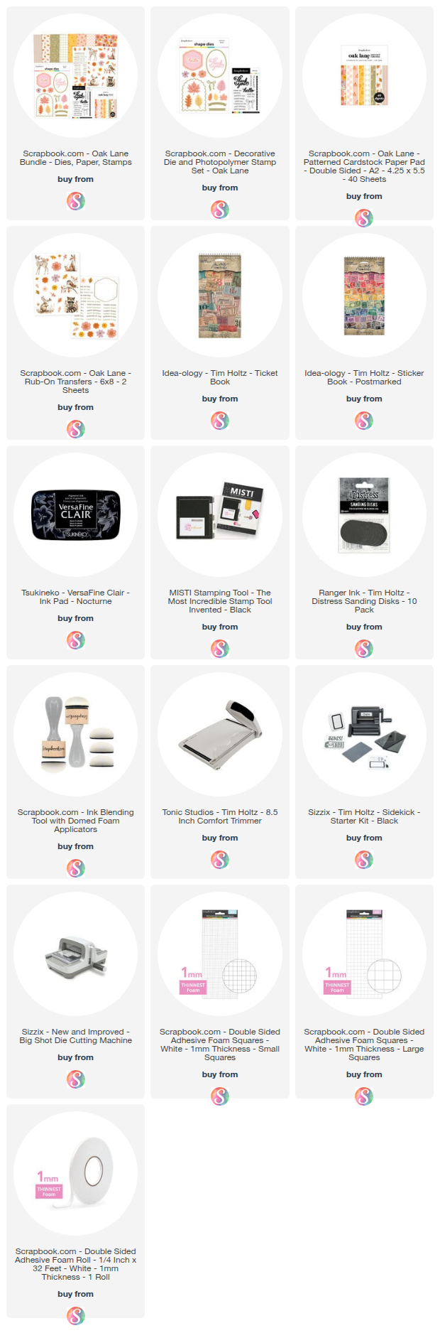
The Oak Lane Bundle includes:
- Oak Lane Paper Pad - 24 double-sided sheets with coordinated patterns
- Oak Lane Die Set - Florals, leaves, frames, bows, and more
- Oak Lane Stamp Set - Sentiments perfect for any occasion
- Oak Lane Rub-Ons - (I didn't use these, but they're included!)
All at an amazing bundled price. It's currently sold out, but you can enable notifications on the product page to be alerted when it's back in stock.
The versatility is the real winner here. While I leaned into full vintage with ephemera and distressing, you could use these same products for a clean, modern card. The muted palette and thoughtful patterns work across styles—it all depends on how you layer and what you add.
A Series Wrap-Up
This brings our four-card series using Scrapbook.com Exclusives to a close, and I'm so glad you've been on this journey with me:
Each card taught me something different about design principles that work across ANY style—mixed media or clean paper layers. The fundamentals don't change. Good design is good design, regardless of medium.
Working with Scrapbook.com's exclusive products reminded me that beautiful, coordinated collections aren't a shortcut—they're smart design tools that free you up to focus on what really matters: composition, storytelling, and creating cards that feel personal and meaningful.
Let's Connect!
Ready to create your own? Grab the Oak Lane Bundle (when it's back in stock!) using the supply list below.
I'd love to hear from you: Which card in this series was your favorite? Halloween's whimsy, Christmas's bold sentiment, the octopus's charm, or this vintage beauty? Drop a comment!
If you make any of these cards, please tag me—I absolutely love seeing your versions!
Thanks for following this series! Subscribe to my email newsletter so you never miss future projects, posts, or videos.
Supply List
Below you can find the supplies I used to create this card. When you shop through those links—whether you purchase that exact item or something else entirely—you're supporting me at no extra cost to you. The commission I receive helps me cover the costs of my blog and other expenses, and allows me to continue to provide you with FREE inspiration and tutorials. If you want to learn more about what an affiliate link is, you can see my full affiliate and product disclosure statement here. Thank you so much for your love and support!
Featured Product:
Oak Lane Bundle (currently sold out - enable notifications!)
Includes: Oak Lane Paper Pad, Die Set, Stamp Set, and Rub-Ons