Papercrafts Unite Against Racism Blog Hop

Hello friends! Welcome to the Papercrafters Unite Against Racism Blog Hop. I’m happy to be coming together to stand with the papercrafting community to stand behind our crafty sisters and brothers of colour and to show my support in the never-ending fight for racial equality all over the world.

Now Is The Time Mixed Media Card by Juliana Michaels

If you are looking for more information about the Papercrafters Unite Against Racism Blog Hop and a full list of participants, ways to help etc. head over to Justine Hovey's blog.

NOW IS THE TIME

As I was thinking about what to create for this blog hop, I was struck by the saying "now is the time". Racism and racial injustice have gone on for too long in this country and now is the time for change.

With this idea in mind, I began selecting elements that went together to support this theme. Clocks and gears seemed the perfect fit to represent time and the butterfly was of course perfect to represent change.

The background was created by spraying watercolor paper with Distress Spray Stains in Speckled Egg, Frayed Burlap and Pumice Stone and just a touch of Ground Espresso. I spritzed it with water and then dried it with my heat tool. Next I smooshed some Rusty Hinge Distress Ink onto it. For this I smashed the ink pad onto my non-stick craft mat, spritzed it with water and then dabbed my paper into the ink. I dried the paper and then repeated the dabbing until I was happy with the look. I also did some water spritzing and dabbed the water dry to give it a bit more grunge. Once the background was dry, I stamped several images onto it using Vintage Photo Archival Ink. This included the clock from Inventor 1 and images from Dapper and Field Notes.

Now Is The Time Mixed Media Card by Juliana Michaels

The clock was created using the Timekeeper Bigz Die. I cut it from watercolor paper and then applied the Distress Embossing Dauber to different areas, sprinkled it with Walnut Stain Embossing Glaze and heat set it. I then added the embossing ink to some of the open areas not covered with the Walnut Stain Glaze and added Rusty Hinge Glaze. I then added Broken China Glaze to the final spots. The main thing to keep in mind for this look is don't cover the entire surface with the same color. Apply the colors to different section and occasionally allow the colors can overlap a bit. I used this same technique on the clock hands and the Hardware Head was distressed with a bit of Mushroom and Mined Alcohol Inks.

The gears were die cut from watercolor paper using the Gearhead Thinlits Die. I inked them with Peacock Distress Ink and added a tiny bit of Vintage Photo using my finger tip.

On top of all of this, I layered a butterfly cut from watercolor paper using the Tattered Butterfly Bigz Die. I smooshed Fossilized Amber Distress Ink onto my non-stick craft mat and dipped and dabbed the die cut into the ink, drying it in between. I then stamped it with the clock from the Inventor 1 Stamp Set using Vintage Photo Archival Ink.

Now Is The Time Mixed Media Card by Juliana Michaels

To finish off the card, I added the sentiment which was stamped using the Vintage Type Lower Stamp Set from Scrapbook.com. Each word was stamped onto a piece of white cardstock that was inked with Old Paper and then edged with Vintage Photo Distress Ink.

Now Is The Time Mixed Media Card by Juliana Michaels

BLOG HOP INFO

You may be arriving to my blog from Martha Lucia Gomez of Joy Clair Designs.  Your next stop on the hop is Amy Hill.  

Thanks so much for stopping by today and I hope you enjoy all the inspiration you find during the Papercrafters Unite Against Racism Blog Hop.


SUPPLIES

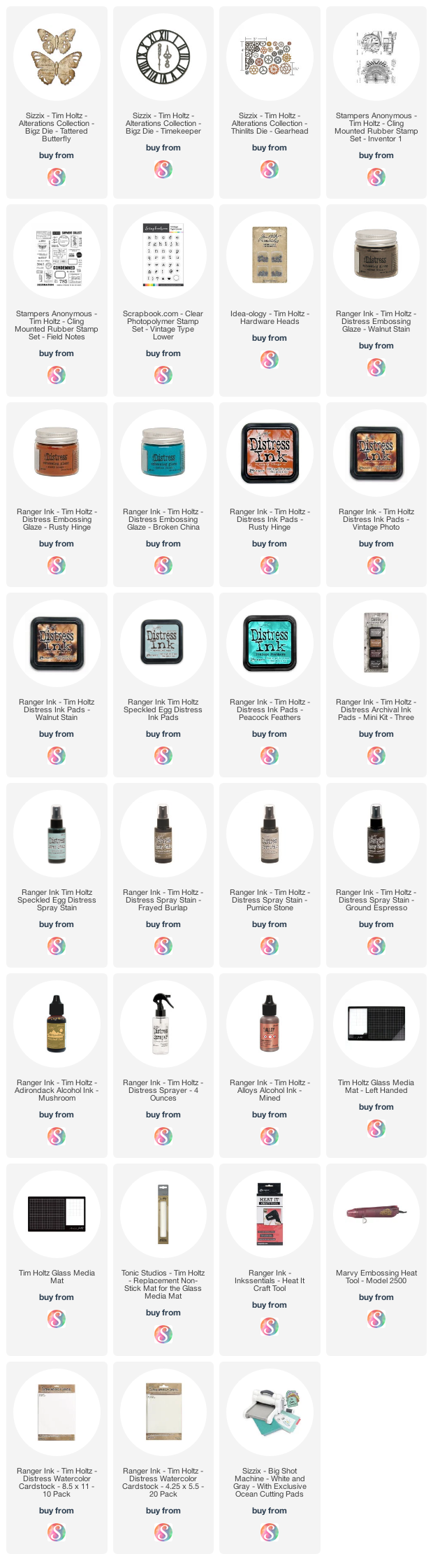
You can find a supply list of the products I used to create this project below. This post contains compensated affiliate links to Scrapbook.com at no cost to you. If you want to learn more about what an affiliate link is, you can see my full affiliate and product disclosure statement here. 
Glazed Ceramic Tags

Hello friends! Today I'm sharing a set of tags I created a bit ago. I don't know about you, but sometimes I can get so lost in the creative process that I just forget about the sharing part. And then sometimes...like now, I find myself not having the energy or mojo to share.


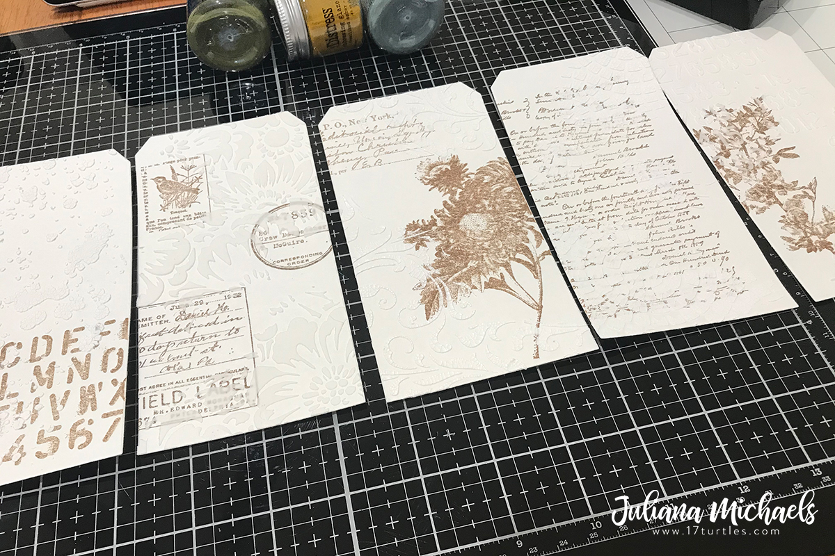
With that being said, today I'm finally getting around to sharing these textured tags. I was inspired to create them after watching several of Tim Holtz's Saturday Demos. Some of the techniques are ones I learned from watching the videos and some were just me wondering "what if I try this". I originally shared how the tags started out on Instagram. They started out quite bright and pretty in this "before" photo.


I then went about creating the Glazed Ceramic effect before I added the final touches. Keep scrolling to see how each tag turned out. I'm also sharing some of the different techniques I used to create the various textures on each tag.


As you can see each tag was finished off with a similar treatment. I added a Paper Doll to each one that was colored with Embossing Glaze. I used an Embossing Pen to color the clothing area, sprinkled it with Embossing Glaze and then heat set it with my embossing gun. To continue the repeated treatment, I also added some die cut circles. These were all cut from scraps of patterned paper, which I tend to hoard, using the Sizzix Thinlits Stacked Circles. Because there are multiples of each size, it was a breeze to cut a bunch of circles all at once. I then finished each one off with a Idea-ology Small Talk sticker.


3D Embossing Folders + Glaze 

These first three tags each began as a piece of watercolor paper die cut using the Sizzix Thinlits Tag Collection.  After cutting each tag I embossed each one with a different 3D Embossing Folder. From left to right I used: Brickwork, Elegant and Foundry. Next, I rubbed over each tag with an Embossing Ink Pad, sprinkled it with Embossing Glaze, tapped off the excess and then heat embossed it with my embossing heat tool. I tried this technique with the Embossing Dauber the first time, but I personally liked how the ink pad covered more surface area and seemed to cover the paper more evenly than the Dauber when rubbing it over the textured surfaces. 

Glazed Ceramic Tags with 3D Embossing Folder, Embossing Glaze and Distress Crayons by Juliana Michaels featuring Tim Holtz products

On the Brickwork tag I used Vintage Photo Embossing Glaze, on the Elegant tag I used Peeled Paint and on the Foundry tag I used Hickory Smoke. At this point, the tags were bright and shiny like the original image I shared above.


To get that Glazed Ceramic look and to add a touch of grunge, I used Distress Crayons. Working in small sections and rubbing it in as I went I added the crayons to each tag to pull out the embossed detail. On the Brickwork tag I used Walnut Stain and Black Soot Distress Crayons.


On the Elegant tag I used Peeled Paint and Ground Espresso Distress Crayons. For the Foundry Tag, I didn't quite get all of the paper covered with embossing glaze, so I inked the edges with Distress Ink in Rusty Hinge and a touch of Black Soot. I then finished it off with some Walnut Stain and Rusty Hinge Distress Crayons.


Stencils + Glaze

For this next set of tags I used Stencils to achieve a similar effect as the embossing folders. This was one of those what if I try this moments for me. Here I used the following stencils from left to right: Bouquet, Digits, Doodle Art 2 and Bouquet.


By adding Texture Paste through the stencil, I was able to create a textured surface similiar to what I achieved with the 3D Embossing Folders. On the Bouquet tag, I placed the stencil on top of the tag and used a palette knife I wipe Texture Paste over the stencil. I gently lifted it off and set the tag to the side to dry. While it was drying, I also washed the stencil. I repeated this same process for the Digits Tag and Doodle Art 2 Tag.


On the Digits tag, I didn't quite cover the entire tag with Embossing Glaze, so I inked the edges and open spaces with Cracked Pistachio Distress Oxide, Twisted Citron Distress Oxide and Walnut Stain Distress Ink. I then spritzed the tag with my Distress Sprayer, dabbed it dry and then splattered on a bit of Vintage Photo and Cracked Pistachio Distress Spray.


I tried a slightly different idea on the other Bouquet Tag. I first stamped several images with Archival Ink from the Field Notes Stamp Set onto the tag. I then used Crackle Paste instead of Texture Paste. 


Once the paste was dry, I used the same process as before. I wiped over the tag with the Embossing Ink Pad and embossed each one with a different color of Embossing Glaze. From left to right I used Tattered Rose, Cracked Pistachio, Broken China and Fossilized Amber Embossing Glaze. At this point, as I mentioned earlier, the tags were very bright and pretty.

And as before, I achieved the Glazed Ceramic look using primarily Distress Crayons. The Bouquet tag used Vintage Photo Distress Crayon and the Doodle Art 2 used Walnut Stain and Rusty Hinge.


I hope you enjoyed the Glazed Ceramic Tags I shared with you today. If you have any questions about them, please feel free to reach out and ask!


SUPPLIES

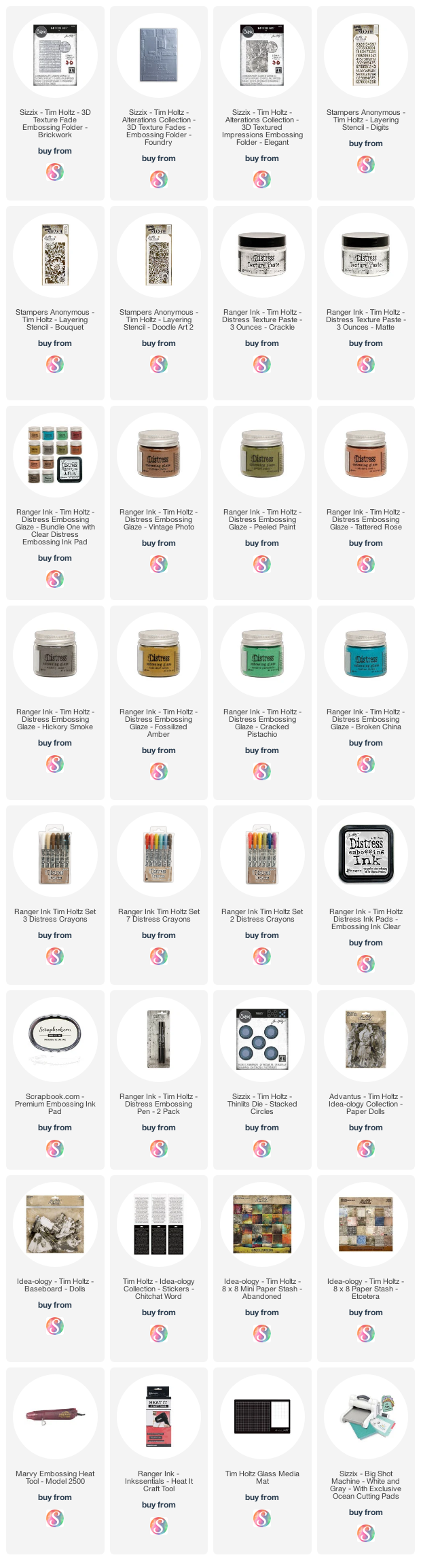
You can find a supply list of the products I used to create this project below. This post contains compensated affiliate links to Scrapbook.com at no cost to you. If you want to learn more about what an affiliate link is, you can see my full affiliate and product disclosure statement here. This is not a sponsored post. The products I used to create these tags are a mix of products I purchased myself and products I received as compensation for projects I created for the Tim Holtz Sizzix Chapter 1 and 2 Release.

Speckled Egg Distress Monochromatic Card

Hello crafty friends! I hope your week is off to a good start. I'm sure many of you are already aware that a new Distress color has joined the family. If not, let me introduce you to Speckled Egg! This is the first of 12 new colors that will be joining the Distress Family over the next year and half. I was blessed to have the entire Speckled Egg Bundle sent to me by Tim Holtz and lovingly packed by Mario!

SPECKLED EGG DISTRESS MONOCHROMATIC CARD


Of course, as soon as it arrived I had to sit down and play. The result was a rather monochromatic card with nearly all of the new Distress products used. I made this card with my niece in mind, as she just graduated from 8th grade and this color is one of her favorites!


To begin, I created the base to my background on watercolor paper. I first sprayed it with Speckled Egg Distress Spray Stain, spritzed it with my Distress Sprayer and dried it with my heat tool. I then smooshed the Speckled Egg Distress Ink pad onto my non stick craft mat, spritzed the ink with water and then dragged and dipped my paper into the ink to create all the little speckles. Once the inking was completed, I made sure to dry everything completely with my heat tool.


The next step involved adding a little texture. I applied Translucent Distress Grit Paste through the Flourish Stencil.


While the paste was still wet, I sprinkled Speckled Egg Embossing Glaze over the area and then tapped off the excess. I then heat embossed the Glaze with my heat gun.


For a bit more interest, I decided to do some stamping. Here, I stamped one of the images from the Ledger Script using the Speckled Egg Distress Ink. I didn't stop there though. I also stamped the splatter stamp from the Spring Shadows stamp set with embossing ink and embossed it with Speckled Egg Embossing Glaze. 


I also spritzed the entire background with my Distress Sprayer and dabbed the water droplets dry.


Once the background was completed, I turned my attention to the focal point. Here I used the Bigz Tattered Butterfly. I die cut it from watercolor paper and then stamped it embossing ink using one of the images from the Baroque Stamp Set. Next, I sprinkled it with Speckled Egg Embossing Glaze and heat embossed it.


I then inked the edges with Speckled Egg Distress Ink and a touch of Old Paper Distress Ink. I also added this color to the very edges of the background paper and sentiment strip. Speaking of the sentiment, it is from the Tiny Text Stamp Set and is stamped in...you guessed it...Speckled Egg Distress Ink!


The design felt like it needed a little something more, so I added a bit of interest with a die cut strip of watercolor paper cut using the Crochet 2 Thinlits Die. This was lightly inked with Old Paper and then adhered to the card.


Thanks so much for stopping by today! I hope you enjoyed this monochromatic card featuring the beautiful new Speckled Egg Distress products.

SUPPLIES


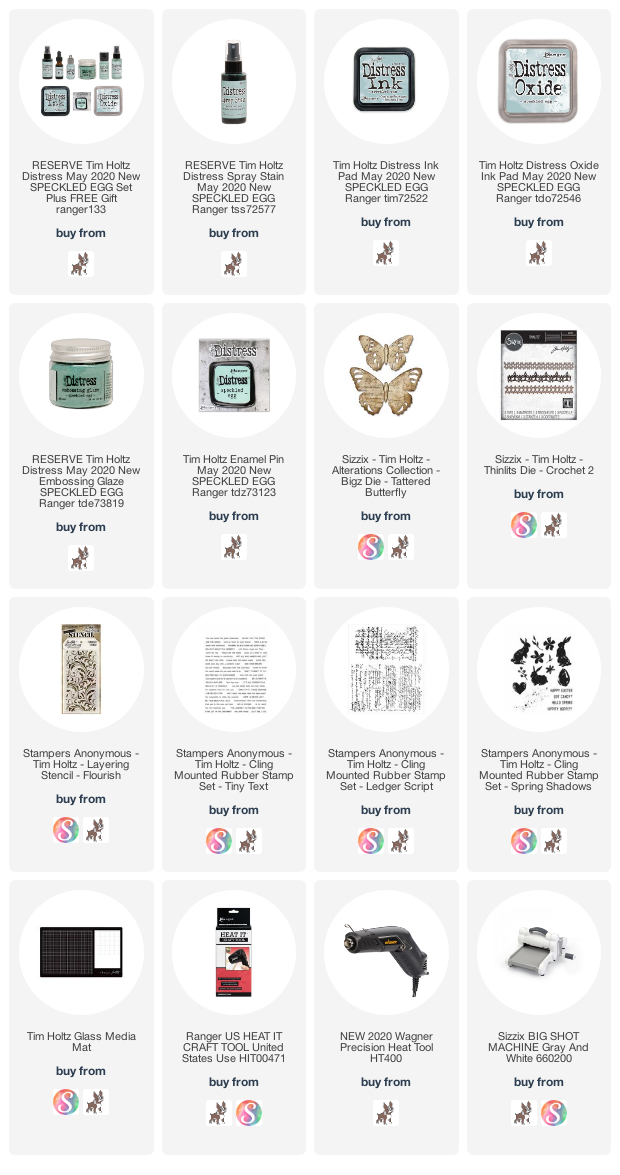
If you are interested in any of the products I used to create this card, you can find a full supply list below. This post contains affiliate links to Scrapbook.com and Simon Says Stamp. If you buy anything through my links, it adds no extra cost to you. I truly appreciate and thank you for your support! (If you're interested, you can see my full disclosure statement here.


Field Notes Tag Book

Hello friends! I'm back to share my latest project...a Field Notes Tag Book. This project was greatly inspired by tag books created by the amazingly talented Paula Cheney and Stacy Hutchison.

Paula first shared this tag book idea and then Stacy shared her take on it. After seeing both of them I was inspired to create my own version. It also gave me the chance to play around with more of the techniques I've fallen in love with after watching Tim's Saturday FB Live Demos. If you've missed any of them, you can check them all out over on Tim's blog.

I'm going to warn you now, this post is photo and information heavy. I wanted to share all the little details on the tag book with you, so I hope you don't mind.


CREATING THE BACKGROUNDS

Each of these tags was created specifically with this project in mind, but you can certainly grab already created tags from your tag stash to create your own version. I wanted a very color coordinated look, but don't be afraid to mix things up to fit your own style.

To get started, I die cut some #8 size tags from watercolor paper using the Framelits Tag Collection. Using Archival Ink in Vintage Photo, I stamped images on each tag using a mix of stamp sets including Flower Shop, Field Notes, Grunged, and Entomology.


I then picked out a stencil for each tag and and applied either Distress Texture Paste Matte or Crackle using a spatula. I know some makers have been sprinkling the embossing glazes onto the wet paste. I however, came up with a different look that I kind of like. 


Once the texture paste was dry, I lightly and gently rubbed an embossing ink pad over the raised texture. Next, I sprinkled the tag with embossing glaze, tapped off the excess and embossed it with my heat gun.  I love how areas of the tag are covered with embossing glaze and others aren't. This gives you space to ink and grunge up the tag even more. If you tend to be heavy handed, this technique might not be for you, but you can always give it a try and wipe the excess away if too much of the tag is covered up for your liking.


I added Weathered Wood and Peeled Paint Embossing Glazes to the tags. Once the embossing was complete, it was time to start grunging things up a bit!

Here you can see what some of the tags looked like before I started the grunging process. I only ended up using the Old Paper Spray Stain though.


During this step, I inked the tags, focusing the ink to the edges and open areas. I applied Distress Oxide Ink using a foam blending tool. On the green tags I used Peeled Paint and Forest Moss and on the blue tags I used Weathered Wood and Faded Jeans. I recommend starting with the lighter ink and then adding the darker ink. I then inked the edges with Walnut Stain Distress Ink and spritzed each tag with water and then dabbed the water dry with a paper towel.

Unfortunately, I neglected to take photos of the next step where I added even more grunge using Distress Crayons. I applied a Walnut Stain over the stenciled areas on the green tags and Faded Jeans on the blue tags. I've learned so much recently about working with this medium and I really enjoy the depth and detail it brings out in project.


After I had completed the background for each tag and began assembling the tag book, I realized I didn't care for the back side to be left undecorated. For a quick and easy fix, I die cut some more tags from scraps of patterned paper and applied them to the back side of each tag using Collage Medium. I must thank my dear friend Katrina for this solution, who gave it to me during one of our crafty chats!

For complete details on how to assemble the tag book, please visit Paula Cheney's blog.


EMBELLISHING THE TAGS

Now that the tag book base is completed, the next fun step begins...decorating each tag! I didn't have any Photobooth pictures which is what Paula and Stacy both used, so I reached for what I did have and love...die cuts and stamps with flowers and butterflies!


I stamped all of the images using Black Soot Archival Ink onto watercolor paper. The stamp sets I used are Flutter, Field Notes, and Ticket Booth. I then either fussy cut them or used the coordinating dies to cut them out.

To color the butterflies, I used Distress Ink and a waterbrush. I tapped the ink pad onto my craft mat and then picked up the color with a waterbrush.  I used Faded Jeans, Stormy Sky, and Fossilized Amber Distress Ink.


For the tickets and other ephemera type images, I smooshed an Old Paper Distress Ink pad onto my craft mat, spritzed it with water and dragged and tapped the paper into the ink. I then dried it with my heat tool and if it needed more ink, I repeated the process. Next, I inked the edges with Walnut Stain Distress Ink and a foam blending tool. I then finished them off by spritzing them with my Distress Sprayer and dabbed them dry.


The die cut flowers are from the Thinlits Wildflower Stems 1 and 2 Die Set and are die cut from watercolor paper. I used a waterbrush to apply Distress Ink to the stems and the petals using the watercolor technique I also used on the stamps.  I then added the tiny splatters with a fun little technique I accidentally discovered.

After watching Tim's videos, we have all learned how differently the glass mat works vs the non-stick craft mat for holding ink when you want to smoosh, drag or tap your paper into the ink applied there. He often spritzes the ink with water to get the ink to bead up more and even runs his finger through it to spread the ink out.  Well, while I was watercoloring I ran my waterbrush through the ink and saw that it created tiny droplets of ink, much smaller than the spritzing with the Distress Sprayer. I took the watercolored images and tapped them into the tiny ink dots and came away with these tiny ink specks, that I just love!


The woodgrain frames were created by die cutting a piece of watercolor paper using the Bigz Decor Frame Dies. To achieve the wood grain look, I embossed them with the 3D Lumber Embossing Folder. I then inked them with Walnut Stain Distress Ink and applied Walnut Stain Distress Crayon to pull out the texture.

The final embellishment are the die cut butterflies from the Scribbly Butterflies Thinlits. These are die cut from watercolor paper and then stamped with images from the Field Notes and Entomology Stamp Sets in Vintage Photo Archival Ink. I then inked them with Fossilized Amber Distress Ink.


TAG BOOK TIE CLOSURE

To create the tie closure on my tag book, I inked up some Hug Snug Rayon Seam Binding with Distress Sprays in Stormy Sky, Faded Jeans, Old Paper and a tiny bit of Walnut Stain.


I hope you enjoyed this detailed but lengthy share on how I created my Field Notes Tag Book. Here are a few more photos for you to enjoy.


SUPPLIES

This post contains affiliate links to Scrapbook.com and Simon Says Stamp. If you buy anything through my links, it adds no extra cost to you. I truly appreciate and thank you for your support!
(If you're interested, you can see my full disclosure statement here.)


Subscribe