Bring on the Brights Paper Pads

Hey friends! Today it's all about the brights! The brand new Brights Paper Pad from Scrapbook.com that is! These paper pads are bright...neon flourescent bright and bring all the 80's vibes along with them! 

If you aren't familiar with the Scrapbook.com paper pads, they are a smooth cardstock paper pad that comes in both A2 and Slimline sizes. Each paper pad contains 40 color coordinated sheets of paper (5 each of 8 different colors) and are currently available in 6 different color palettes. You can use them to create an instant card front, trim them to create layers, use them for die cutting and so much more.

Today, March 4, Scrapbook.com will have a Brights Paper Pad Bundle available starting at 9 AM MST during their YouTube Live, that includes both the A2 and Slimline paper pads at an amazing price! These bundles are only available while supplies last, so I recommend loading your cart with any Scrapbook.com items you plan to purchase, then adding this bundle when it goes live so you don't miss out on this great deal! Their last bundle sold out in record time!

Now that you know more about these Brights Paper Pads, let me share this Bright Stripes Birthday Card I made using the paper pads.

Bright Stripes Birthday Card by Juliana Michaels featuring Scrapbook.com Brights Paper Pad

To get started, I took a flat card front and trimmed it to 4 x 5.25 inches. I then adhered 2 strips of the Scrapbook.com 2" Clear Double Sided Adhesive to the back side.


I then took 6 colors from the Brights A2 Paper Pad and trimmed them into strips sized to 0.25 x 5.5 inches. I also did this with a piece of white cardstock. Once I had all my strips cut, I began adhering them at a angle. I recommend starting at the bottom and working your way up in rainbow order and alternating with a color strip and a white strip until the entire panel is covered.


Once the panel was covered with the paper strips, I cut off any excess using my paper trimmer.


With the background complete, I added some layered butterflies die cut from vellum and the "Happy" from the Birthday Celebration Sentiments Word Dies.


To give the sentiment some dimension, I adhered a piece of white cardstock to a strip of Scrapbook.com 2" Double Sided Foam Adhesive, laid the happy die on top and ran it through my die cutting machine.


I'm still amazed at how easy the Double Sided Foam Adhesive makes adding dimension to these delicate die cuts. I then finished off the card with a typed sentiment and some machine stitching before adding it to my card base.


Now that you've seen the Brights Paper Pad in action, RUN (don't walk) over to Scrapbook.com and get this Brights Paper Pad Bundle before it sells out!

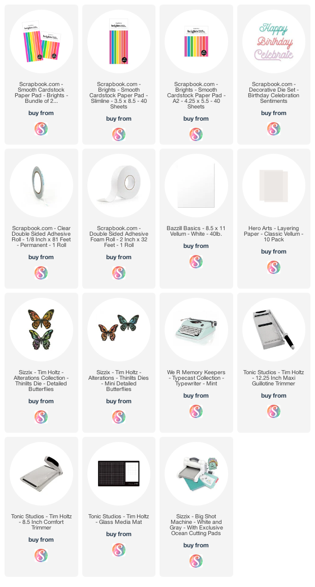
Supplies

Below you can find the products I used to create this project along with compensated affiliate links to Scrapbook.com. These links are at absolutely no extra cost to you. If you want to learn more about what an affiliate link is, you can see my full affiliate and product disclosure statement here.  

You Are Enough Card | Tim Holtz Wildflower Stems 3, Alphanumeric Stretch Thinlits and Swirls Texture Fade

You are enough. Say that outloud to yourself. Shout it from the rooftops. Tell everyone you meet. I am enough. Do you know anyone who needs to hear this? Maybe it's a friend. Maybe it's you. Either way, I am here to tell you that you are enough. In the words of Brandi Kincaid..."we need not show up gloriously, we must just show up as we are" and as we are is enough.

This You Are Enough card carries all these thoughts with it and these thoughts are what inspired the final design. To get started I grabbed all the Wildflower stems Thinlits including Wildflower Stems 3 from Tim Holtz's recent Sizzix Chapter 1 release. I die cut the daisy looking flower from each set (each set has this flower from a different angle) and a few of the wispy delicate ones from watercolor paper. 

You Are Enough Card by Juliana Michaels featuring Tim Holtz Wildflower Stems 3 Thinlits, Alphanumeric Stretch Thinlits and Swirls Texture Fade Embossing Folder

I sometimes find it easier to watercolor these super delicate flowers if I leave them in the paper I cut them from and use a bit of Mint Tape on the backside to hold them in place. I colored a bunch of the flowers before settling on using the purple ones with the daisies. 


For the final flowers I used on this card, I used Distress Ink and a water brush to color each of the images. I used a combination of Peeled Paint, Forest Moss, Dusty Concord, Milled Lavender, Fossilized Amber and Pumice Stone.


For the background, I took a sheet of Distress Heavystock and embossed it using the Swirls Texture Fades Embossing Folder. I applied Speckled Egg Distress Oxide to the top portion of the embossing folder (the one with the design printed on it) and then ran the paper and folder through my die cutting machine. This applied the ink to the more flat areas of the design.


I then lightly ink blended over the raised areas and the edges of the paper with Gathered Twigs Distress Ink. If you tend to have a heavy hand you might try wiping off some of the ink onto your craft mat or even a paper towel before you begin applying it to the paper and then repeat until you achieved the desired amount of ink.


Next, I wanted to add a little shine to the design with some embossing glaze. To prevent the powder from sticking to areas that I didn't want it, I dried the entire piece with my heat gun and then rubbed an embossing bag over the surface. I then gently rubbed an embossing ink pad over the raised areas, sprinkled it with Speckled Egg Embossing Glaze and heat set it with my embossing gun. The shine is difficult to photograph, but in real life it adds a nice touch of texture and interest. The final step for the background was a bit of machine stitching around the outside edge.


With the background completed, I gathered the wildflowers and created a little bouquet. I added a hand dyed crinkle ribbon using Snug Hug Seam Binding in Chalk White and Speckled Egg Distress Spray Stain


For the sentiment, I die cut the letters from Blackout Kraftstock using the Alphanumeric Stretch Upper Thinlits. To give this extra dimension, I die cut the each letter three times, glued each layer together and then adhered them to my card. I then stamped the sentiment from the Tiny Text Stamp Set onto a piece of white cardstock, inked the edges and adhered it on top of the die cut letters.


I hope you enjoyed learning how this You Are Enough Card was created using the Tim Holtz Wildflower Stems 3 Thinlits, Alphanumeric Stretch Thinlits and Swirls Texture Fade Embossing Folder. Thank you so much for stopping by!

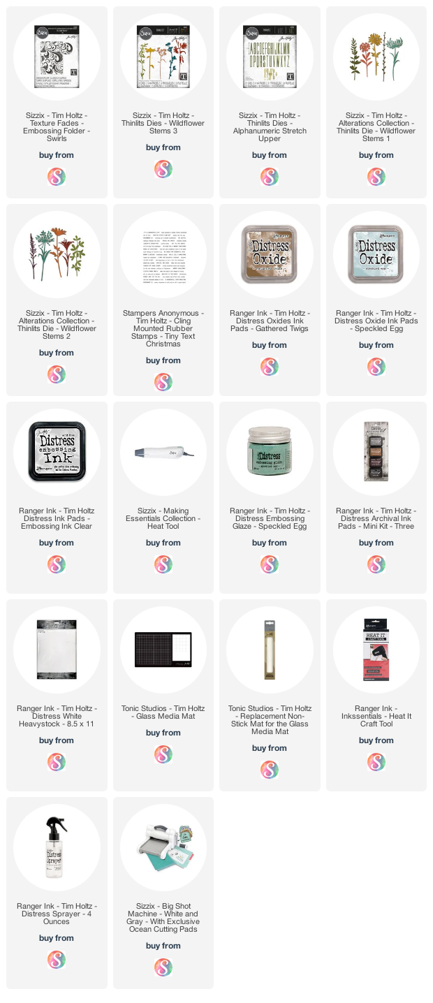
Supplies

Below you can find the products I used to create this project along with compensated affiliate links to Scrapbook.com. These links are at absolutely no extra cost to you. If you want to learn more about what an affiliate link is, you can see my full affiliate and product disclosure statement here.

Butterfly Specimen Canvas | Tim Holtz Butterfly Perspective Thinlits

Butterflies are my thing! I love everything about them so it was no surprise to me that I immediately fell in love with the Tim Holtz Butterfly Perspective Thinlits! This oversize design is perfect for offsetting and using only part of the design as I did in my Don't Forget To Fly Card or to use it in full as I did on this Butterfly Specimen Canvas that I'm sharing today.

Butterfly Specimen Canvas by Juliana Michaels featuring the Tim Holtz Butterfly Perspective Thinlits

The base of this project is an 8x8 inch canvas. You can find these at your local craft supply store or online. To prep the surface, I first painted it with a coat of Distress Collage Medium. Once that was dry, I inked over the entire thing with a bit of Vintage Photo Distress Ink. I then added some Distress Crackle Paste to the sides of the canvas and then on the top about a 1/2" or so in from the sides. No need to waste the paste when I knew I was going to layer other pieces on top of it. Applying the ink before the paste allows some of the color to seep through and add to the distressed look of the crackle. After the Crackle paste was dry, I then applied another layer of Distress Collage Medium and allowed that to dry. To complete the distressing, I then applied some Walnut Stain Distress Crayon to make the cracks stand out even more. With the base completed, I set it to the side and began working on the focal layer.


I started off die cutting the Butterfly Perspective twice from Distress White Heavystock. I inked both layers with Peacock Feathers Distress Ink toward the edges and Speckled Egg Distress Ink toward the center. Next, I applied a bit of Therm O Web DecoFoil Transfer Gel to the edges of the one butterfly and allowed it to dry. Once dry, I covered it with a piece of Copper Decofoil and ran it through my Minc to adhere the foil. I then adhered the two butterfly layers together and sat them to the side.


Now onto the background. For this I took a piece of Distress White Heavystock and trimmed it to 6.5 x 6.5 inches. I placed the Roses Layering Stencil on top and applied Crackle Paste and allowed it dry. I cleaned the stencil and once the crackle was completely dry, I placed it back on top and applied embossing ink. I then sprinkled the flowers with Tattered Rose Embossing Glaze and the leaves/stems with Peeled Paint Embossing Glaze and heat embossed it.


I find that if I try to apply the Embossing Glazes to the Crackle Paste that a lot of it doesn't stick and blows off when I go to heat emboss. This extra step with the embossing ink has solved that problem for me! Next, I added some random stamping using Frayed Burlap Distress Ink with the Ledger Script Stamp Set. This step would have been easier if I'd done it before the stenciling, but it's all good! I then added a couple of stamped, distressed and cut out labels from the Field Notes Stamp Set. To the edges I added some ink blending with Distress Oxide Vintage Photo and Frayed Burlap. I then finished it off with the addition of some Hardware Heads colored with Mushroom Alcohol Ink.


This entire piece was then layered onto a piece of paper from the Kraftstock Metallic 2. The final touch was that I used a straight pin, colored with Mushroom Alcohol Ink to "adhere" the butterfly specimen to the canvas. To do this, I simply poked the pin through the papers and used a bit of hot glue to hold it in place on the backside. If the pin is too long, you can use a pair of jewelry metal cutters to carefully trim off any excess that might poke anyone.


Thanks so much for your visit and I hope this Butterfly Specimen Canvas using the Tim Holtz Butterfly Perspective Thinlits inspires you with your next make!

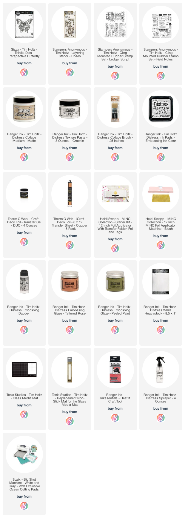
Supplies

Below you can find the products I used to create this project along with compensated affiliate links to Scrapbook.com. These links are at absolutely no extra cost to you. If you want to learn more about what an affiliate link is, you can see my full affiliate and product disclosure statement here.

5 Ways to Use a 6x8 Album

What do you think of when you hear the words 6x8 album? Do you think scrapbooking, mini album, pocket pages? Scrapbook.com recently released a new line of 6x8 albums in 10 new colors and designs. They sent me one to play with and I thought it would be fun to come up with some ways to use these beautiful albums. Today I'm going to share with you 5 Ways to Use a 6x8 Album  to organize your craft room as well as a little scrapbooking/pocket page inspiration. So let's get started.

5 Ways to Use a 6x8 Album 

1. Pocket Pages/Memory Keeping/Scrapbooking

Memory keeping or scrapbooking is, of course, the most common way to use a 6x8 album. I recently started scrapbooking again using a pocket page type format and this past October I participated in Ali Edward's Art of Noticing. If you're interested in more information about this project you can check out her first Art of Noticing post from February.


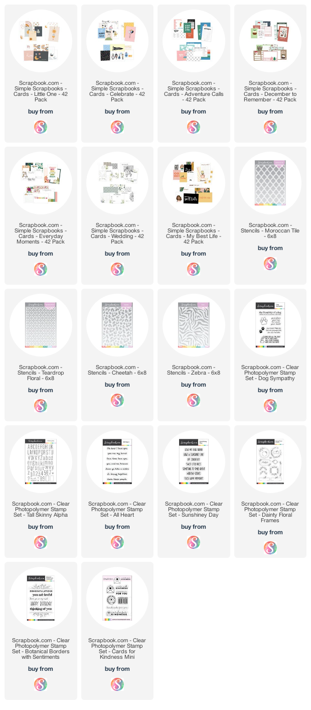
I had done the journaling and photo taking at the time, but I got a bit lazy about actually putting it all together. When the 6x8 albums arrived I knew I had found the perfect system to use. I incorporated it with some papers and stickers from the Heidi Swapp Storyline Chapters collection and some Scrapbook.com Simple Scrapbook Cards.
 

Now here's a fun note for you...the Scrapbook.com Simple Scrapbook Cards I used are the Little One pack of cards. These are meant to be used for baby themed projects, but when I looked closely at the art on them I realized so many of them could be used for way more than baby projects and the colors and rainbows were perfect to coordinate with the other products I was using.


I definitely recommend taking a look at the Simple Scrapbook Cards and to keep an open mind as to how they could be used for something other than just the specific theme for which they are named.

 2. Stencil Organization

Next up, let's get into some organization and storage ideas. I've been collecting stencils for quite awhile now and I've been looking for a way to store my ever growing stencil collection. For some reason, I tend to keep them in the package, but on many of them the plastic packaging has started to rip, so I've been on a mission to find a new solution. Once again, when the 6x8 album arrived I knew I had found the perfect solution!


You can easily store your stencils in the 6x8 pocket pages. Here I've used the packaging card from the Scrapbook.com stencils and trimmed off a quarter inch so they would fit in the pocket. If you no longer have the packaging, simply cut a piece of paper to size and place it into the pocket. And if you want to get really fancy you could use a label maker to create labels for each stencil to help organize things even more.

3. Ink Swatch Organization

I've been creating ink swatches for awhile now, but most of mine were done on a piece of paper, punched with a hole and then stored together on a binder or book ring. This worked great, but lately I've seen examples of people using coin collecting pages to organize their swatches and I really loved the look and how you can see the colors laid out next to each other!


Coin collecting pages have 2x2 inch pockets that are a great size for an ink swatch. With the arrival of the 6x8 album and page protectors, I was inspired to create my very own ink swatch book. However, there was only one problem, I didn't have any 2x2 coin pages that would fit my 6x8 album. So I thought, hmmm...I have a Fuse Tool, why don't I try to make one using a 6x8 pocket page? Well, after a little trial and error I figured it out and created my own 2x2 pocket pages. 

UPDATE..Scrapbook.com now offers 2x2 pocket pages and you can find them linked in the supply list below.


Here you can see how I've used this method to swatch my collection of Distress Ink, Distress Oxides, Archival Ink and Alcohol Inks. When creating swatches, I highly recommend that you swatch the ink onto the type of paper that you most commonly use with that ink.


4. Stamp Organization

Another option is to organize your stamps. By using a mix of pocket pages, you can store a wide variety of stamps sizes. I cut a piece of typing paper to slide behind each stamp set, but you could certainly include the packaging insert of so desired. You could also include the coordinating dies by adding them to a magnet sheet and including that in with the stamp set. With all the different colors of albums that Scrapbook.com offers, you could easily separate your stamps by theme or brand and give each one it's own album. Just think how beautiful that would look on your shelf!

These are stamps stored in a 6x8 page protector...


Stamps in a 4x6 pocket page protector...


Stamps in a 3x4 pocket page protector...

5. Handmade Card Sending Kit

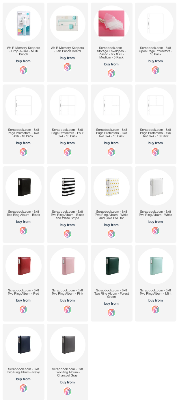
By now you might be starting to see a theme for some of the ways to use a 6x8 Album...organization. Yes, these little albums are perfect for organizing so many of our favorite crafting supplies. But what about your handmade cards? Mine usually end up in a bin somewhere, bent and forgotten. By placing them in the two 4x6 page protectors you have a great way to safely store your cards. You can even sort them by theme with the use of handmade dividers. Include a pocket for your envelopes and stamps, add a pretty pen and you've created your own handmade card sending kit.


To create a storage pocket for holding the stamps and envelopes, I used one of the Scrapbook.com Medium Plastic Storage Envelopes. Using the We R Memory Keepers Crop-A-Dile Multi Punch I added a couple of holes so I could include it in the album.

The dividers were made using the We R Memory Keepers Tab Punch Board and a selection of rainbow colored cardstock. I cut each piece of cardstock to the same size as one of the 6x8 page protectors and then followed the instructions to create the tabs. Once again, I used the Crop-A-Dile Multi Punch to add some holes so I could add them to the album. To decorate each divider, I used a Scrapbook.com Stencil with either a corresponding lighter or darker color of Distress Oxide Ink so that the design would show up against the cardstock color.


Just think how handy this will be for keeping you organized with sending out all those handmade cards you create!


So, now that I've shared 5 Ways to Use a 6x8 Album with you, how would you use the 6x8 albums in your craft room? Would you just stick to memory keeping or would you use them as a way to organize your crafting supplies? I'd love to hear your ideas!

Supplies

Below you can find the products I used to create this project along with compensated affiliate links to Scrapbook.com. These links are at absolutely no extra cost to you. If you want to learn more about what an affiliate link is, you can see my full affiliate and product disclosure statement here.

6x8 Albums, Page Protectors, & Tools
Pocket Cards, Stencils, & Stamps 
Kitsch Flamingo Distress | There Is Only One Happiness Card

So, I finally had a bit more time to play with the new Kitsch Flamingo Distress Ink from Tim Holtz, and quite honestly I'm kind of in love with what I created. I don't say that often, but sometimes do you ever create something that just really makes your heart happy? Well, this is definitely one of those makes for me. This combination of beautiful florals and vintage typography is two of my favorite things. The only thing missing is a butterfly!

There Is Only One Happiness Card by Juliana Michaels featuring Kitsch Flamingo Distress Ink, Bloom Colorize Thinlits, and Retro Type Bigz Dies by Tim Holtz

I started off by embossing a piece of silver Metallic Kraftstock using the 3D Texture Fades Typewriter. I then trimmed it to 4.25 x 6 and painted over the entire surface with Black Soot Distress Paint. Once the paint was dry, I lightly sanded over the surface to reveal the numbers and distress it just a bit.


Next, I started die cutting pieces of Distress White Heavystock using the Bloom Colorize Thinlits and the Retro Type Bigz Dies. I also die cut the Retro Type base from a piece of craft foam. Once the die cutting was finished, I began ink blending the flowers with Distress Ink in Kitsch Flamingo and Spun Sugar. With the flowers assembled I also did a little ink smooshing into some Kitsch Flamingo as well. For the flower centers I used Fossilized Amber and Gathered Twigs and after adhering these, I inked the edges of the flowers with some Vintage Photo. On the leaves, I used Peeled Paint, Rustic Wilderness and Forest Moss.
 

To add color to the typewriter, I first painted the Distress White Heavystock with Speckled Egg Distress Paint. I probably could have ink blended this with Distress Ink, but for some reason, I wanted to do a little painting. I used Brushed Pewter Distress Paint for the carriage return, roller knob, etc. Once the paint was dry, I lightly inked the edges with Vintage Photo Distress Ink. I then inked the entire surface with an Embossing Ink Pad, making sure to cover the Brushed Pewter areas so no ink would stick there. I then heat embossed the body of the typewriter with Speckled Egg Embossing Glaze giving it a shiny metallic look. I then repeated the heat embossing on the Brushed Pewter areas using clear embossing powder. For the space bar and and keys I used black embossing powder. To avoid having to heat emboss all the tiny key pieces, I cut a piece of heavystock to fit behind the opening, heat embossed it with the black embossing powder and adhered it to the back of the typewriter.
 

With the flowers and typewriter completed, I then added a typed phrase I created using my Royal Jr. Typewriter, making sure to type it out so the trimmed piece would fit through the opening on the die. I absolutely love the look this adds to the piece. And if you don't have a typewriter, you could easily achieve the same effect using a typewriter font with a word program on your computer and then print it out.

To finish off the card, I ink blended a piece of Distress White Heavystock trimmed to 4.5 x 6.25" using Kitsch Flamingo Distress Ink.


I hope you enjoyed this bit of inspiration using the new Kitsch Flamingo Distress Ink. Thanks so much for stopping by today and I look forward to seeing what you create using this gorgeous new color!

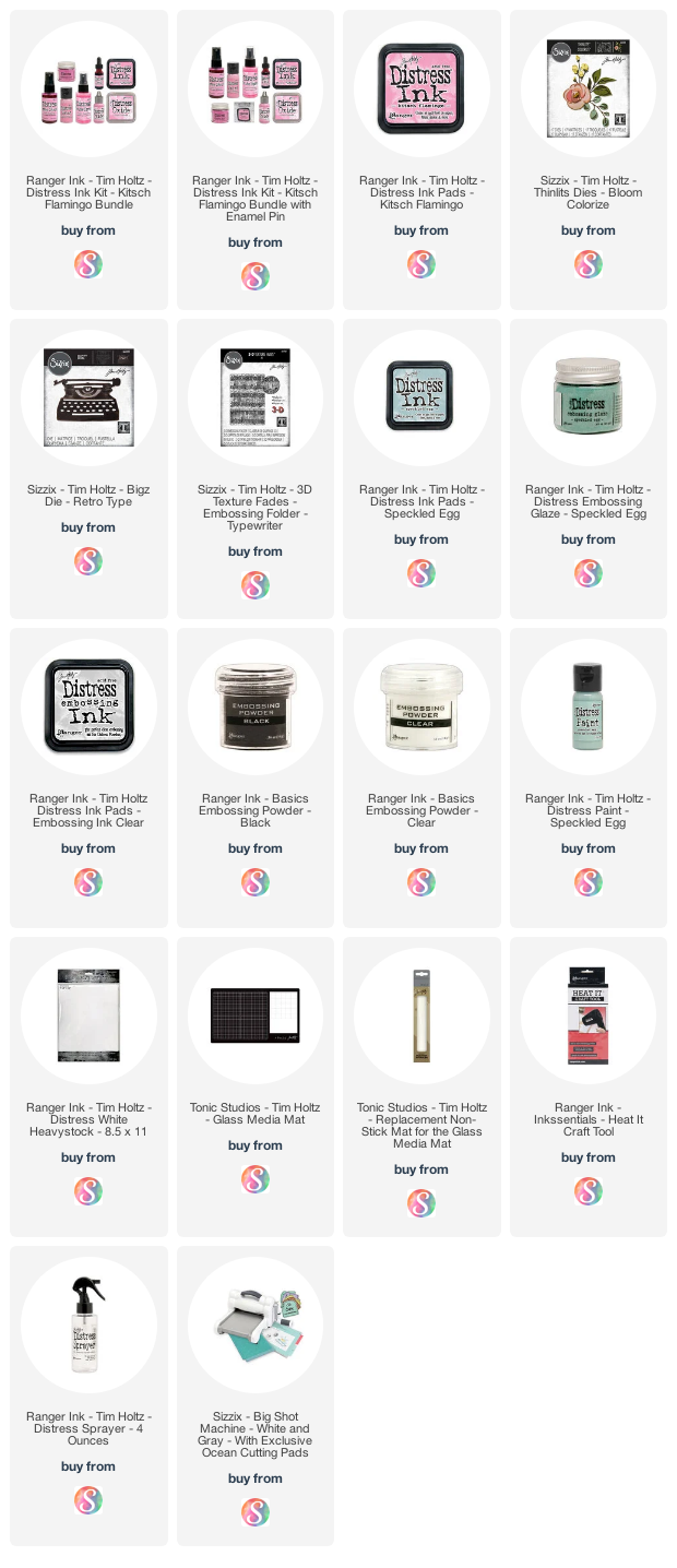
Supplies

Below you can find the products I used to create this project along with compensated affiliate links to Scrapbook.com. These links are at absolutely no extra cost to you. If you want to learn more about what an affiliate link is, you can see my full affiliate and product disclosure statement here

Subscribe