
Hello friends! I'm so happy you're here! Today I have some fun techniques to share with you using the new Tim Holtz Distress Embossing Glazes! If you aren't familiar with embossing glazes, they work a lot like embossing powder in that you apply it over ink and then use a heat gun to melt the powder. The BIG difference though, is that embossing glazes are translucent, so you can see through them. This allows you to layer them and create a lot of depth and dimension in your projects.

I've created a video sharing these techniques and the cards I created using them. You can check it out below. If the video isn’t showing up, click HERE to watch it.
Below are the cards from my video. I've included some of basic information along with the main products I used on each card. If you are interested in more details on how I created each card and the techniques I used, make sure to check out my video. And as always, you can find a complete supply list at the end of this post.
Keep Moving Forward Card | Distress Embossing Glaze & Stencil Background

On this first card, I'm using the Tim Holtz Lattice Work Stencil with Distress Translucent Texture Paste on Distress Watercolor Paper. I then applied Wilted Violet, Salty Ocean and Twisted Citron Distress Embossing Glazes. For all the tips and tricks make sure to check out my video. I also share how I created the butterfly that I used on each of these cards.

Hello There Card | Distress Embossing Glaze & Stencil Background

To create this card, I used the same technique that I used on the first card. The difference is that I used the Tim Holtz Mosaic Stencil with the Distress Translucent Texture Paste and for the Distress Embossing Glazes I used Picked Raspberry, Candied Apple and Wild Honey.

Don't Forget To Fly Card | Distress Embossing Glaze & Archival Ink Background

To create this card background I used Distress Embossing Glaze and Archival Ink. Make sure to check out my video to see how this came together. The Archival Ink colors I used are Rustic Wilderness, Prize Ribbon, Villainous Potion, Picked Raspberry, Fired Brick and Crackling Campfire. The Embossing Glazes are Twisted Citron, Salty Ocean, Wilted Violet, Picked Raspberry, Candied Apple and Wild Honey.


I hope you enjoyed this inspiration and the video I created featuring Distress Embossing Glaze Backgrounds. Thanks so much for stopping by!
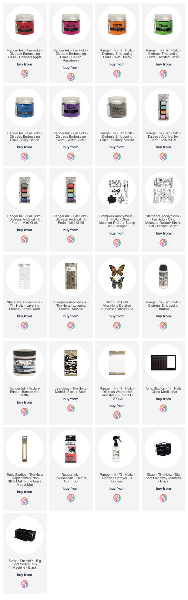
Supplies
Below you can find the products I used to create these cards along with compensated affiliate links to Scrapbook.com. These links are at absolutely no cost to you. If you want to learn more about what an affiliate link is, you can see my full affiliate and product disclosure statement here. I really appreciate your support of my blog and videos!


No comments
Every time you smile at someone, it is an action of love, a gift to that person, a beautiful thing. ~Mother Teresa
HUGS!
JULIANA