
When I sat down to create this Christmas card, I decided to focus on something I don't always consciously think about: foundation and focal points. What grounds the design? What draws the eye first? These fundamentals work whether you're doing mixed media or clean paper layering.
Stripping away my usual texture paste and gesso forced me to be really intentional about every choice. And honestly? That clarity felt good. Working with the Scrapbook.com Yuletide Paper Pad made the process even smoother—when you start with a beautifully coordinated collection of patterns and colors, half the design decisions are already made for you. Those rich greens and reds with vintage patterns? They work together effortlessly, leaving me free to focus purely on composition and hierarchy instead of wondering if my colors clash.

Foundation & Focal Points: Building a Strong Design
Before I dive into the how, let me share the design principle that makes this card work.
Every great card needs two things: a solid foundation and a clear focal point. Think of the foundation as your stage—it sets the tone, anchors the design, and creates visual boundaries. The focal point is your star performer—the element that draws the eye first and holds attention.
For this Christmas card, my foundation is that vintage label shape with distressed edges. It grounds everything and creates a frame. My focal point? That bold "Merry Christmas" sentiment—impossible to miss, layered for impact, and centered to create a strong, balanced composition.
When these two elements work together, your design feels intentional and professional, even when you're layering multiple patterns and colors.
Why This Card Works
Here's what makes this design successful:
- Clear hierarchy — Your eye goes to "Merry Christmas" first (the focal point), then travels around the supporting elements
- Strong foundation — The vintage label creates boundaries and anchors the busy elements
- Contrast creates impact — Black sentiment against lighter backgrounds equals instant drama
- Strategic distressing — Sanding and inking add vintage character without overwhelming the design
- Symmetrical balance — The centered sentiment with florals clustered above and below creates stability and classic appeal

With that framework in mind, here's how I built this card:
Building the Card
Step 1: Create Your Focal Point
I began by die cutting "Merry Christmas" from black cardstock using the Scrapbook.com Christmas Joy die set. This is my focal point, so I made it impossible to miss—black for maximum contrast. I then die cut the shadow layer from a piece of patterned paper from the Yuletide Paper Pad to add depth and visual interest. I centered the sentiment on my foundation to create a strong, balanced composition—sometimes symmetry is exactly what a design needs.
Step 2: Build Your Foundation
The foundation anchors everything. I flipped through the Yuletide Paper Pad and selected a neutral monochromatic pattern to die cut the Nested Vintage Classic Labels. By keeping it neutral, it doesn't compete with the bold sentiment or vibrant poinsettias. It's like creating a frame that says "look here" without shouting.
Step 3: Add Definition
I inked the edges of that label with Distress Ink in Walnut Stain using a foam blending tool. This serves two purposes: it adds depth and shadow (making the foundation feel grounded), and it creates separation from the background, which helps your focal point pop.
Step 4: Choose Your Background
I selected a background paper from the Yuletide Paper Pad that had that vintage Christmas feel—rich color with subtle pattern that wouldn't compete with my focal elements.
Step 5: Create Supporting Elements
For the florals, I die cut the poinsettias and some of the greenery from papers in the Yuletide Paper Pad. I wanted a couple more solid colors for the greenery, so I went to my cardstock stash and selected a warm green and dark grey to coordinate with the other colors.
The poinsettias support the focal point—I clustered one arrangement above the sentiment and one below to create balanced, symmetrical framing. This creates visual stability while the florals naturally guide your eye to the words in the center.
Step 6: Add Vintage Character
I used a Ranger Sanding Disc—which is just a piece of fine grit sandpaper like you can get at the hardware store—to lightly sand the edges of the papers from the Yuletide Paper Pad. Those papers have a white core, so when you rub the sandpaper over it, it removes the printed color to reveal the white core. A nice touch of distress to add to the vintage vibe.
Step 7: Build Dimension
I used double-sided foam adhesive to pop up the main sentiment, the poinsettias, and the entire focal piece to add interest and dimension. This reinforces the hierarchy—what pops up physically is what should pop visually.

Foundation & Focal Points in Action
Here are the techniques that bring this principle to life:
Creating a Strong Foundation:
- Use neutral or monochromatic patterns that support rather than compete
- Add definition through inking or distressing edges
- Choose shapes that create natural frames or boundaries
- Keep it substantial enough to anchor your design
Making Your Focal Point Unmissable:
- Use high contrast (like black on light backgrounds)
- Add dimension with foam adhesive
- Layer shadow pieces for depth
- Center for classic, balanced appeal—symmetry creates strength
- Make it bold enough to command attention
Supporting Elements:
- Florals and greenery should guide the eye, not distract
- Balance floral clusters above and below for symmetrical framing
- Use odd-numbered groupings for natural appeal
- Vary sizes to create flow
- Position elements to reinforce your focal point

A Different Kind of Foundation
In my mixed media work, I build foundations with layers of gesso, texture paste, and stamping. Here, the Yuletide Paper Pad and thoughtful die cutting did that job. The sanding and inking? That's my nod to the distressing I'd normally do with heavy texture.
Different tools, same principle: create a strong base that supports your focal point. This process reminded me that good design isn't about the medium—it's about understanding hierarchy, contrast, and intentional placement.
Coming Up in This Series
This is the second of four cards I'm sharing using Scrapbook.com Exclusives—each exploring paper-only cardmaking from a different angle:
- Previous: Halloween card — Character & Whimsy (Check it out here)
- Next: Love card — Dimension & Movement
- Finally: Thinking of You — Vintage Vibes
Each card taught me something different about design principles that work across any style, mixed media or not.
Let's Connect!
Ready to create your own? Grab these Scrapbook.com exclusives using the supply list below.
I'd love to hear from you: What's your favorite part of Christmas card design—bold sentiments or intricate florals? Drop a comment!
If you make this card, please tag me—I absolutely love seeing your versions!
Don't miss the rest of this series! Subscribe to my email newsletter so you never miss a new project, post, or video.
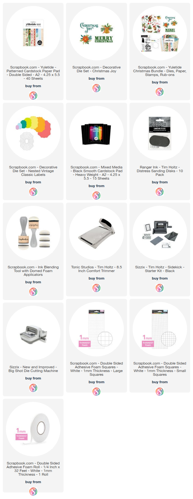
Supply List
Below you can find the supplies I used to create this card. When you shop through those links—whether you purchase that exact item or something else entirely—you're supporting me at no extra cost to you. The commission I receive helps me cover the costs of my blog and other expenses, and allows me to continue to provide you with FREE inspiration and tutorials. If you want to learn more about what an affiliate link is, you can see my full affiliate and product disclosure statement here. Thank you so much for your love and support!


Lovely Christmas card! I love the combination of both the bold sentiment and florals. I also like how you used simple techniques to give it texture and character. Thank you for your talented inspiration!
ReplyDeleteWhat a classic looking card! I would never have guessed you cut the poinsettia out of patterned paper. You explained this concept so nicely and it makes total sense to me now. I never thought of my cardmaking in these steps. Thank you, as always for your talents!!
ReplyDeleteThis is a beautiful Christmas card Juliana! My favourite part of Christmas card design are definitely intricate florals, I just love all floral designs. I love these beautiful poinsettias you used, I'm going to copy your card!
ReplyDelete