Embodied Spirits | Tim Holtz 2020 Stampers Anonymous Halloween

Hey crafty friends! I'm back with another Tim Holtz 2020 Stampers Anonymous Halloween card that I created using some of the new stamps from Tim's latest release. Today I'm featuring the Examination and Tiny Text Halloween Stamp Sets.


This card actually came together rather quickly for me because as soon as I saw this stamp set, I knew I wanted to create a x-ray effect with the skeleton image and Alcohol Lift Ink.

I began by creating an alcohol ink background on Yupo paper. I used Pitch Black and a tiny bit of Pebble and then blended them with Alcohol Ink Blending Solution.


Next, I stamped the skeleton image onto the alcohol ink background using Alcohol Lift Ink. I then followed the steps for lifting the ink by dabbing the image with a clean paper towel until no more ink would lift off. With each dab the ink was lifted and the image was revealed in more and more detail. I also repeated the process using the splatter image that is included in this set.


After completing the background, I created the sentiment strip and label. The label is from the Examination Stamp Set and the sentiment is from the Tiny Text Halloween Set. They are each stamped onto black metallic kraft stock with embossing ink and then heat embossed with Liquid Platinum Embossing Powder.

To complete the card, I layered the stamped piece onto a piece of champagne metallic kraft stock and then onto a piece of black metallic kraft stock.


I hope you enjoyed learning how this card came together using the Examination and Tiny Text Halloween Stamp Sets by Tim Holtz.

Supplies

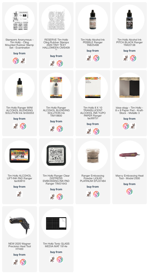
You can find a supply list of the products I used to create this project below. This post contains compensated affiliate links to Scrapbook.com and Simon Says Stamp at no cost to you. If you want to learn more about what an affiliate link is, you can see my full affiliate and product disclosure statement here.
 

Things Are Not What They Seem | Tim Holtz 2020 Stampers Anonymous Halloween

Hey friends! Did you catch the Tim Holtz 2020 Stampers Anonymous Halloween Release on Facebook Live? Oh my goodness it was amazing! Tim just released some amazing new stamps and stencils that are perfect for all your Halloween makes. However this release is not just for Halloween and has some great sets that can be used all year round. I was blessed once again to be asked to create some projects that were shared during the Facebook Live and today I'm sharing one of the Halloween cards I made. If you happened to miss Tim's Facebook Live you can catch it here.

Things Are Not What They Seem Halloween Card

This card is definitely not what it seems. At first glance, it looks like an ordinary card, with some layering and embellishments. However the butterfly and skeleton are actually flaps that flip open to reveal the full background design and room for you to add a message to the recipient.

Let me walk you through the details on how this card came together!

Things Are Not What They Seem Halloween Card by Juliana Michaels featuring Tim Holtz Stampers Anonymous Tiny Text Halloween Specimen, Examination, Dearly Departed and Eroded Metallic Technique.

The background of this card begins with the Eroded Metallic Technique. Tim shares this in his Q+A Demo: Distress Paint  and you can find it around the 1:11:20 mark. His video is very detailed, but I'm also going to share what I did as well.

I began by applying Distress Paint in Black Soot, Peeled Paint and Wilted Violet using a dry brush to a piece of Bristol Smooth Paper. I added colors here and there, until the entire piece of paper was covered with paint. And yes, it kind of looks like a hot mess at this point!


While the paint was drying (make sure it is completely dry), I gathered the following supplies. You want all of these items ready to go, as you can't let things dry or this next step won't work. 

Supplies: Brushed Pewter Distress Paint, paint brush, Ranger Heat Gun, Distress Sprayer (filled with water) and a paper towel. Tim recommends using paper towels without texture, however, I don't have any of those and the texture on the ones I do use doesn't bother me. The more grunge the better in my book! 

Once I had all of my supplies within easy reach, I squeezed a large amount of Brushed Pewter Distress Paint onto my craft mat. (You want to make sure you have enough to completely cover the paper.) I then brushed the paint onto the paper, making sure to work quickly and to avoid wiping over it or trying to do layers. Once the paper was covered with paint, I immediately sprayed the paper with water, squeezing the trigger slowly to get big droplets and allowing the water to even pool here and there.

I then briefly dried the paper with my heat gun, just long enough to dry the areas that didn't have any water on them. For the final step, I covered the paper with a paper towel, ran my hand over it to smooth it out and then peeled it up immediately. This step removed some of the metallic paint and revealed the original colors I had painted and gave me this cool eroded metallic look!

Eroded Metallic Technique

After I completed the Eroded Metallic technique, I stamped several images from the Anatomy Chart, Examination, and Dearly Departed Stamp Sets using Archival Ink in Black Soot, Hickory Smoke and Wilted Violet. You can see a full view of the background in the final image down below.

Things Are Not What They Seem Halloween Card by Juliana Michaels featuring Tim Holtz Stampers Anonymous Tiny Text Halloween Specimen, Examination, Dearly Departed and Eroded Metallic Technique.

For the focal point of this card, I stamped the butterfly from the Specimen Stamp Set and the skeleton chart from the Examination Stamp Set onto Bristol Smooth Paper using Black Soot Archival Ink. I then ink smooshed the skeleton paper with Old Paper Distress Ink and trimmed around it leaving about a 1/2 inch flap on the right side. I wrapped this flap around the backside of the Eroded Metallic panel and used a bone folder to give it a nice crease. I then inked the edges with Vintage Photo Distress Ink.


For the butterfly, I did the same ink smooshing and then water colored sections of it using Wilted Violet Distress Ink and a water brush. I fussy cut the butterfly and then inked the edges with Vintage Photo Distress Ink. On this piece, I wrapped part of the wing over the left side and adhered it in place on the backside of the background panel. 

Before I adhered the flaps, I realized that when they opened the backside of them was not very attractive. To fix this, I stamped various images from the stamp sets using Hickory Smoke Archival Ink and then inked the paper with Old Paper Distress Ink and the edges with Vintage Photo Distress Ink. I then adhered the flaps to the backside of the background paper. You can see this in more detail in the final image below.

Now, even with the using a bone folder to crease the paper, the butterfly flap didn't want to lay flat. To help with that, I added the 31 from the Idea-ology Numeric. Before adhering the numbers and the Hardware Heads, I distressed each of them with Pitch Black and Mushroom Alcohol Ink. 

For the sentiment I used the Tiny Text Halloween. I then layered everything onto a piece of Bristol Paper inked with Old Paper Distress Ink and then onto a piece of black cardstock.


Here you can see how the card opens to reveal the background/inside of the card and the stamping on the backside of the flaps.


I hope you enjoyed learning how this card came together and how some things really aren't what they seem! 

Supplies

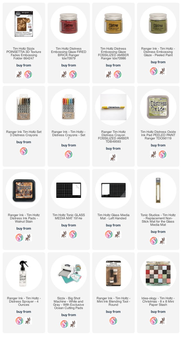
You can find a supply list of the products I used to create this project below. This post contains compensated affiliate links to Scrapbook.com and Simon Says Stamp at no cost to you. If you want to learn more about what an affiliate link is, you can see my full affiliate and product disclosure statement here.
Sunny Studio Stamps 5th Birthday Blog Hop

Hello friends! Welcome to the Sunny Studio Stamps 5th Birthday Blog Hop! I'm thrilled to be a part of this event and to help Mendi (the owner) celebrate this very special milestone for her company! There are loads of fun things going on along with the blog hop, including some great promotions that will save you money and some amazing giveaways. You can check out all of the details below and learn more about the Slimline Christmas Card I created and am sharing with you today. 


As part of the blog hop, you'll be seeing some fabulous inspiration using the brand new Sunny Studio Stamps Fall/Winter Release. You should be arriving here from the talented Isha and your next stop from here is the amazing Leanne.

I'm a huge fan of all things Christmas and a Santa lover, so I choose to create and share a card featuring the North Pole Stamp Set. I used this along with the new Slimline Scallop Frame Dies to create my card.


I stamped and colored all of the images from the North Pole Stamp Set using Copic Markers and then die cut them using the coordinating die set. Making scenes with stamped images is something I love to do, so I thought it would be fun to divide the space on the front of the card into three sections. Each one is 2.75 x 2.5 inches and cut from a piece of green patterned paper that can be found in the Very Merry 6x6 Paper Pad. I adhered each section onto a piece of white cardstock that I had die cut using the new Slimline Scallop Frame. I then went about creating a small scene on each section using the various images I had colored. When doing this sort of scene creating, I always try to color a bunch of extra "filler" images. In this case, it was presents, and I used them to fill in the spaces here and there on each section.


I hope you enjoyed this Slimline Christmas Card inspiration using the Sunny Studio Stamps North Pole Stamp Set. Now it's time to learn about all the good stuff!

BLOG HOP INFO, PROMOS & GIVEAWAYS

Here is the full blog hop order so you don't miss a stop along the way to enter for the giveaways!

Juliana (you are here)

Sunny Studio has a couple different promotions going on right now. Only one discount code can be used per order, so you will need to choose the one that has the biggest savings for you. There is free US shipping on all orders over $25 using the code FREESHIP or 20% off all Sunny Studio Branded Products (excluding the new release and retired products) using the code FIVEYEARS through Wednesday, August 26th at 11:59pm PDT.

Now, how about the giveaways?! Each stop along the blog hop will have a $25 gift code to give away. 
To enter, leave a comment below telling me one of your favorite things about the holiday season! 

You can hop and comment to win now through Wednesday, August 26th 11:59 pm PDT. All winners will be emailed their shopping codes and shared on the Sunny Studio blog on Sunday, August 30th.

Happy Hopping!

Supplies

You can find a supply list of the products I used to create this project below. This post contains compensated affiliate links to Sunny Studio Stamps, Scrapbook.com and Simon Says Stamp at no cost to you. If you want to learn more about what an affiliate link is, you can see my full affiliate and product disclosure statement here.

Season's Greetings Christmas Card | Tim Holtz Sizzix Christmas

Christmas will be here before you know it, so now is definitely the time to get started creating your Christmas cards. Today I'm sharing a Season's Greetings Christmas Card with you that I created using the beautiful Tim Holtz Sizzix Poinsettia 3D Texture Fades embossing folder.

Season's Greetings Christmas Card by Juliana Michaels featuring Tim Holtz Sizzix Poinsettia 3D Texture Fades embossing folder

To get started, I lightly misted a piece of kraft cardstock with water using my Distress Sprayer. I then embossed it using the Poinsettia 3D Embossing Folder. Next, I applied Peeled Paint Distress Oxide to the flat side of the folder and embossed it again. This applies the ink to the "background" of the design.


Once the ink was completely dry I colored the raised surface design of the leaves with an embossing marker and sprinkled it with Peeled Paint Embossing Glaze and then embossed it using a heat gun. I repeated this process for the flowers using Fired Brick Embossing Glaze and for the centers using Fossilized Amber.


Once everything was heat embossed, I colored over the embossed areas with a Walnut Stain Distress Crayon. Working in small sections, I rubbed the crayon into the cracks and crevices of the embossed design.


I then used a damp paper towel to wipe away any excess and reveal the embossed color once again.


To further distress the image, I inked the edges of the paper with Walnut Stain Distress Ink.


I then spritzed the entire piece with water using my Distress Sprayer and dabbed the droplets dry.


To complete the card, I added a quote chip from a past Christmas Quote Chip set and layered the design onto a piece of inked cardstock and then onto a piece of patterned paper from a past Christmas paper stash.

Season's Greetings Christmas Card by Juliana Michaels featuring Tim Holtz Sizzix Poinsettia 3D Texture Fades embossing folder

Season's Greetings Christmas Card by Juliana Michaels featuring Tim Holtz Sizzix Poinsettia 3D Texture Fades embossing folder

Season's Greetings Christmas Card by Juliana Michaels featuring Tim Holtz Sizzix Poinsettia 3D Texture Fades embossing folder

I hope you all enjoyed learning how I created this Season's Greetings Christmas Card featuring the Poinsettia 3D Texture Fades embossing folder.

Supplies

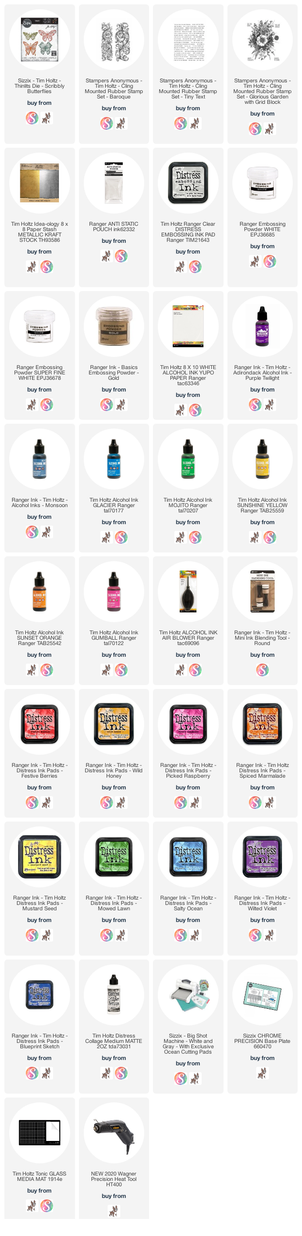
You can find a supply list of the products I used to create this project below. This post contains compensated affiliate links to Scrapbook.com and Simon Says Stamp at no cost to you. If you want to learn more about what an affiliate link is, you can see my full affiliate and product disclosure statement here.

Rainbow & Analogous Color Backgrounds with Alcohol and Distress Ink

Hello friends! Today I'm sharing a set of 6 cards that focus on creating rainbow and analogous color backgrounds using Alcohol Ink and Distress Ink. I was originally inspired by the Iron Off Resist technique shared by Jennifer McGuire. However, in my laziness of not wanting to deal with getting out the iron and ironing board, I went a different route and ended up with the set of cards I'm sharing today. It just goes to show how inspiration is everywhere and how it can be a jumping off point for your own creative process.

Ok. so now back to these rainbow and analogous color backgrounds. We all know what rainbow color is, but... you might be asking yourself what analogous colors are? Analogous colors are groups of three colors that are next to each other on the colour wheel. For example: red, orange and yellow. Working with analogous colors makes for easy blending as you never have to worry about the colors getting muddy or brown.

Alcohol Ink Rainbow and Analogous Color Backgrounds

This first set of cards uses Alcohol Inks on Yupo paper to create the backgrounds. I made one card with a rainbow color palette and the other two with analogous colors.

Alcohol Ink Rainbow Backgrounds Card by Juliana Michaels

The stamped image on all three of these cards is from the Tim Holtz Stampers Anonymous Baroque Stamp Set. For the focal point, I die cut a butterfly from gold Metallic Kraft Stock using the Sizzix Scribbly Butterflies Thinlits Die. The sentiment is from the Tim Holtz Stampers Anonymous Tiny Text Stamp Set. It is stamped on black cardstock with embossing ink and heat set with gold embossing powder. I used this same focal point on each of the Alcohol Ink cards, but switched up the sentiment on each one.

Alcohol Ink Rainbow Backgrounds Card by Juliana Michaels

For the rainbow pattern, I applied the colors in rainbow order from top to bottom and used the Ranger Alcohol Ink Air Blower to move the inks around. I also used a tiny bit of Alcohol Ink Blending Solution.
I used the following Alcohol Inks for this card: Gumball, Sunset Orange, Sunshine Yellow, Mojito, Glacier and Purple Twilight.

Once the Alcohol Ink was dry, I rubbed the entire panel with a Ranger Anti-Static Pouch just to make sure no stray embossing powder would stick to it. I then stamped the Baroque image with embossing ink and heat set it with white embossing powder.


This next card uses the analogous colors of red, orange and yellow. I used the following Alcohol Inks: Gumball, Sunset Orange and Sunshine Yellow.

I used the same stamp image, but this time I stamped it with Alcohol Lift Ink. After stamping the image, I used a paper towel to dab and lift off the ink to reveal the image. It creates a subtle effect, but adds a nice bit of interest to the background.

Alcohol Ink Analogous Rainbow Backgrounds Card by Juliana Michaels

On this final alcohol ink card, I used the analogous colors of blue, indigo and violet. The Alcohol Inks I used are: Glacier, Purple Twilight and Monsoon. The stamped image is the same one I used previously and again I used it with Alcohol Lift Ink.

Another analogous color combination that I didn't do, but that would be a great option is yellow, green and blue. Wouldn't that be gorgeous?

Alcohol Ink Analogous Rainbow Backgrounds Card by Juliana Michaels

Distress Ink Rainbow and Analogous Color Backgrounds

Now onto the second set of cards. This time I used Distress Ink with watercolor paper, but continued with the rainbow and analogous color combinations.

Distress Ink Analogous Rainbow Background Cards by Juliana Michaels

On these cards, I used the Tim Holtz Stampers Anonymous Baroque Stamp Set and the Glorious Garden Stamp Set. I stamped the image with embossing ink and heat embossed it with white embossing powder. I found that Super Fine White Embossing Powder worked better in keeping the details of the Glorious Garden image as compared to regular embossing powder. With all of these, I made sure the inked background was completely dry and ran an Anti-Static Pouch over the surface before stamping and heat embossing.

For the focal point, I again die cut butterflies from gold Metallic Kraft Stock using the Sizzix Scribbly Butterflies Thinlits Die. The sentiment is from the Tim Holtz Stampers Anonymous Tiny Text Stamp Set. This time I stamped it onto white cardstock with embossing ink and heat set with white embossing powder. I then inked the white paper with Distress Ink to coordinate it with the card.

Distress Ink Analogous Rainbow Background Cards by Juliana Michaels

On each of these cards, I used Distress Ink to create the background. For the rainbow effect, I used an Ink Blending tool to apply ink in stripes at a diagonal along a piece of watercolor paper. I then used the blending tool to blend the colors next to each other together. Next, I spritzed the paper using the Distress Sprayer, making sure to apply enough water to get the inks to create the distressed look. I did a combination of spritzing and drying with a heat tool and spritzing and dabbing dry with a paper towel to get the inks to blend and move. The Distress Ink colors I used on the rainbow background are: Festive Berries, Spiced Marmalade, Mustard Seed, Mowed Lawn, Salty Ocean and Wilted Violet.

Distress Ink Rainbow Background Card by Juliana Michaels

This next card uses an analogous color scheme. This time I used the following Distress Inks: Picked Raspberry, Festive Berries and Wild Honey. When applying the ink, I again used a foam blending tool, but I applied the various inks to the card in different areas, blended the colors next to each other and then used the spritz and dry methods I used on the previous card. As I mentioned earlier, I used Super Fine White Embossing Powder when I stamped and embossed the Glorious Garden Stamp.

Distress Ink Analogous Background Card by Juliana Michaels

On my final card, I used Wilted Violet, Salty Ocean and Blueprint Sketch Distress Ink with the same technique as mentioned on the previous card.

Distress Ink Analogous Background Card by Juliana Michaels

That's it friends! I sure hope you enjoyed learning how to create these Rainbow and Analogous Color Backgrounds using Alcohol Ink and Distress Ink. Thanks so much for stopping by and as always, if you have any questions, don't hesitate to ask.

Supplies

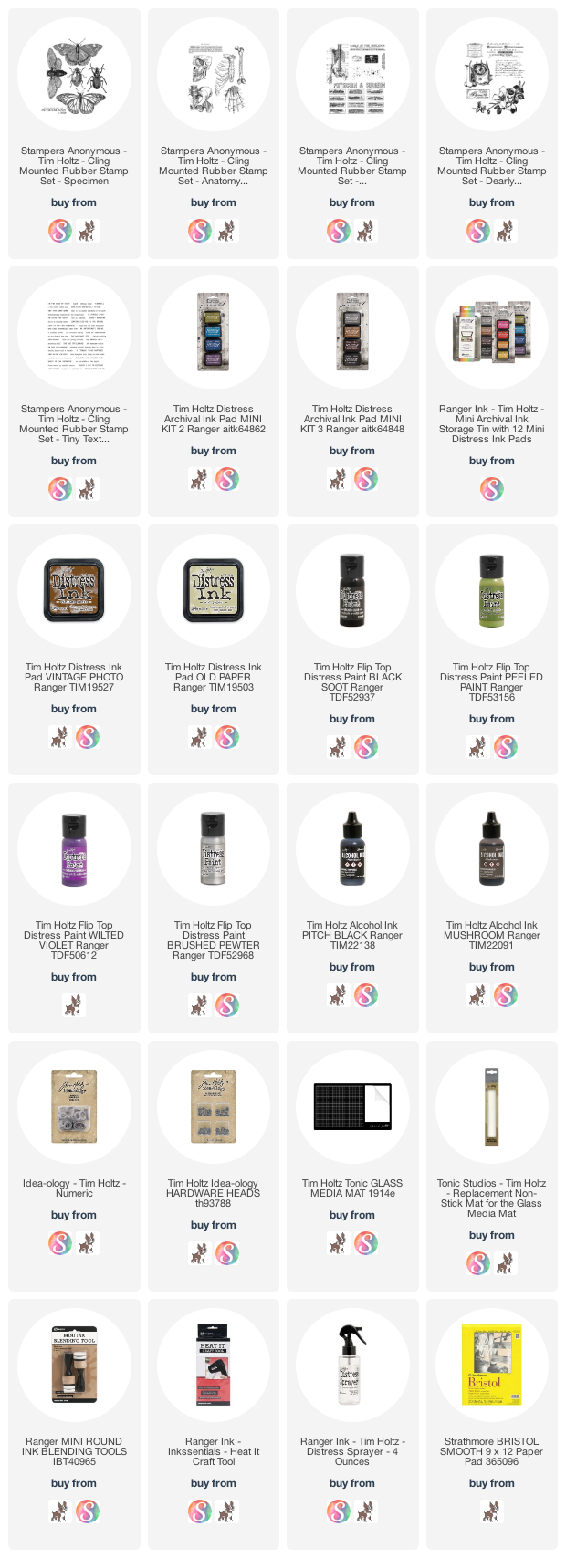
You can find a supply list of the products I used to create this project below. This post contains compensated affiliate links to Scrapbook.com and Simon Says Stamp at no cost to you. If you want to learn more about what an affiliate link is, you can see my full affiliate and product disclosure statement here.
Subscribe