The best cards are the ones that feel made for someone, and that's exactly what I had in mind when I created this Father's Day card. My stepdad is a private pilot, so the travel theme, the airplanes, and the vintage ticket all came together with him in mind. I used the Tim Holtz Vault World Traveler die set for those little airplane accents, and Theodore just happened to be the perfect passenger.

Meet Theodore
If you haven't met Theodore yet, he's part of the Tim Holtz Sizzix Colorize collection — and he is absolutely the most charming bear in a bow tie you'll ever put on a card. For this project, I cut him from pre-colored cardstock rather than building custom color with inks or paint, which makes the process so much faster while still giving you that gorgeous layered Colorize look.

The Card
The background has a lot going on in the best possible way — it's layered, textured, and has that vintage travel feel that I just love. I used the Honey Bee Stamps Aviator stamp along with Tim Holtz Numeric and Mini Set 11 stencils to build up the background, and the technique I used to pull it all together is one I taught in my Steampunk Vibes class. The color palette leans into those warm, earthy tones with hints of teal and blue — perfect for a masculine card without feeling flat or boring.
The sentiment is a combination of the Tim Holtz Handwritten Celebrate die set for the script "happy" and a stamp from the Scrapbook.com Celebrate Expressions set for the "Father's Day" label strip. The vintage ticket in the background is from the Tim Holtz Ticket Booth stamp set, which adds that perfect touch of worn, travel-worn charm.

If you love the background technique and want to learn it yourself, it's part of my Steampunk Vibes class — and right now, my email and newsletter subscribers can use the code BEARHUG to get $5 off. (This coupon code is good now through June 19th, 2026).
Head over to my classes page at julianamichaels.podia.com/pretty-grunge-steampunk-vibes to check it out!

I'd love to know — do you make cards with specific people in mind, or do you tend to make a design and then decide who it's for? Leave a comment below and let me know!
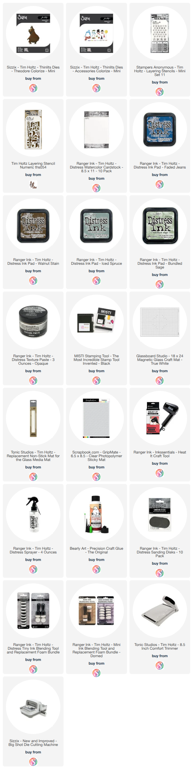
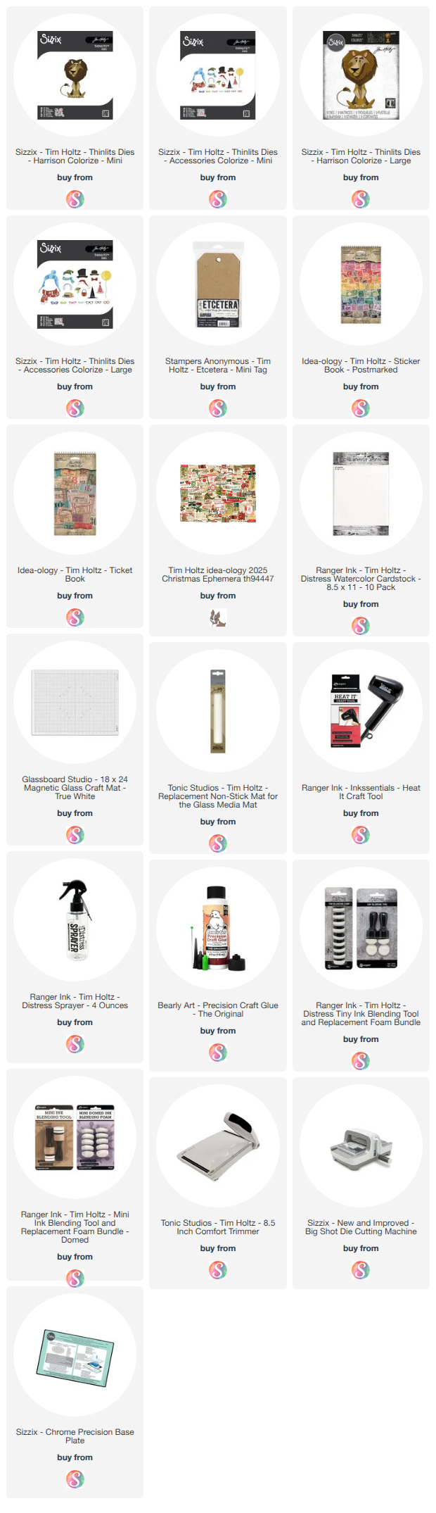
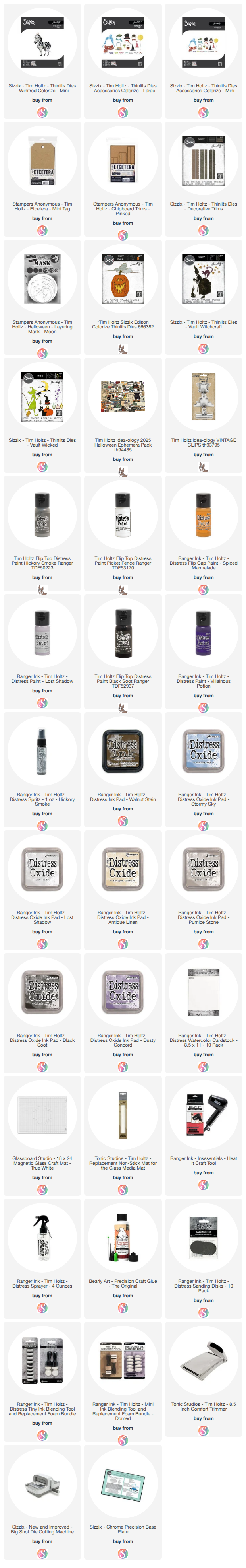
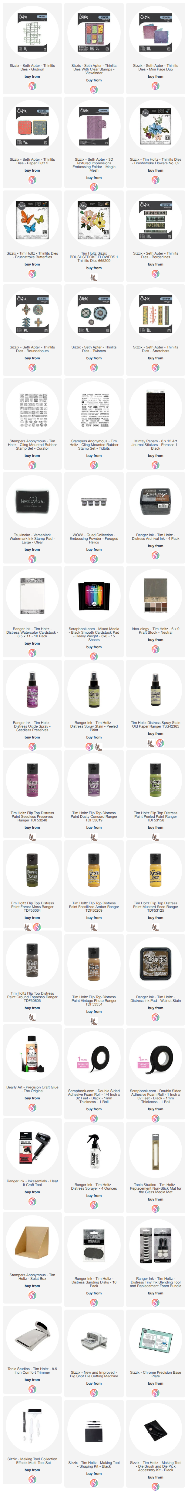
Supplies
Below you will find links to the supplies I used to create these cards. When you shop through these links—whether you purchase that exact item or something else entirely—you're supporting me at no extra cost to you. The commission I receive helps me cover the costs of my blog and other expenses, and allows me to continue providing you with FREE inspiration and tutorials. If you want to learn more, you can see my full affiliate and product disclosure statement here. Thank you so much for your love and support!